HOME | DD
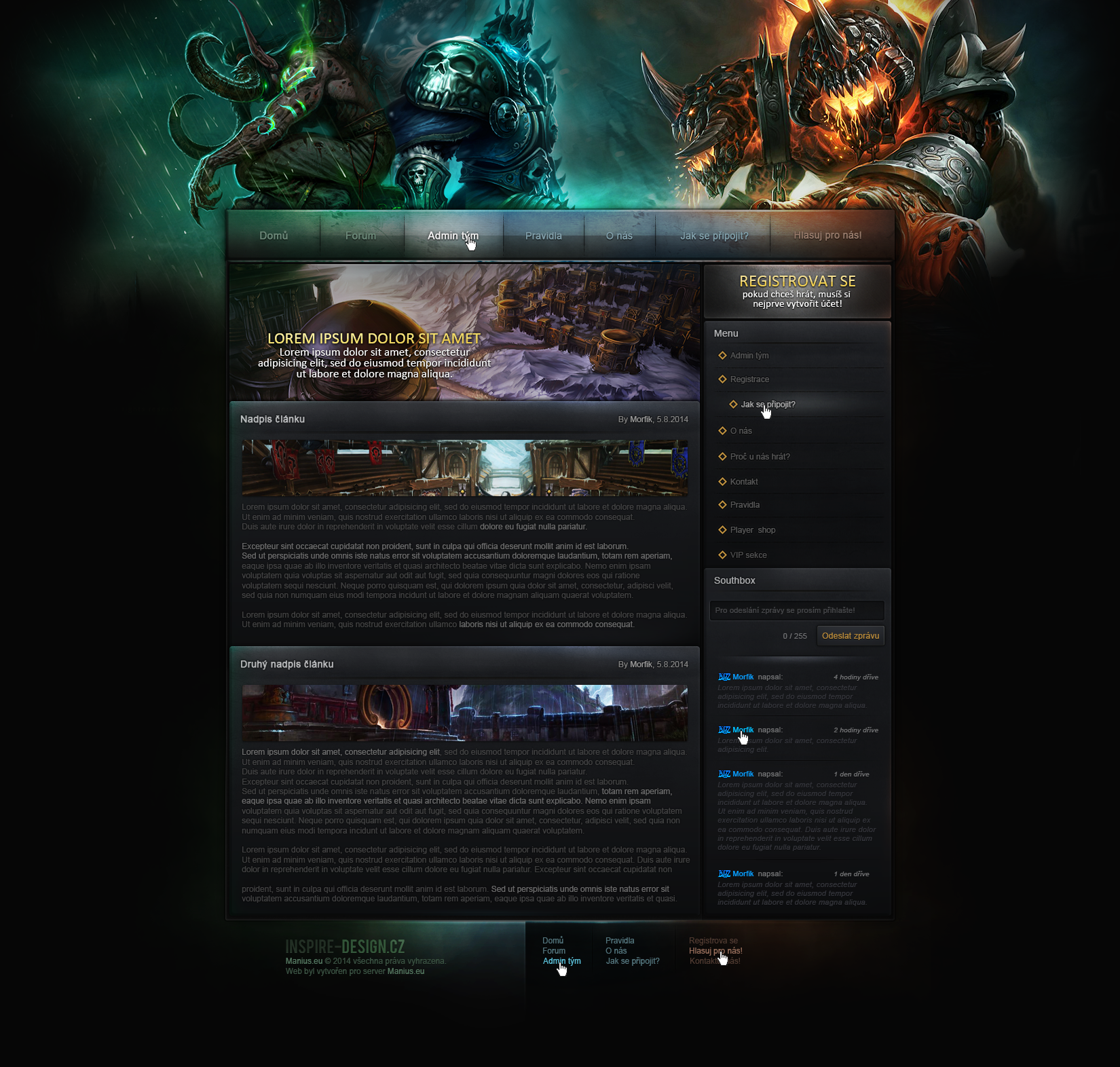
 xDrac — Interlude Design

Published: 2011-09-11 00:05:03 +0000 UTC; Views: 9563; Favourites: 62; Downloads: 0
Redirect to original
Description
Took me sooo long.Credits to Diegowd for the IL Image.
Related content


Comments: 33


Whoa. Mind blown.
You've got some serious design skills, my dear. Your talent is... whoa.
👍: 0 ⏩: 1

Whoa! Thank you very much appreciated QuestionableWhimsy!
👍: 0 ⏩: 0

ich weurd auch zustimmen, ich glaub das hier is mein favorit : D
👍: 0 ⏩: 1
")

You have a lot of really great designs in your gallery but I think this is my personal favorite.  (Smile)")
👍: 0 ⏩: 1
Thank you very much for your comment
👍: 0 ⏩: 0


For further information please send me an Email or Notify me.
👍: 0 ⏩: 0

Your ability to fit huge amounts of content into a relatively small space is pretty good. But I would still loosen up the design, and not default to three columns quite so quickly (i like the Agony L2 Design for this). I can tell you love to incorporate illustration, but I think more conservative cropping of the header would be prudent to get more information above the fold. Shaving off 1-200 pixels from all of your headers would be absolutely reasonable- without digging into the meat of the illustration (which on a real website would have been designed to fit elegantly into that space.) On the other hand the frame is very playful and intriguing all on its own. I barely need the illustration because the frame stands on its own merits. Trust your design sensibilities more and rely less on the showy imagery.
I want to say that your footer here is especially attractive. The curve and gradient give a sense of movement, and nicely echos the curve in the header.
You have a tendency to create dark-background layouts, and I'd push to experiment with higher value ranges (as lighter backgrounds tend to be more legible in the long-term). This site is also more legible because the reading areas aren't flooded with texture.
👍: 0 ⏩: 1
Thank you sooo much for the amazing feedback.. I really really appreciate it.
👍: 0 ⏩: 0


This is a very nice layout design, well done. Keep up the great work! (:
👍: 0 ⏩: 1

This is sooooo cool! I love it, lovely design
👍: 0 ⏩: 1
Thaanks! I'm so so glad you love it!
👍: 0 ⏩: 0


Thank ya buddy! Appreciate it!
👍: 0 ⏩: 0

")

