HOME | DD
 xenomanic — Open

Published: 2004-12-17 08:12:38 +0000 UTC; Views: 5434; Favourites: 22; Downloads: 163
Redirect to original
Description
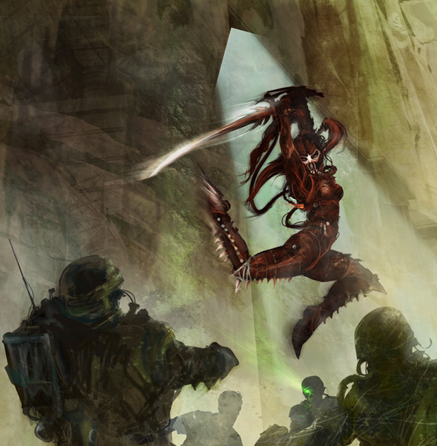
20+ Hours in Photoshop CS, no refs.Ok, so I started on this wonderful image a while back and In the middle of it, I received a class assignment to design a book cover from a book of our choice. Instead of doing that, I wanted to find a book that would match this image instead. I found more than one book that I liked and fit, so I blended them all together.
So this beta image is a blend between Battle Angel Alita, StarCraft, and Ghost in the Shell. What I really want from you people is to know what your opinion is on both the technical aspect of the image as well as the blending of the concepts. I am not done with this image and will take all suggestions into consideration, so speak up! Thanks! And of course, favs always appreciated.
 (Wink)")
Related content


Comments: 21


technicaly brilliant.
blending the concepts again brilliant.
i wish i could fave it twice
👍: 0 ⏩: 0

I truly dig the traditional art feel that you have accomplished with this peice. It's something that Ive been chasing for some while! I like the play with black and sepia-ish-yellow, and I love the various refferences (I love Alita!). I just have one quibble and that's the bacground is too smooth. I know that perhaps you wanted a contrast, but I did notics you were starting to give the background a little craggyness, and just thought if that was excentuated a little further then it might bring this peice together a little better. I still dig the piece overall though!
👍: 0 ⏩: 0

why havn't you set this up as a print yet? holy crap on the reflections man...
👍: 0 ⏩: 0

She doesnt really have much of a feeling of the Major, but there is a very definate Alita presence. Cant say anythign on Starcraft, not being all that familiar...maybe a little more technical detail on the city in the sky. And that hat thing is just kinda weird...but overall, its really well done - the general feel is cool and it feels very complete. Nice..err coloring (do you really call it that?) and shading - it fits the piece very well.
👍: 0 ⏩: 1

Awww, thanks! The background has been the concern of most everyone so that is going to be my first renovation. Thanks for the comment!
👍: 0 ⏩: 1
 (Smile)")
👍: 0 ⏩: 0

you know I love you and your art, but I don't think I'd buy a book if this was the cover. Perhaps when its done. I guess I just really need the realistic image (even in a fantasy setting) so I can actually get into the book. I think that is why I love Larry Elmore, his dragons look exceedingly "real".
Kelida
👍: 0 ⏩: 1
hmmm, be more specific... Someone mentioned the eyes looked to cartoony, is that what you are refering to? Or is there something about the style or highlights that just come off as fake?
👍: 0 ⏩: 0

Yeah yeah... it looks good, I dont know about those rocks in the background tho. Im really diggin the monocromatic scheme and the texture of the brush strokes. Now if only i could get as many comments on my stuff as you do....
👍: 0 ⏩: 1
hey, thanks for the comment! thats gonna be the first thing i change is those rocks/piles in the bg. the secret is sharing with as many people as you can and regular posting/commenting. then it just multiplies.
👍: 0 ⏩: 0

damn good integration, if you ask me. the background is very intriguing and mistifying, and the girl's gear has some real character to it. one thing i have a problem with is that her left arm is way bigger than the right one. also, her eyes do not match well with the rest of the picture. they seem very unrealistic and simple, while the rest of the drawing is so articulate and vivid. overall very cool
👍: 0 ⏩: 1
hmmm, good call! I appreicate your thoughtful comment, thanks! ^^
👍: 0 ⏩: 0

dude that is amazing, you need to show how you do work like that in Photoshop
👍: 0 ⏩: 0

Wow! That's very well done. It would be even better if the city-like thing under the floating part (i remember seeing that in Gunnm) would contain at least some details, some lines. It's the only thing in the picture that doesn't have any, and it kind of make the thing look flat, like a decoy or something. Nontheless it's some great work, gj.
👍: 0 ⏩: 0


hi
i love seeing your work. so do i understand it correctly that you basically drew/painted this image freehand, in photoshop? or?
either way, the image is beautiful. of course i love the figure. but the best part about this piece is the depth you created.
lovely.
-kappa
👍: 0 ⏩: 1
aww, thank you! ^^ That makes my day.
Yeah, free hand in Photoshop with a tablet.
xo!
👍: 0 ⏩: 0

thats awesome! 
")
👍: 0 ⏩: 0