HOME | DD
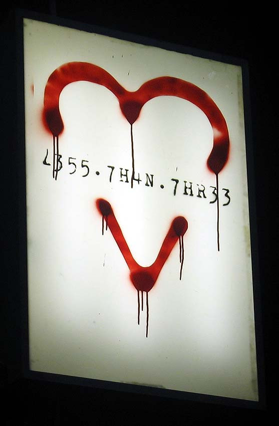
 xerocorp — less than three
Published: 2004-12-23 09:45:03 +0000 UTC; Views: 98; Favourites: 2; Downloads: 54
Redirect to original
Description
<3Related content


Comments: 4

woah i love that the drips, the text everything looks awsome ")
👍: 0 ⏩: 0

what a great piece. This is so awesome. I love the fact that one can read it, and THEN realize that they aren't really words at all. I love that the < and the 3 make an obviously female shape. What an absolutely fabulous piece. Had I wall space, I would love to hang it in my apartment. amazing. great job. really great.
👍: 0 ⏩: 1

wow thanks
i hadn't really noticed the female shape before..
👍: 0 ⏩: 1
really? that was one of the first things I noticed. maybe it's my art history studies showing through, ya know the emphasis on fertility and the female shape and what not. again, really great piece.
👍: 0 ⏩: 0