HOME | DD
 Xeromander — MegaMan X

Published: 2008-01-10 02:49:35 +0000 UTC; Views: 31282; Favourites: 981; Downloads: 779
Redirect to original
Description
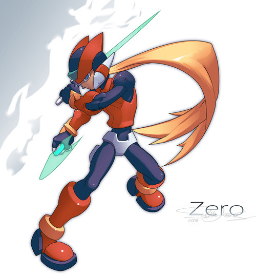
Megaman X from the series. I tried to incorporate a similiar style from the official art although the color scheme on some of his parts might be wrong.Revision: change up the bg colors, cropped it, fixed the proportions alittle.
Related content


Comments: 79

100% accurate, best deviation of X ive seen thus far. It was such a great series..before x7
👍: 0 ⏩: 0

Wowsers!! this looks very very very close to the offical art, but it still has a hint of your own style in it 8D, it looks like X is on break and playing around with his x buster. the Background and lighting on the ground is a Verry nice touch! faved!
")
👍: 0 ⏩: 1
your welcome! keep drawing!
👍: 0 ⏩: 0


You've done a great job there!
Looks really like official artwork.
Respect!
 (Cool)")
👍: 0 ⏩: 1

yeah for some reason i was trying to copy that style, which is kinda great, as gives me new art perspective. i usually learn a little from to add to repertoire of my own style if that makes any sense.
👍: 0 ⏩: 0


Whatels could i say...C O O L Artwork u did here ^^
👍: 0 ⏩: 0


Ick that reminds me of X8 I hate taht game the only X game I ever hated.
👍: 0 ⏩: 1
lol, i heard the x7 is also bad although i never played it. i have played x8, not very good i agree.
👍: 0 ⏩: 1
X7 needed to to be refined.
👍: 0 ⏩: 0


Deberias usar esqueleto, te quedo algo desproporcionado.
👍: 0 ⏩: 0

this is one of the realy close to the official one
its look awesome !!!
👍: 0 ⏩: 0


Awesome, you got the colors mostly correct =3,the bg matches a lot with X, makes him gather the attention (or however its said X_X), good job ^^
👍: 0 ⏩: 0

Great colors, it looks like the match up.
I love the background. The sepia tone makes X's blue stick out nicely.
His pose is really cool, I like it!
X: "Heeey... I've got a scratch on my thumb!" ;_;
👍: 0 ⏩: 0

SOOOOOOOO SEXY!!!!! NYARGH!!! Coooolnessssssssssssssssssssss...........
👍: 0 ⏩: 0

<= Prev |