HOME | DD
 xfragg3r — 2FORONE - Webhosting
Published: 2007-08-31 15:09:30 +0000 UTC; Views: 3041; Favourites: 17; Downloads: 66
Redirect to original
Description
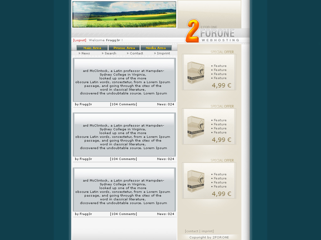
i made some new template, i love the colors again!think i did a good job
 (Wink)")
i would be proud of some comment or fav
 (Smile)")
stay creative, xFragg
Related content


Comments: 43


oouh looks nice dude
I really like the logo and the rest how things placed etc etc.. but the only thing that I;m not really feelin' is that you see in the content/news area how you placed the text center-ish.. yeah I'm not likin' that maybe if everything was aligned right it would have looked nicer.. but not a big problem, still a nice layout
👍: 0 ⏩: 1

thanks
all the other comments get removed by someone :>
had 40 cmtz...
👍: 0 ⏩: 1
what the hell..maybe someone has passwords to your account.
👍: 0 ⏩: 1
no... think that was some bug :>
👍: 0 ⏩: 1
u hacked me!!! bbock mr.haxxor^^
👍: 0 ⏩: 1
ur a hacker
u deleted my messages ")
")
👍: 0 ⏩: 1


Mir gefällts echt gut, man könnte den header irgendwie noch besser wirken lassen aber naja...

👍: 0 ⏩: 1

Wow, nice work bro!...as always, your still the best web designer I know! Keep up the amazing work!
👍: 0 ⏩: 1
wow really proud of that, thank you so much!
👍: 0 ⏩: 1


Hm
Why don´t you try a new style ? Of course, the design is very hot
but you don´t get a
bye
👍: 0 ⏩: 1
")

Logo ist sehr schön. Aber auch der Rest ist wirklich prima gelungen
👍: 0 ⏩: 1


Looks really accurate, congrats!
Tho, to make it look even better, you could make that bar under the "main, promo, media area" buttons a little shorter on the right, so it's not touching the brown part of your template.
Again, good job!
👍: 0 ⏩: 1

