HOME | DD
 xGeekpower — Power Puff Girls
by-nc-nd
xGeekpower — Power Puff Girls
by-nc-nd
Published: 2005-02-10 05:53:08 +0000 UTC; Views: 16307; Favourites: 596; Downloads: 952
Redirect to original
Description
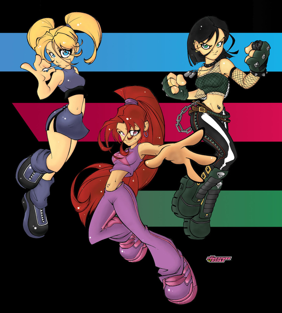
art:color: me.
6 time using photoshop, this was my entry for Lp contest.
No background: [link]
-Done like in 12 hrs (im slow) in photoshop7.
Related content


Comments: 64


I love the green one's outfit! It's my favorite!!
👍: 0 ⏩: 0


me parec una buena imagen
de las powerpuff, es un buen estilo
de dibujo
suerte
👍: 0 ⏩: 0

my friend gets these pics and draws them
he's awesome so r u(whoever u r)
👍: 0 ⏩: 0

Wow that's rly cool. I haven't seen that show in a while. Nice work!!
👍: 0 ⏩: 0


aw cool their outfits are all representing their personality and shitz
👍: 0 ⏩: 0


Ahora si se deben llamar las "chicas" superpoderosas...
XD
👍: 0 ⏩: 0


makes me remember the Spice Girls.
love the pic though.
👍: 0 ⏩: 0

No manches el trazo esta de masters... color no se queda atras...pero los brillos del cabello se ven exelentes en burbuja, pero en las otras a la mejor eran con un color mas claro que del cabello..imagino realmente no se de colores...pero esta genial.
👍: 0 ⏩: 0

looks a bit rough when full fiewed, maybe you should consider shrinking it, it's a little too big, great piece though
👍: 0 ⏩: 0

Estas monitas me recordaron a los personajes de un cuento que escribí...
Luego te lo paso para que lo leas...
👍: 0 ⏩: 1

Nombre esta chido el dibujo, aunque no c como aguantaste tanto frente a la compu, yo a las dos horas se la rayo a la compu y me voy a ver.... a donde
👍: 0 ⏩: 0

That looks really good! Don't have experience in coloring and all that jazz, so I'm sad to say I can't give you any tips on how to improve it, but honestly it looks great to me. I like the little sparkle dots  (Smile)")

Now I'm off to view the rest of your gallery... Fwee!
👍: 0 ⏩: 0
That looks really good! Don't have experience in coloring and all that jazz, so I'm sad to say I can't give you any tips on how to improve it, but honestly it looks great to me. I like the little sparkle dots
Now I'm off to view the rest of your gallery... Fwee!
👍: 0 ⏩: 0

Good overall, I'd just say, don't be afraid to shade. I go from almost white to almost black on most things (of course depending on the light I'm trying for). It'll add the depth it needs. It just seems a little flat right now. Hopefully I'll get my submission finished in time for the contest's end, but I only found out about it a few days ago.
👍: 0 ⏩: 0

I'm loveing these designs of the Girls, especialy Buttercup (piercings! Yay! 
👍: 0 ⏩: 1

umm, thanks , but i only did the colors, the draw is of my friend here:
, anyway thanks for looking!!!
👍: 0 ⏩: 1
Yeah, I read that, and the colors kick-ass too.
Linework is awesome, colors are awesome, and together they make a creamy chocolate-peanut butter goodness that melts in the artist mouth of the starving hobo living under the freeway like a common troll.
Yeah, that's a good thing
👍: 0 ⏩: 0

that is the essence of buttercup. Nice job with the coloring. I don't think I could have done that good and I've been using Photoshop for about 2yrs now

👍: 0 ⏩: 0

they, they are the powerpuff girls, except they look awesome. O_O
👍: 0 ⏩: 0

Oh oh, and I just saw your signature. Anyone who quotes Ashe is SUPER cool!
👍: 0 ⏩: 0
That is f*in GREAT MAN!! I love the powerpuff girls, so does my best friend Tomit!!! I want to add it to my favorites but we're having difficulties with a stalker right now, so until the stalker goes away, I'm going to add it to my imaginary favorties ok?
That's just so awesome!
👍: 0 ⏩: 1
stalker??.... um ok, but know that i only color this, idid not draw it, the draw is of so chek him out, anyway thanks for looking.
👍: 0 ⏩: 0

When i saw this
one..
The first on my mind
was Powerpuff-girls..
But hey..
It's tüff
")
👍: 0 ⏩: 1
well they are the Teens Powerpuff-girls, the draw is of the LP, thanks for looking.
👍: 0 ⏩: 0


haha... sorry, u did the colors only... i think it's real nice
👍: 0 ⏩: 0
nice... real nice ")

👍: 0 ⏩: 0

this is definitely one of the coolest renditions of the powerpuff girls that i have ever seen.
such style! i love it.
+fav
👍: 0 ⏩: 0

I like it! I really like the skin tones, though I think the color choices are a bit off! I don't know if I like the pink color you used here...seems off! I like the hair, but should have more highlights in my opinion, especially the one with the black hair...But I really like the overall color scheme. Great work with this!
👍: 0 ⏩: 0

It looks real good. But I would say that you need to add more shading and highlighting all the way around, it seems too bland. The color is great, and I like the spots on it. Just try going heaver on the highlighting. But practise makes perfect.
👍: 0 ⏩: 0

Looks great...
You could search on google for some pics of the PPG to have some ideas... 
Hope it helps...


👍: 0 ⏩: 0

WHOA!!! That's a King of Fighters team dood? o.O
👍: 0 ⏩: 0


| Next =>