HOME | DD
 xinus — be afraid.

Published: 2004-08-24 23:15:00 +0000 UTC; Views: 766; Favourites: 12; Downloads: 233
Redirect to original
Description
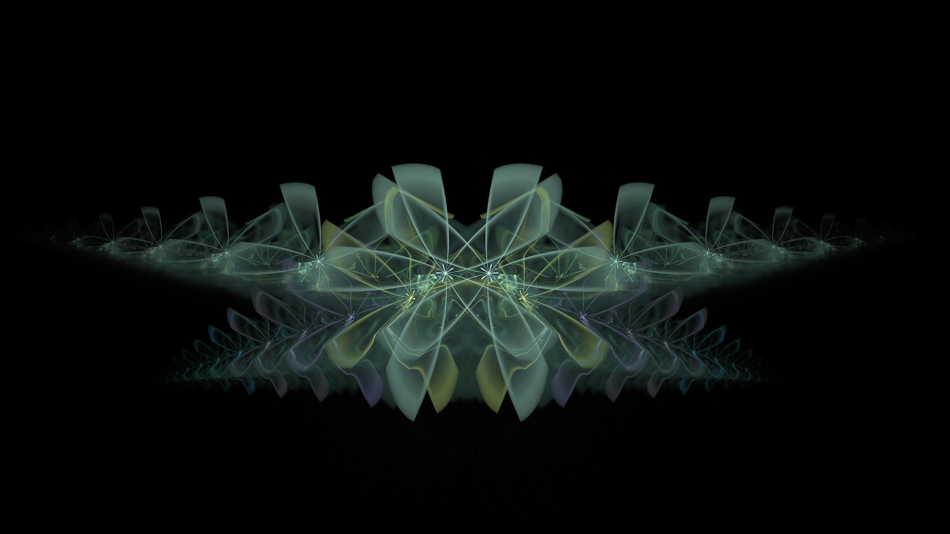
like it. or not
.
.
.
and
dont worry
just
be afraid
Related content


Comments: 25

 (Wink)")

yay! my logo! i love the render. different color typo wouldn't hurt..but who complaining. i like it! great job bud!
👍: 0 ⏩: 0


")

ppl u dont understand u should be fraid of this.. the work was never ... like wow this is great just a little experiment with style 2d typho and that shit so dont care
cheers.
be afraid
👍: 0 ⏩: 0

yep very nice render !! but i don't like the 2D and the typo !!
well done bro !! ^^
👍: 0 ⏩: 0

Wow great render and brushwork and I really like the 2D work as well

👍: 0 ⏩: 0

Nice render and colours, the 2d is a bit repetetive though.
👍: 0 ⏩: 0


Hehe way to blast some slipknot and break loose on the 2D, love the fonts and the differences in color, works great together! ")
👍: 0 ⏩: 0


i love it! these green highlights are the sexhest!
👍: 0 ⏩: 0


Wow, great 3d mate, makes oyu feel underwater  (Smile)")
👍: 0 ⏩: 0

ehhhh... 2d is killing people. horrid man. Overall, im disappointed. I think you can do a lot better than this, crappy for your expertise.
👍: 0 ⏩: 0

your art would just be that much better without your 2D. sorry to say, it completely ruins this one. your one-pattern of red and white 2D drives me crazy, especially when the 3D work is as nice as this one...
👍: 0 ⏩: 0

yop ^^ nice work bro
could be really better if you work more on the 2d/ typo and like *vekin say the dots saturated are strange^^
really like the render at the botom left : )
overall feelings are good ^^
++
👍: 0 ⏩: 0


nice work..
dunt like the red 2d on green and the blue too.. but the 2d is very nice..
some saturated dots are strange..
but overall is very nice
👍: 0 ⏩: 0


kool job man
")
👍: 0 ⏩: 0