HOME | DD
 xNIR0x — Floating

Published: 2019-03-01 12:08:57 +0000 UTC; Views: 10450; Favourites: 517; Downloads: 0
Redirect to original
Description
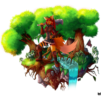
PLEASE CLICK HERE FOR LARGER VERSIONI did something... I DID SOMETHING!!! I've been working on this for quite a while now, and finally took a day off to sit down and actually complete it.
It's probably not much, but this drawing means a lot to me. I feel bad creating characters that I barely use. I love Røsslyng and Ragnar so much, but I barely give them any love.
So here they are! Floating about on a small island. I really hope to do something similar again. Maybe with Frikk as well. I've been super inspired to draw nature and plants lately, I just don't find the time.
Feedback/critique on this thing would be super appreciated. I really need experience with art like this and could use some tips!
Røsslyng (left) is the closest I have to a sona. Ragnar is her best friend/brother figure (not related).
Characters and art belongs to me
Thank you for viewing <3
PATREON |TWITTER |FURAFFINITY
Related content
Comments: 14

👍: 0 ⏩: 0

I have included this amazing artwork in the new feature for March 2019 on the front of the journal. Please 
👍: 0 ⏩: 1

I really love your deer characters, their so gorgeous!!!
I certainly enjoy that background. The floating Island idea is very cute. And i kinda get that will to search through the background a lot, since i get the feeling i can find something new everytime i see. Very beautiful!
👍: 0 ⏩: 1

Ahh thank you so much! I probably put a bit too much effort into details, I find them to be a bit distracting now when it's completed :')
But hey if it looks interesting to you, I'm glad to hear that! Thank you for your comment
👍: 0 ⏩: 1

YOU DID SOMETHING!!!??? THAT'S AMAZING...
This is a good picture, but if you wish for critique... you art style is very detailed, but it's to the point that images like this get a bit clustered.
I would suggest having less details on images and having more space between objects; I would also suggest using more contrasting colors to help with this, but that's just me.
👍: 0 ⏩: 1

I felt like it was getting a bit clustered as well.. I was going for a compact object-like scene. Since it's just a small island, If you get what I mean. With exaggerated details, because I wanted everything to stand out. Prooobably not a good idea 
👍: 0 ⏩: 1

Hmm... I see... well, detail and coloring are what you want to focus on; let me better justify my reasoning.
The detail issue is NOT the fact that you're putting texture or detail on the image, but it's the amount of stuff you're putting on the image; there is so much stuff, I can't tell what you want me to look at. Images like this (at least the ones I've seen) typically showcase the character and, as such, would keep the background simple (as in the amount of stuff is low) while the character has all of the detail. Really, what's causing the issue are the bugs and plants; the leaf crown is fine, but the other plants with individual leaves, as well as the bugs, are rather distracting.
The coloring also is an issue and probably the center one; the characters have a very similar shade of brown as the background and, combined with the amount of detail, it makes the characters and background kind-of blend together, to the point that it's hard to distinguish certain things, like that tree stump near the female character. Contasts are important and it's best to do this with color, but if you really want to keep that brown, then you should have contrasting shades of brown, like the dirt with the male characters' legs; I can distinguish the legs from the ground easily... I should have this with the fence and characters.
This is a good start, mind you, but you should try to find a good balance between detailed and simple; don't have so many objects on screen, put detail on what you want me to focus on, and make sure shades and colors contrast each other... this way, I know what to look again.
👍: 0 ⏩: 1

Ahh this is super helpful! I'm seeing that she really does blend in with the stump and fence now.
Thank you SO so much for elaborating and taking the time to help me!
I will definitely keep this in mind next time I do a similar piece, I really appreciate it!
👍: 0 ⏩: 0

