HOME | DD
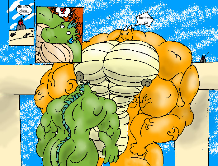
 XSYSTM47 — Xen's Request 2

Published: 2004-12-05 05:46:40 +0000 UTC; Views: 5134; Favourites: 49; Downloads: 257
Redirect to original
Description
So here it is... i took a really long time to finish this one. I think all the shine spots makes them look more 3-d-ish.Related content


Comments: 16


just some constructive critique, when you choose a color for cloaths what ever cloathes they are, the colors should defuse themselves against the characters, it will make the image flow a littel better espetaly if the cloaths only cover a small area.
👍: 0 ⏩: 1

Thank you for noticing that, but I don't understand what you mean when you say they should diffuse against the characters. Could you show me an example?
Your critique is greatly appreciated.
👍: 0 ⏩: 1
when I said diffuse I meant the cloaths should be a color that doesn't stand out from the color of the character, if the color stands out then that area will be the area of focus and in your case that isn't the best spot to stand out  (Wink)")
👍: 0 ⏩: 1
I see. Perhaps I will try that on my next work. Thanks for catching that!!
👍: 0 ⏩: 1
you'r welcome, I just like helping people
👍: 0 ⏩: 0

Ya.. they look just slightly overinflated. Lol.. What program did you use to color this?
👍: 0 ⏩: 1
Photoshop7. Xen wanted them all bulgy, so I did it. It's kind of my style.
👍: 0 ⏩: 0

....amusing image of buff guys blowing themselves to bits....maybe i'm just in a sardonic mood. ")
👍: 0 ⏩: 0

Yes... veiny = good. I wanted them to look like they were going to explode.
👍: 0 ⏩: 0


I like it alot great work and I do agree with the shine spots! ^_^
👍: 0 ⏩: 1
yeah, I might do that more often now that I know people like it.
👍: 0 ⏩: 0

LOL. Havent heard from you in awhile...
👍: 0 ⏩: 0