HOME | DD
 Xubchas — So Go Ahead

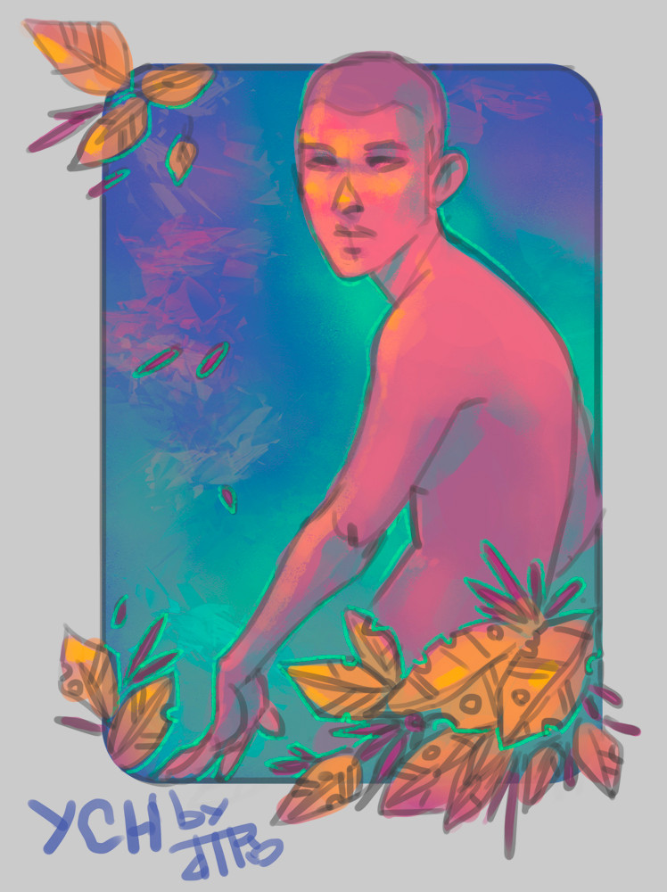
#blue #boy #bust
Published: 2016-02-07 18:22:02 +0000 UTC; Views: 265; Favourites: 12; Downloads: 0
Redirect to original
Description
Revisiting this fav.me/d61z19j friend.I'm pretty happy with it, but I can see that I have a lot of distance to go when it comes to rendering.
I really need to stop doing busts, it's a comfort zone thing I suppose.
Related content


Comments: 10

Another person from project comment. projectcomment.deviantart.com/
I think your color selection is lovely. The blending is sort of messy but in a way that adds interesting texture, every nice, gives it a more traditional art feeling. I like the composition. I feel like the simple shape behind the bust takes the piece a step up from a average bust portrait, and once again, good color choice.
I think one thing you could work on is the hair. I feel like the highlights are a bit to sharp. Also you might want to define the texture of the hair a bit better by giving the impression of strands and weight and a part in the hair.
👍: 0 ⏩: 1

Thank you so much for taking the time to comment!
I really appreciate your feedback. When blending I kind of deliberately go for a more painterly style, but some of the messiness is definitely unintentional and I'll definitely be more mindful of it. I also really see your point about the hair. It's still something I struggle with and will start studying more carefully.
Thanks again for your critique!
 (Smile)")
")
👍: 0 ⏩: 0

I can definitely see your improvement.
even with a different color pallet your facial anatomy is accurate. I never had to wonder if he was near human alien, or dead.
Is it your intent that the character has matured some since the other link, or better quality due to size? [I'm looking at the shift from round to more angular face and the attitude portrayed in the hair.]
Regarding the "only doing busts" conjecture...
You are concentrating on the skills of doing a human face. there is nothing wrong with working on one component at a time.
I'm trying to learn doing the digital coloring of my art, but the face on this:
fav.me/d9r2hfx
is the result of dissatisfaction from trying to get her colored.
You faces are recognizable, and you show good symmetry [I'm not trying to discourage more challenging practices, but working with a limited scope of challenge can help you focus and keep your frustration manageable.
Keep it up
#projectcomment
👍: 0 ⏩: 1
Hi! Thanks for your comment!
I kind of reworked the face. I had an idea of the face as being rather youthful, and I felt like the more angular and narrow jaw and the larger ears would actually make the face look younger.
I agree that there's a lot of work to be done in the face, they're hard to draw. I'm actually not exclusively drawing busts but I'm not submitting my full body work just yet (it's mostly gestures and construction studies anyway)
I really appreciate that the symmetry came out right, I made a point of not copy-flip-pasting and it was a pain. I had to revisit the eyes several times, so I'm glad it looks right.
Thank you for your input!
As a a side note, check out Fun With A Pencil or Drawing the Head and Hands (preferably both in that order) by Andrew Loomis, it'll help a lot!
👍: 0 ⏩: 1
I've got a JAck HAmm book I have learned a lot from, but I am open to any suggestion of good reading material to advance my art. [I'm one of the lucky ones who can use written word to learn about other disciplines / contrasted with some of my fellows I work with who can do amazing things with wood or metal, but because they were shown]
For Christmas my kids got me a sketch book with various prompts on each page, only done 3 so far. I am much more at home with a traditional media project, but I'm getting there. THis is my latest attempt at a human being.
fav.me/d9r2hfx
👍: 0 ⏩: 1
Look at Andrew Loomis nevertheless, Jack Hamm is pretty great but he doesn't emphasize construction, which is what imo your picture currently needs.
👍: 0 ⏩: 1
Then that is who I will be reading as soon as I can find the book[s]
'cuz I love books too!
👍: 0 ⏩: 0

amazing collors!
I love the shading on the nose
👍: 0 ⏩: 1