HOME | DD
 xXNightRose14Xx — Help Me With Coloring.Lineart
by-nc-nd
xXNightRose14Xx — Help Me With Coloring.Lineart
by-nc-nd
Published: 2012-02-06 01:28:34 +0000 UTC; Views: 460; Favourites: 19; Downloads: 3
Redirect to original
Description
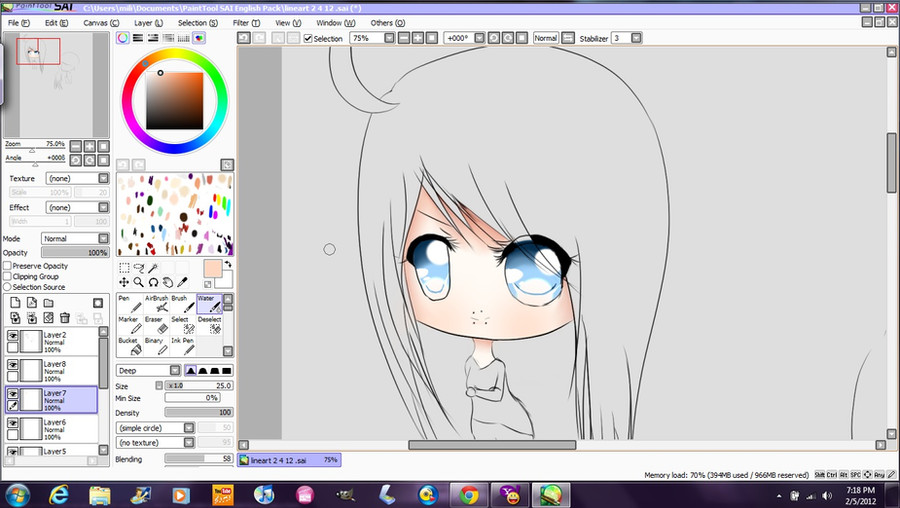
OMGIDIDLINEARTITSTHEENDOFTHEWORLD.jpegI'm trying a new coloring style
") and I did lineart xD
and I did lineart xDI need you to help me though, does anything look wrong/I can improve on? Specially on lineart.
Do not crit on the drawing, like "the arms look weird, the heads to big, anatomy's off" I want to improve more on coloring/lineart. Not how I draw. (I do want to improve my drawing too, I'm just focusing on lineart/coloring at the moment).
I'm going to do a few print for Sakura Fest, I thought I can draw traditional while at school, then do lineart at home. But I need to work on my lineart first

And I want to improve on coloring so people will buy the prints. xD
I'm going to do Final Fantasy fanart, maybe Pokemon, and then a random drawing still in progress.
If you can help I would be so happy!!!

Will be moved to scraps later
")
Kutian (c) me
Related content


Comments: 16

if you want maybe I can make a tutorial on how I color hair..? Just look at my gallery and tell me if you are interested in learning how I color my anime's hair. ^w^
👍: 0 ⏩: 1

That would be awesome!
👍: 0 ⏩: 1
okay! i am working on it now!
👍: 0 ⏩: 0

the lineart is really good and neat, mine is so messy. And the coloring is really smooth and looks great! I dont think there's a lot for you to improve on, but maybe if you wanted to do a little something extra, you could put some color in her cheeks or around her face somewhere.
👍: 0 ⏩: 0

I swear, Sara has gotten a lot of stuff, so just look at those.
Overall, everything is good. Your lines came out amazing even though you rarely do it.
Line wise, make sure everything is connected and there's no weird strands sticking out.
Your usage of pen pressure and line thickness is amazing. :0
Coloring wise, make sure you have a consistent coloring style throughout so it won't look weird.
Since what you're doing here is soft shading, it would be best to stay soft shading. If you remember how you colored the skin, color the rest that way. Except for the hair, Make streaks going down of different values of the base color (or w/ water tool). Your coloring definitely improved a lot.
I really wouldn't want you to use some of the styles people have tutorials since it might make things look different. I would love to see the finished product.
👍: 0 ⏩: 0

A good overall tutorial for SAI [link] ; you never know what you might find out (p.s. I'd look over this firstly b/c then you will know what the other tutorials are talking about)
Coloring: Here are swatches with helpful skin colors if you're in need of any [link]
Here is a very, very good tutorial for coloring [link]
A very good cel shading tutorial [link]
An over all quick coloring one [link]
this tells the basics of SAI and a lot of tips on coloring [link]
Scroll downwords for this it shows a good example btwn. single color line art and colored lines [link]
Line Art:
A tutorial for line art [link]
and another one [link]
This one is for Photoshop: [link]
What mostly I've done was look at that tutorial from that person and then try to re-make it exactly the way they did it. And then try with something else and so on. It is quite tedious but it does help. Also go on people's Livestream!! It helps a ton. Firstly b/c you can see what they're doing live and you can ask them about it! That's about as good as it gets to a resource.
Lastly just practice and try to make your own way...if you notice not all coloring/line art's are exactly THE same. They do have the basics but then the person twisted it around to the way its most comfortable for them
Hope this long ass message helps

👍: 0 ⏩: 1
Also...one thing I forgot to add. Experience with your pen. See how it can thicken or thin a line!! That can help a lot. Do it from different angles. Your pen should have more then 500 different pressure settings so test them out!
👍: 0 ⏩: 0

why do you need help for the colouring... youre doing fine 
👍: 0 ⏩: 0

I find that making the outer lines thicker than the inner lineart make the drawing look really nice.
And the eyes should have a bit of a thicker lineart to make them stand out.
👍: 0 ⏩: 0

She's so cute!!
Okay, crit time!
I think the eyes are perfect the way they are, but I think the eyelashes need to blend in a bit more with the few pieces that stick out and make them a thicker black
And remember for the lineart, especially in the hair to erase the lines that are being covered up so it looks neater. And don't forget about putting hair behind her head! If you ever need to try and see mistakes remember to flip the picture horizontally from time to time.
Hope this helps!! She's looking really good
")
👍: 0 ⏩: 0

wow, i am not an expert in coloring or even making cool art like you do, but i feel you are already doing so superbly . love the glossy look of the eyes here


👍: 0 ⏩: 0

Im bada t sai , but you could try painting the areas less blotchy.
it feels like its all over.
try this
[link]
👍: 0 ⏩: 1
Can you explain the blotchiness? I can't see it. >_<
👍: 0 ⏩: 1
it was the face
define the dhadows around her face by picking a light source,
use the image I gave yuo for shadowing but at a second look it didnt look as bad as I thought. Just ad a less blotchy look
if you were on LS I could show you, but you woud have to send me the line art
and Id have to use SAI, in photoshop I could do it no problem though.
study the image I sent you and you will notice what I mean.
I think the best way to put it is that it looks undefined, but in any case its unfinished.
[link]
this paint work is similar to what you are doing, I figure it will help you
evolve your stile.
also this manga is cute ( actually tragic) and I think you will like it
[link]
👍: 0 ⏩: 0

The lineart already looks fluid and I like the coloring job you did with the eyes.
Are you using the magic wand tool in SAI? If you select certain areas of the layer and pick another layer that's underneath, you can fill up that entire area with the pen or the bucket fill tools.
I learned this method from a fellow artist's stream sessions too: you can try reserving individual layers for hair, skin and clothes colors, then put in another layer for shading. I'd also lower the pen's density or use airbrush and blur tools.
You can also adjust the size of the line art, and that's dependent on how much pressure you apply to the tablet with the pen.
That's as best as I can describe it and I hope that answers your question.
👍: 0 ⏩: 0

So Far so good. Maybe along in the future you can focus on different light sources  (Smile)")
👍: 0 ⏩: 0