HOME | DD
 xxPseudOxx — Helluva Mourning
by
xxPseudOxx — Helluva Mourning
by

Published: 2013-09-07 00:18:17 +0000 UTC; Views: 1709; Favourites: 18; Downloads: 9
Redirect to original
Description
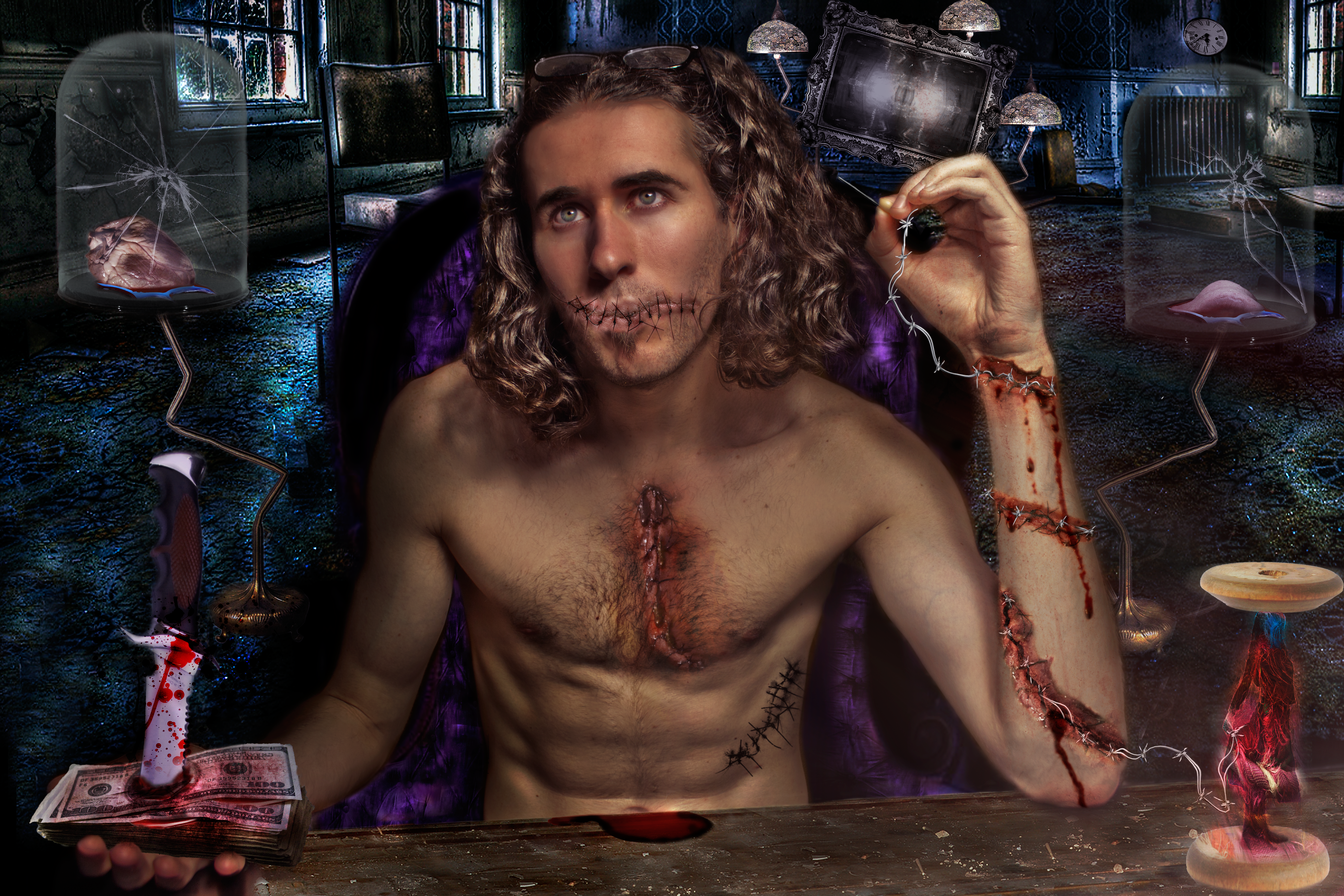
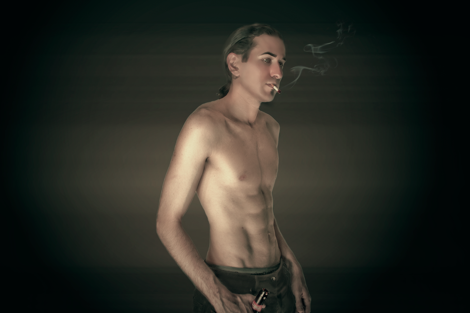
Helluva Mourning: After a wild night, its a Helluva MourningI took this stock last xmas some time, didnt get a chance to produce any thing with it till this summer..omg

******************************************
Watch the development of this peace in a Timelapse: www.youtube.com/watch?v=-nWEfH…
******************************************
***************************************************
Stock Resources:
***************************************************
model me @ xxpseudoxx.deviantart.com/art/…


smoke by media malitia smoke pack @ mediamilitia.com/smoke-pack-75…
female silhouettes by @ www.deviantart.com/art/Silhoue…
mail box by @ tortured-raven-stock.deviantar…
weeds by :brokenwing3dstock: " brokenwing3dstock.deviantart.c…
grassy ground texture @ e-dinaphotoart.deviantart.com/…
cave by @ night-fate-stock.deviantart.co…
lava cracks texture by @ sirius-sdz.deviantart.com/art/…
horns by @ frozenstocks.deviantart.com/ar…
leg fur ~http ://mihraystock.deviantart.com/art/beef-stock-1-123418204
bottle parts @ vocesdelatierra.deviantart.com…
skeletal hand by @ serpent-stock.deviantart.com/a…
flesh wound by @ babsxstock.deviantart.com/art/…
666 font: 'Satans Minons' free from dafont.com @ www.dafont.com/satans-minions.…
Related content


Comments: 20

Wow, that's really neat how you did the silhouettes.
👍: 0 ⏩: 1


👍: 0 ⏩: 1
Oh? Heehee! Well it worked out great.

👍: 0 ⏩: 1
hehe 

*returns to cave of photoshop tinkering,,,
👍: 0 ⏩: 1
")

 (Smile)")

This is fantastic 
Thank you for using my stock and the credit

👍: 0 ⏩: 1
 (Wink)")

I know you asked for a critique but I wasnt sure where to post it so I figured I'd leave it as a comment. First off the picture came out awesome. I'm amazed that you were able to take so many different pieces and put them together in a natural and believable way with a cool concept I might add. After looking at it for a while my only crtiques are see if you can play around with the part of the picture where the hair on the legs meets the skin on the waistline. I think with a little reworking you will be able to make the transition look more natural by not making it so linear so it doesnt look like he is just wearing furry pants. I would also suggest the same for where the hairline on the head portion meets the skin on the characters forehead. And lastly I would put a shadow on the grass to help ground the character to the character with the back and foreground. I will add that besides the shadow, these critiques are me being very nitpicky because overall the piece came out great. I hope this is what you were looking for, keep up the awesome work!
👍: 0 ⏩: 1
hey dude, thanks for the feedback/critique, its totaly on point.
this piece sort of kept growing (as they all do tend to i supose) but with it so (for a change) did my work flow, once i build out the main concept, i started (which helped me many a time on this piece) to just export out the layergroup onto a flat version of the over all background and work in the detail (export it back in to a the main PSD) which allowed me to zero on detail points... i'll defo be stickng to this method from now on.
with regards to the points you mentiond, if i'd rememberd to take my time with the peice a little more those finer details should/would have reveild themselves
thanks for the points dude, they were super helpful, i'll try be more mindful of the finer points in the future (if i dont end up over extending/clutering the peice) 
👍: 0 ⏩: 1
Np man, I hope my critique was the sort of thing you were looking for. To be honest, if you didnt ask for a critique, I would have never noticed those things. But I figured if I was going to critique it I should really look it over and give the piece the respect it deserves by taking my time and really looking it over. Im still blown away that you were able to take so many different pieces and come out with something that looked completely uniform. Thats why I sayd I was being nitpicky ( I hope that's a real word lol) because the picture came out awesome. Keep up the great work, you are very talented.
👍: 0 ⏩: 1

