HOME | DD
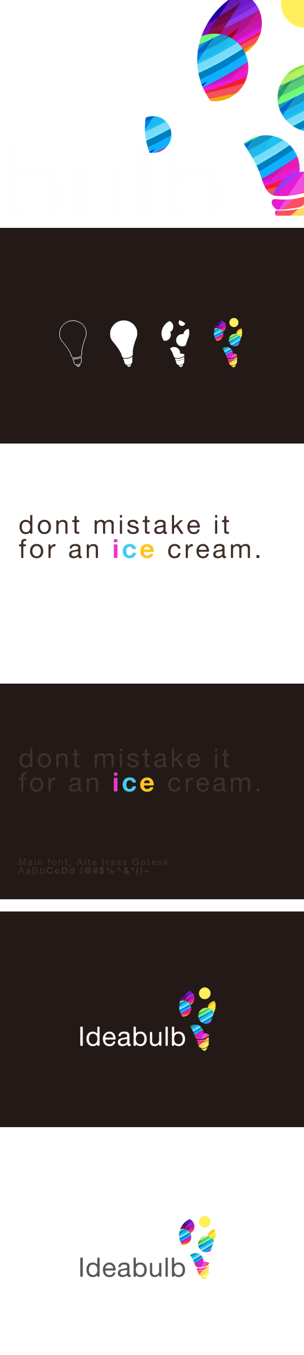
 xyphid — ideabulb Study
Published: 2010-04-20 18:32:36 +0000 UTC; Views: 4004; Favourites: 49; Downloads: 0
Redirect to original
Description
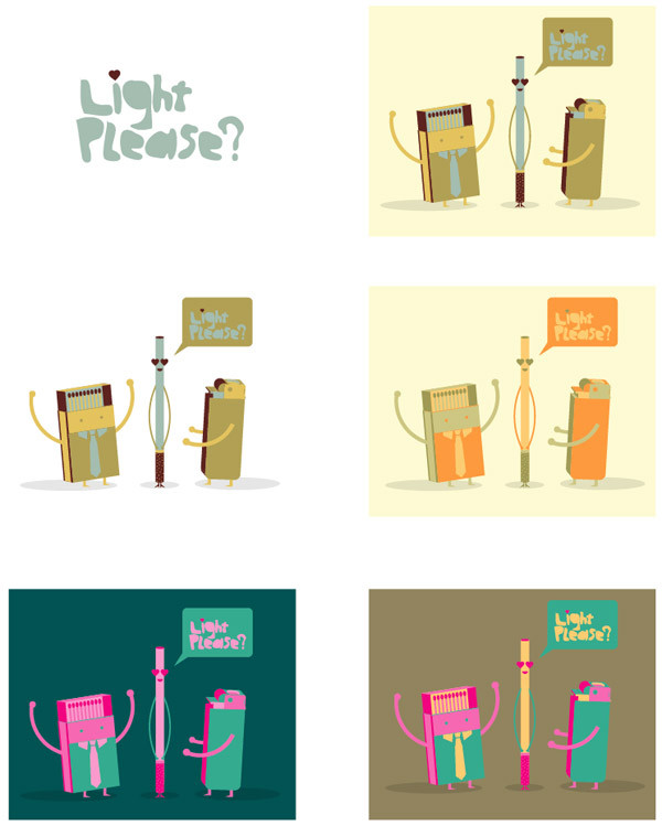
I would like to say this is not a supersecret project, but it is
Related content


Comments: 28


hmmmm...just a suggestion...take another look at the 4th bulb in the second panel and the bulbs in the last two panels...could you explain the full yellow circle on them...for me it seems to break the lightbulb shape and draws too much of my attention...it doesn't have a gradient like the other circles, which makes it tough for a white backround...think about going back to the shape of the third bulb in the second panel...keep the gradients you're using though...i love those
👍: 0 ⏩: 2

Personally I agree here too. The avoidance of a cow-pattern I can understand...maybe, but to get a little analytical here, sticking with solid colours and avoiding gradients like the other parts brings it closer to that of a cow-pattern than without. In a nutshell: the yellow circle is distracting and serves no functional purpose. I find the most jarring aspect is simply the circular shape, whereas because of the blending and curvature of the bulb, nothing else matches it.
Above that, a logo is supposed to work without any colour. In the b/w style, the circle is clearly cut in half because the assumed curvature melds into the remainder of the circle. The following colour version stands outside the bulb's curve, and even if it was the same cut, you're still losing out with the solid colour because it will blend into itself.
👍: 0 ⏩: 1

it was intentional, I like how it breaks the bulbs shape and not make it look entirely like a cow-pattern

👍: 0 ⏩: 1
not at all, just saying, I kinda like it, everybody's entitled to having their own opinion and I respect it, btw, I'm working on a couple new concept concerning that bulb

👍: 0 ⏩: 1
i understand ^_^
and good luck with the new concept
👍: 0 ⏩: 0


")


really nice man, whats the idea behind it? how did you come to it> what does the company do?
👍: 0 ⏩: 0

Definitely looks better on the darker background.
👍: 0 ⏩: 0

i like it. one point though, i think the bulb is a bit flat. it would be nicer if it's not.
👍: 0 ⏩: 1
new ideas are coming up sewn.
👍: 0 ⏩: 0

Nice idea, nice bulbs  (Smile)")
👍: 0 ⏩: 0


It does look very delicious ")
👍: 0 ⏩: 1

👍: 0 ⏩: 1