HOME | DD
 YannickBouchard — Going to Hell
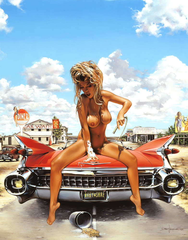

Published: 2010-02-16 00:56:05 +0000 UTC; Views: 5910; Favourites: 73; Downloads: 177
Redirect to original
Description
This is a commission I did for a heavy metal band from North Carolina named Salvación, for their first album: Going to Hell.Their Myspace:
[link]
Related content


Comments: 29


Amazing painting 0.o
I love the girl, so sexy ^^
but I have a question... don´t you think the girl is too big in comparison with the car??? Proportions and perspective could be confusing sometimes (I hate perspective D (Smile)")
Don´t worry, this pic is freaking awesome!!!
And its so funny the fact that a group called "Salvación" ("Salvation") make it´s first album called "Going to Hell"
")
👍: 0 ⏩: 1

Maybe so, I had a hard time figuring the perspective out, and doing the car as well. It came out pretty well anyway, but there may be a bit of an issue with the perspective, you're right.
👍: 0 ⏩: 1
as I said, the entire drawing is AWESOME, so some technical details doesn´t really matter when you see this great art. I love how you colored it ^^
👍: 0 ⏩: 1
Thanks for your critique, I appreciate it! Glad you like it!
👍: 0 ⏩: 0

That paint you've done on the car's material is just outstanding. Love this piece of yours!
👍: 0 ⏩: 1

Cool! I like the composition and the balance you have with the girl, road, car, graphics and background. Your proportions on the 1971 Pontiac Firebird are good, and you did a fine job on the extreme foreshortening. You did a great job of capturing the lines and character of the car. You have a great range of values here. The overall illusion that the shadows create might bug some people, but i do not see it as a major distraction. It's a sterling piece of work!

👍: 0 ⏩: 1
Thank you so much! The square composition isn't the most fun to work with, it was a bit hard to fit everything and make it look good, put I'm pretty happy with the way it turned out.
The car wasn't easy either. I know shit about car and it was my first time painting one -heck, maybe even drawing one. I'm really not interested in cars at all, but the guy I did this for requested a car so it was a bit of a chalenge, but fun all as well. It's supposed to be a 1973 though, not 71, but looking at pics from both years, they look exactly the same to me... but I could be wrong!
👍: 0 ⏩: 1
You're welcome! And i think you're right about it being a '73...i got it stuck in my head that the egg crate grill was on the '71, and that's incorrect.

👍: 0 ⏩: 0

Nope, all made with Photoshop.
But it's cool if it looks like oil, they wanted an old school kind of illustration that looked like a traditional painting. I don't like digital paintings that look too much like digital paintings, if you know what I mean. And I used to paint with oil, so I guess I paint with Photoshop the way I used to with my brush and my oil.
👍: 0 ⏩: 1

wow, its really looks like oil Man...
yea i agree, digital never be better than traditional, i never had a passion on digital.. hahhaa and i trapped on it.. sucks Man..
btw ilove this illustration, very vintage..!
👍: 0 ⏩: 1

I don't know enough about cars to say more than "Nice car!" but I do know a bit about light and shadow.
And both play an important role here.
The light on her looks as if it comes from a setting sun judging by the angle but her shadow is very short. The shadows cast by the shrubs in the background have another direction and are very short. This is what breaks the image for me, things not looking connected.
The girl has a nice sexy pose, she has volume built with very nice detail. The car looks like a glimmering car that can burn some serious rubber. The background has this "You don't want to end up here." feeling going. But the pieces just won't match up for me.
Push her into the ground with solid shadows that connect her to the road. Find the direction for all shadows in the piece and make them add up. Take some time and think about how the light that illuminates the background would make her skin and the red paint of the car look.
With those changes, this piece would look truly kick ass!
(I know you didn't ask for any critique but I see so much potential here that it feels bad to not comment. Just ignore my comment if you think I'm in the wrong.)
👍: 0 ⏩: 1
I don't mind your critique. I actually get your point and I must say you were right, there was some weird shadow direction in the background. As a matter of fact, I edited it, so it doesn't look so chaotic. Maybe not perfect, but good enough I think.At least they seem to go more or less all in the same direction
I made her shadow a bit sharper as well, although I think the length is ok considering the angle of light and the road. I didn't want to spend too much time reworking this piece as I considered it finish, and normally I wouldn't corect a painting after a critique, but yours was fair and I think the little changes I made -although pretty quickly made and not so important either- make a difference, so thanks!
👍: 0 ⏩: 1
Glad I could help.
Keep wow-ing us!
 (Wink) - ;)")
👍: 0 ⏩: 1
Awright, I'll do my best!
👍: 0 ⏩: 0


I'm not a car lover but I must say this one looks pretty nice!
👍: 0 ⏩: 1

well no wonder the devil rides that machine!
Awesome work!
the whole comp is awesome.
hot chick
cool ride
nice background
and a kickass thypography.
👍: 1 ⏩: 1