HOME | DD
 Yanoda — MLP-VC on Things to Avoid When Vectoring
Published: 2013-04-10 21:46:12 +0000 UTC; Views: 39261; Favourites: 341; Downloads: 274
Redirect to original
Description
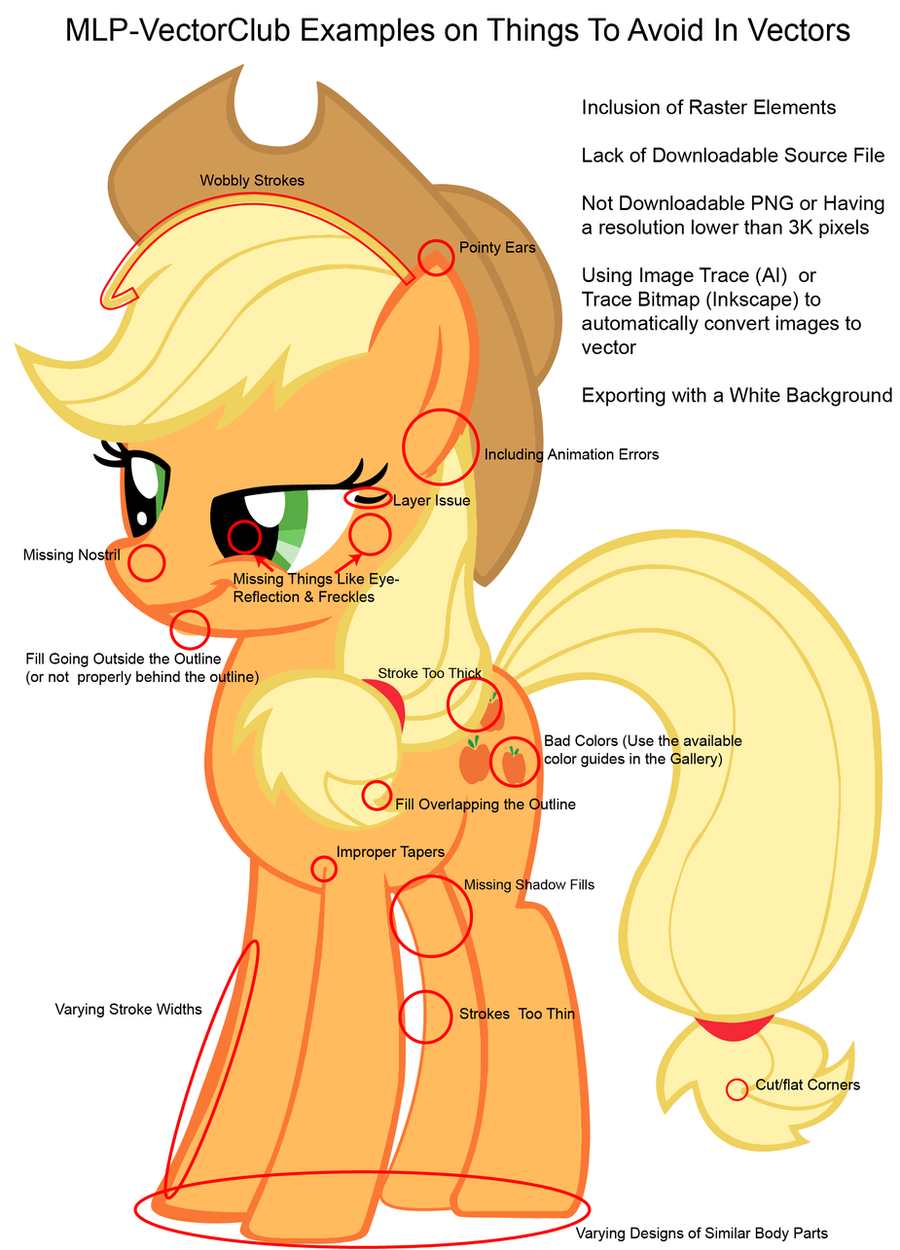
Here's a basic guide showing the common issues in Vectoring MLP Characters.Here as a list again:
 Fills not reaching or going outside their outlines; Ears having pointy tips (should be rounded, the only exceptions are Luna, Soarin and Mrs. Cake); Bad colours (in most cases, you can check them on our colour guide, which is linked on the left side of the group's main page: mlp-vectorclub.minus.com/mbiv9… ) Lack of proper tapers; Corners being cut off due to a low miter limit; Stroke width being inconsistent throughout the individual parts of the vector (the only exception is when the artist attempted to create a feeling of perspective); Outlines being too thin or too thick in the vector overall; Strokes being wobbly; Missing nostrils, eye highlights (two stripes of colour on the iris) or eye reflections (white circles); Legs in the background lacking a darker fill; Layering issues (objects being incorrectly layered under or over something), includes eyelashes from the far eye in the 3/4 view being layered under the head stroke; Inclusion of raster elements (all submissions must be 100% vector); Lack of downloadable source (vector) files (only necessary for show traces); PNG image not being downloadable or having a resolution smaller than 3k pixels wide or tall; Exporting image with a white background. Using Program Tracing to convert image to Vector.
Update: 14/04/13 - Added Soarin to the exception on having pointy ears.
Update: 29/08/13 - Added Mrs. Cake to the exception on having pointy ears.
Related content


Comments: 74

Lol, i have pointy ears on every single one of my vectors. I know it is probably wrong, but i like them more like this + im too lazy.
")
👍: 0 ⏩: 0


I wish you hadn't made it sound like line variation over-all is a bad thing. bit it sounds like that to me. Anyways, nice little guide there.
👍: 0 ⏩: 2

Line variation on the body, especially face and ears leads to an asymmetrical appearance that is just subtle enough to be creepy. This leads to a Derpy. with things that aren't naturally symmetrical or would be moving like a mane, tail, or background objects it can work to make it look more appealing.
👍: 0 ⏩: 1
Derpy looks weird because of her eyes, not because of the thickness of her lines.
👍: 0 ⏩: 0

It wasn't intended to sound like they are bad overall. A slight variation is OK, just major differences aren't recommended for show based traces.
 (Smile)")
👍: 0 ⏩: 1
I guess I can see how it would detract from the image :3
👍: 0 ⏩: 0

My Rainbow Dash vector might have some minor errors in it...
👍: 0 ⏩: 0

Traces (of images you've made for the purpose) are not bad if you know what you are doing. You should heavily Simplify them, usually, and then do a little cleanup. In Inkscape this is Ctrl+L, you also have the option to simplify during tracing by increasing 'Optimize paths' tolerance (and 'smooth corners' threshold, but this takes more experience to set intelligently since it's basically a 'curviness' control.); The 'Smooth' option in the main tab is not recommended even though it simplifies your curves, because it is based on a gaussian blur, meaning the edges of EVERY feature are rounded
For MLP style you probably want to avoid making too high-res base images, which produce spurious 'details' that then have to be simplified away. 'Large pixel art' is a nice scale for your base image if it's clean B/W (no greys/AA), to produce sharp edges without excessive detail.
But you shouldn't trace a color image (eg a cutout from a screencap), usually, it's too uncontrollable and unoptimized. Only trace outlines that you have made explicitly for the purpose. Controlled trace + cleanup can be much faster than manually vectoring everything.
👍: 0 ⏩: 0

duuuuuude, this makes me cringe.
also, the most common issues that i see in vectors are the strokes too thick (mostly in vector comics) and bad colors. but nothing's perfect, i presume. at least, this is remains a good representation regrouping the common issues that a vector artist mays encounter in his life
👍: 0 ⏩: 0


You forgot one thing, getting the color right instead using the colors you picked to vector Applejack. http//:www.MLPwiki.com
If you want the right colors you go there get the info of any pony, it'll tell you what color they use and you go here.
http//:www.perbang.dk. Here's one example
http//:www.perbang.dk/rgb/FFC36B/
👍: 0 ⏩: 0

This is definitely good for people to brush up on. It can get painful to see a lot of the same mistakes, but it's worth it in the end.
👍: 0 ⏩: 0

About the pointed ears, is it OK to make the tip a single cusp node with a rounded join like this ? Because it looks an awful lot like that's what's going on here and in several other references I've seen in a 3/4 view.
👍: 0 ⏩: 2

I'd say it's perfectly fine.
👍: 0 ⏩: 0
To elaborate a bit, I think it's a perspective thing. As in, the tips of their ears are round, but from certain angles you're looking at the rounded part edge-on and it ends up appearing a bit more like a corner.
👍: 0 ⏩: 0

This is all basic stuff. I can understand people making little mistakes, but it does make me cringe though when the most obvious of mistakes go seemingly unnoticed by the artist...
👍: 0 ⏩: 0

I noticed on several vectors of Soarin' in the Wonderbolts folder and in the show (his last appearance being at the end of Season 1, at least) that his ears are genuinely pointed. Are we still expected to make the tips of his ears round despite this, or is he an exception?
👍: 0 ⏩: 1
Good catch. He might indeed be an exception.
👍: 0 ⏩: 0

Luckily, the majority (60%) were already there since this is based on my first show traced Vector (as much as I dislike to admit it)... The upside is; that I was able to see how much I improved since then (a little over a year).
 (Wink)")
👍: 0 ⏩: 0

<= Prev |