HOME | DD
 YeroCtoze — a different approach
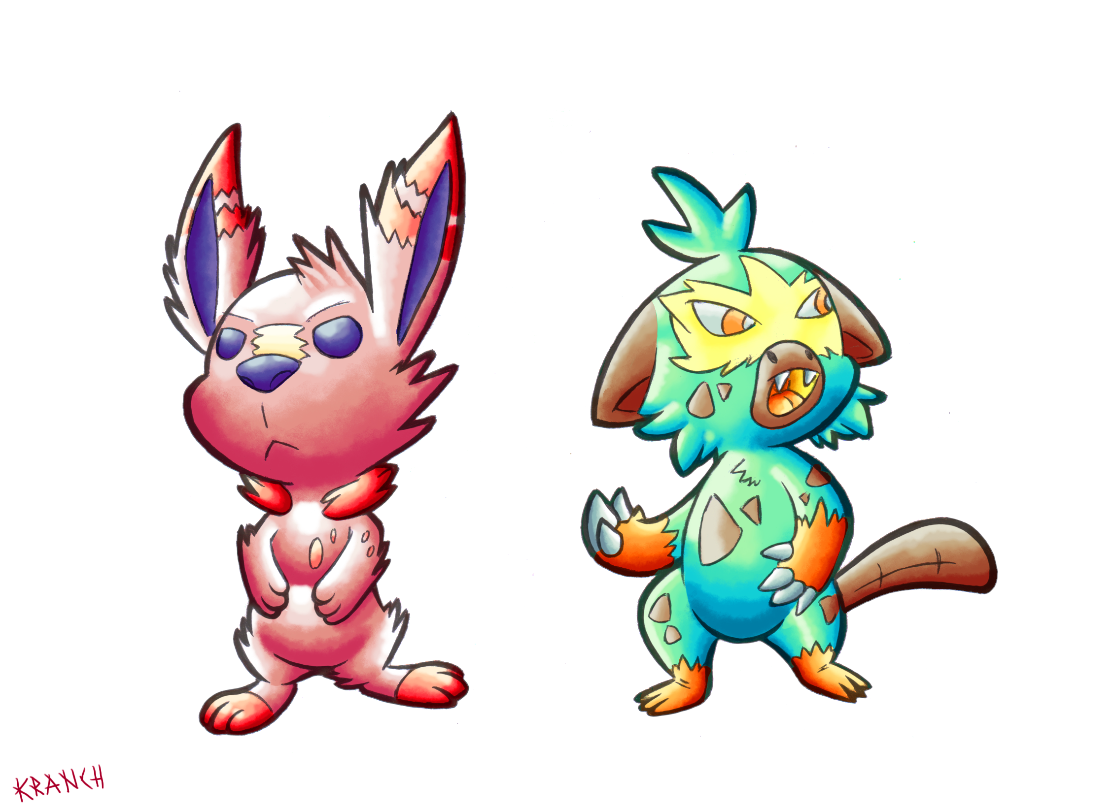
#bunny #fanart #monkey #pokemon #swordandshield #scorbunny #grookey
Published: 2019-05-18 14:41:26 +0000 UTC; Views: 181; Favourites: 12; Downloads: 0
Redirect to original
Description
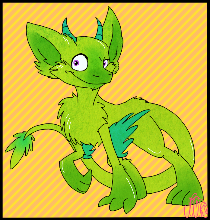
recently i saw a video which theme was the pokemon art style and how it changed through the years, so i had to do this i know its a really different take for this pokemon but i think this is how they would have looked if they were gen 1 pokemonfor scorbunny design i took inspiration from vulpix and the typhlosion evolution line, and a little bit of wigglytuff too
for grookey i wanted something different, back then some pokemon had aggressive looks sometimes, it was something common to see those eyes i used, the voltorb eyes wich are the same that had gengar and so on, i used him as the agresive one sience i think a monkey is more likeley to be agresive, or at least more common than a bunny
i'm not gen 1 expert so, this is bound to not be completely accurate, it's just my version of a what if, we might never have an official version of
changing the theme, this time i decided to make the shadows and lights more prominent, normally i make them a little hard to, but i spent so much time doing them that i think i just wanted to see what happens if i dont do that
what do you all think about it, its it better if i just make them nearly invisible or, just don't touch it like in this drawing
Related content


Comments: 8


Se ve bastante curioso el sombreado que aplicaste! :0
👍: 0 ⏩: 1

Normalmente suele verse así en un principio, antes de completarlos les bajo la tonalidad. Pero al momento de hacer este dibujo decidí que quería ver qué tal si no lo hacía, pues tienes que entender que el 70% del tiempo se va en las luces y en las sombras. Simplemente no se porque intentar ocultar algo en lo que invierto tanto tiempo
👍: 0 ⏩: 1
Claro! Especialmente si debe ser algo difícil hacer eso! Y es claro darlo a resaltar!
")
👍: 0 ⏩: 0

Muy buen dibujo, la verdad a mi me gustaba mas ese estilo que tenían antes a comparación del actual, no se, se veían mas clásicos (lo que sea que signifique xd). Pero bueno los tiempos cambian jeje.
Algo en lo que si diste en el blanco fue el coloreado estilo Ken Sugimori, ¡genial!
👍: 0 ⏩: 1
Francamente el estilo tenía su encanto, pero ya van más o menos 23 años desde entonces, los nuevos estilos han dado la oportunidad de tener pokemon diferentes que pese a que muchas veces no son del gusto de todos le dan variedad a los juegos en lugar de repetir muchas ideas
👍: 0 ⏩: 1
Si, es un arma de doble filo xd.
👍: 0 ⏩: 0