HOME | DD
 YihyoungLi — ice mage - process
#icemage #icewizard #mage #process #tutorial #wizard #fantasypoc
Published: 2018-09-12 14:25:57 +0000 UTC; Views: 779; Favourites: 29; Downloads: 1
Redirect to original
Description
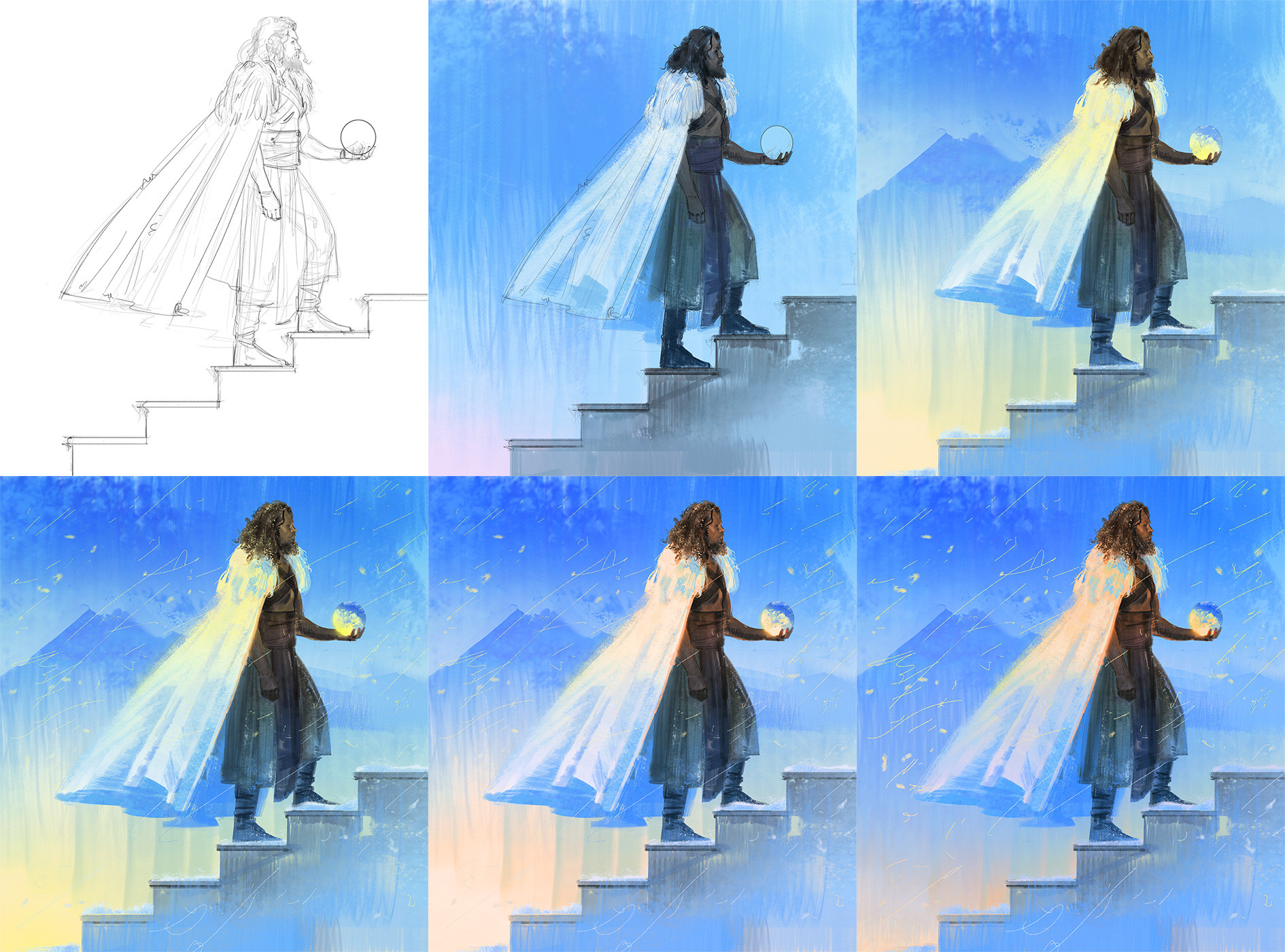
I feel sheepish about sharing my process because there are more masterful artists that others can and should learn from. But I will probably feel that way for a long time, and I think someone might find my comments useful as a first step.I googled pose and color references before starting. I've uploaded my reference board on my tumblr . References can be so useful for representational paintings. I didn’t use all the elements on the board, but they can serve to inspire and inform. I also collect references that I think could be useful for future projects. For example, one category is ‘heroic poses’ because that format is so common.
Sometimes painting in blobs is the way to go, but for this piece I wanted to practice my linework (and I wanted to draw Idris Elba’s handsome mug, OK?) To achieve a softer line weight, decrease flow percentage and increase spacing in brush settings.
Afterwards, I blocked in basic shapes. I aimed for a similar value/color structure to the Coby Whitmore painting in the reference sheet. I frequently switch between brushes because of their usefulness: soft brushes = soft materials/edges, hard brushes = hard materials/edges, textured, shape, opacity, etc. They also can create unexpected shapes, such as the mountain in the background.
Throughout the process, I tried to stay more zoomed out so I wouldn’t get sucked into noodling on minutiae. This allows me to work more quickly, of course, but also keeps the brush marking fresh instead of overworked and heavy. Sometimes I do get sucked in though, and taking a break when that happens is a good idea.
That said, getting sucked in is not always bad. Things like hair, features, embroidery, etc. can be a lot of fun but I recommend working on them after the overall composition is strongly established. This piece isn’t very detailed, but I did enhance the lights, shadows, and colors so the overall effect would be more vibrant. One way to do that is to paint with varying grays on a soft light layer, or varying colors on a hard light layer. Or use adjustments like hue/sat, color balance, brightness, vibrance, levels, etc.
Please let me know if this is helpful! I’m open to constructive criticism too.
---
twitter / facebook / tumblr / instagram
Related content


Comments: 2

 (Smile)")

Thank you, I'm glad to know this!
👍: 0 ⏩: 0