HOME | DD
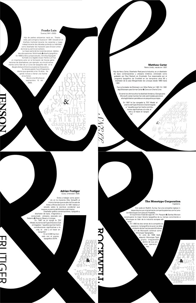
 Yourmung — Typo poster 01
by-nc-nd
Yourmung — Typo poster 01
by-nc-nd
Published: 2006-12-02 06:14:49 +0000 UTC; Views: 3797; Favourites: 22; Downloads: 416
Redirect to original
Description
Final version of an exercise of Typo 1. I really don't enjoy the final result, but anyway I think was a good attempt. Im posting it coz I want to remade it and I want a "before - after" view of it.Comments and criticism are welcomed and encouraged.
Related content


Comments: 6


It's cool...I look forward to seeing the newer version!
👍: 0 ⏩: 0


Thanks a lot, I wish the upgrade (coming soon) will like u too.
👍: 0 ⏩: 0
Thanks, I have to work a lot on it.
I'll work on other ideas, less formal; more experimentation will teach me a lot more, I think. A hug lad.
👍: 0 ⏩: 0

I think this is better than the other three. like the high contrast between the bold big font and the text.
 (Smile)")
👍: 0 ⏩: 0