HOME | DD
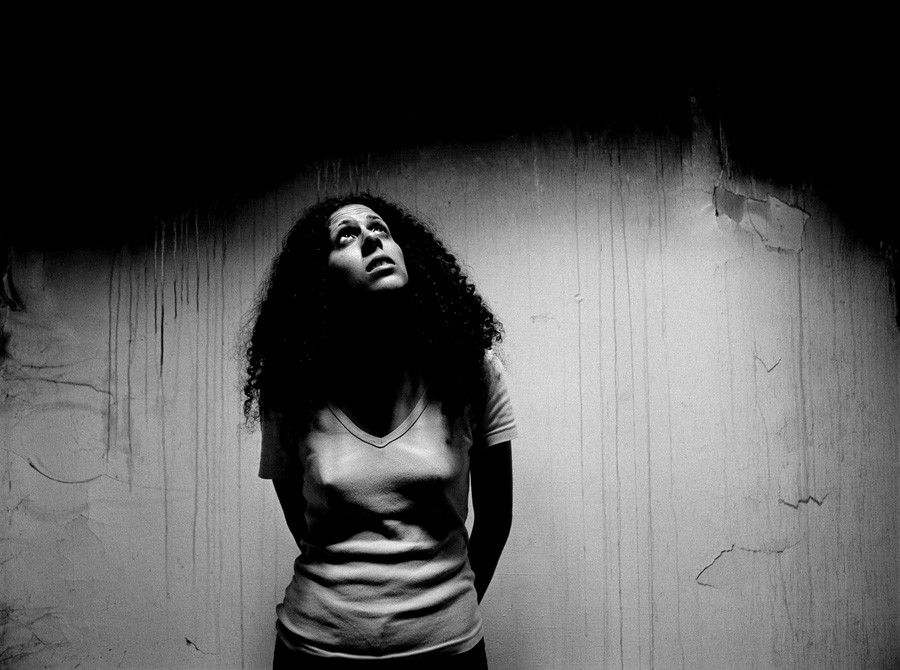
 yox — This is not Kansas
Published: 2002-10-28 13:05:19 +0000 UTC; Views: 554; Favourites: 6; Downloads: 50
Redirect to original
Description
And the red shoes have gone gray...Related content


Comments: 15

this is an intense image
the lighting and contrast is the strength here
👍: 0 ⏩: 0

fabulous mood and expression, the light, the shadows, everything fits.
👍: 0 ⏩: 0

I read the title, then saw the picture (great lighting and contrast btw) and then I read the description ... i loved it "and the shoes have gone gray" ... awesome.
👍: 0 ⏩: 0

i love the lighting and background, but it's her expression and pose... they make this so much more than good technical elements. The title sums it up so well. i love this.
👍: 0 ⏩: 0

Great. Nice composition. The background is beautiful. The only thing is I kinda wanna see a hint of shadow detail under her face. Great job
👍: 0 ⏩: 0


great contrast very dramatic dude i love your works
+fav
👍: 0 ⏩: 0

awesome perfect focus, composition, and contrast. really gets across the emotion.
👍: 0 ⏩: 0


The title, the way you described it, the lighting, the expression on her face, the overall mood of this piece of art...
fantastic!
Poetic yet nihilistic.
👍: 0 ⏩: 0

I agree with Kari. This photo is luscious. The deepness of dark is compelling and really draws the interest in to the subjest.
👍: 0 ⏩: 0

yox-I easily picked out your latest three deviations from the thumbnail gallery and said "these have to be by the same person"
there's definitely something to be said for that. I think what gives your shots the most 'style' is the contrast. (you probably knew that already)
Take this one, for example. This is really beautiful work. The contrast is GORGEOUS and the lighting is such a refreshing change from the typical spotlight or blank white wall. It's such a simple photo but your intelligent use of form and contrast really make it something special. I'm in awe
👍: 0 ⏩: 0


the background is very nice, and so is the pose of the girl.good contrast!
👍: 0 ⏩: 0