HOME | DD
 Z-Crackers — Locksmith

Published: 2010-06-03 12:38:11 +0000 UTC; Views: 1790; Favourites: 29; Downloads: 32
Redirect to original
Description
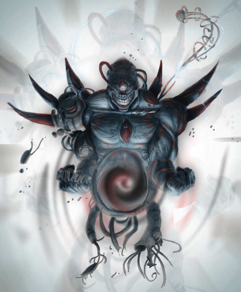
Hey hey! Remember this guy? [Hint: [link] ]Since I need to make a portfolio, and I've improved quite a bit since I did the last one, I've decided to paint over the old Keysmith to give it a bit of shine (Or in this case, glow).
Urk, finished. Hopefully this will be the last time I bug you with this guy :/
Crits, thoughts, ANYTHING is really appreciated.
Related content


Comments: 21


and this shall haunt me for the rest of my days o,,,o
👍: 0 ⏩: 0

THERE IS A LOT OF GOOD GOING ON IN THIS PAINTING NNNNNNNHMMMMM YESSIR
I SEE THAT IN SOME PLACES YOU EDGED THE FIGURE WITH LIGHT, THIS IS V. SMART
RIM/EDGE LIGHTING AND BLOOM ARE BOTH EFFECTIVE VISUAL TOOLS AND ALSO THEY HELP YOU DISTINGUISH FOREGROUND FIGURE FROM BACKGROUND FIGURE IN THIS VERY DARK IMAGE
Ooookay, now that I'm done capslocking at you-
-Excessive use of pure black.
Try not to use black so much to convey that the area is not exposed to light. Gradiate more; use black only in the absolute darkest areas, where NO light reaches.
-Check your anatomy.
It's hard to get too up in arms about the anatomy, because this is of a creature that doesn't exist. In some of the recognizably humanoid features, however, there are things that leave me confused - deformed biceps, missing elbows, etc.
-Too much white.
Using too much white looks unprofessional. Try to add a hint of color to those highlights, until you hit the absolute brightest point of it.
-Gold/bronze doesn't look gold/bronze.
It took me forever to learn to paint metal. The key is just that it's highly reflective. Cram all the colors of the surrounding area onto it, and hint at the actual color of the metal. I suggest looking at references for this.
-Key is orthogonal.
You could give the image a lot more depth by turning that key in one direction or another.
-The eye is dry.
This could be intentional because it's not in a socket and has no way to moisturize itself, but it's odd to see an eye with so little reflection.
Really great shadows under the arms going across the lower portion of the image, there. I hope you paint more!
👍: 0 ⏩: 1

Ahaha, oh jeez. You really are the queen of critiquing <3
Thanks so much for taking the time to do this. I'll either fix this painting up when I have the time, or at least keep this all in mind for my next painting/s.
👍: 0 ⏩: 0

Anatomy may be wrong, but I don't think it matters here. You made some strong decisions regarding the anatomy and stuck to them, which is really bold and gutsy. I think bold decisions like those are more important in creating a good piece of art than correct anatomy. I think the more disturbing/horrific images defy anatomy anyway. (Not that you shouldn't study it, of course.)
I also like how he appears to be crawling out of the darkness. Very creepy and cool. The gradient from top to bottom helps a lot. Also, the cast shadows of his front arms onto his legs gives a good sense of depth and lighting. On this topic, a good way to add to that effect is atmospheric perspective. If you progressively darkened his arms in back, that would give you an even greater sense of depth, which would help him appear that he's coming out of a black void rather than sitting on a black background.
It looks like you took a stock image for the background and altered it, which is fine, but you should really try making your own backgrounds. And not just flat backgrounds, but environments with grounds and depth. It's a really impressive skill to fit a character into an environment. Make it fun for yourself.
And lastly, consider the white outline this guy has. I personally would avoid an outline like that, so I suggest you either make it work to your advantage next time or polish it up before calling it done.
👍: 0 ⏩: 1

ITS PONDERING YOUR FEEEEEEEEEEEEEEAR.
👍: 0 ⏩: 0


👍: 0 ⏩: 0


")


B-b-but what about Birindu-kun? :C
👍: 0 ⏩: 0