HOME | DD
 z3rx — FastUnited Hosting

Published: 2008-01-15 18:01:14 +0000 UTC; Views: 5751; Favourites: 15; Downloads: 0
Redirect to original
Description
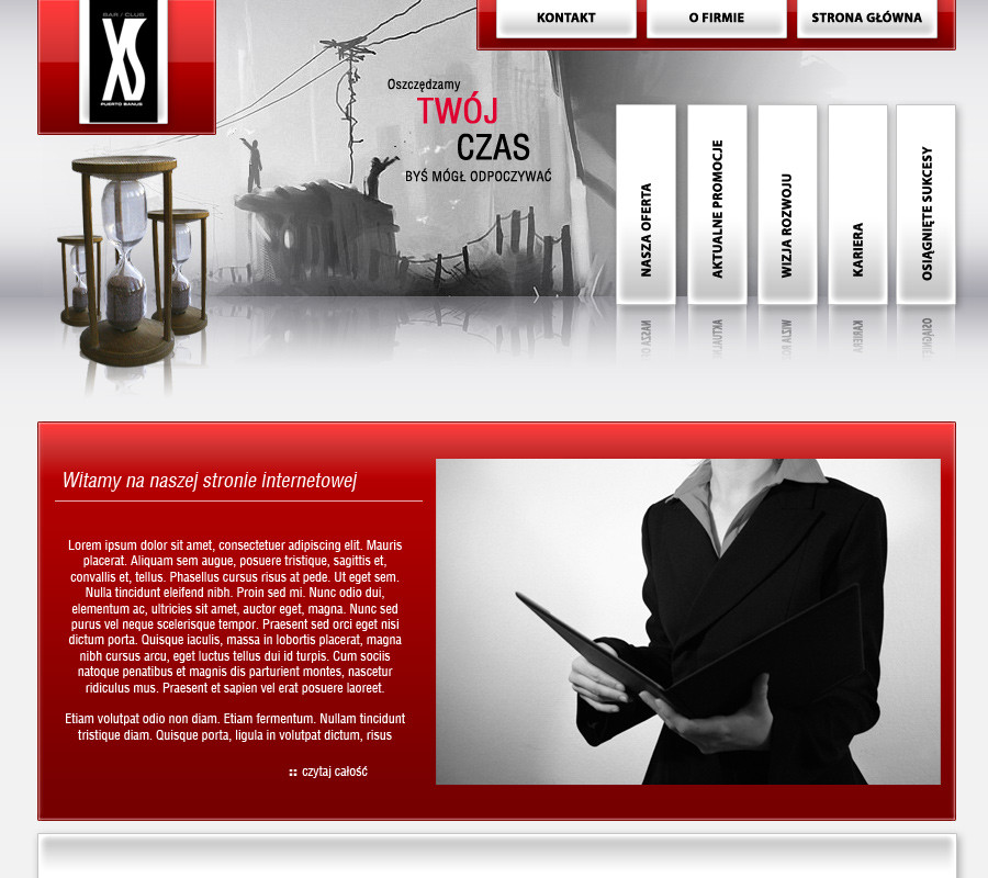
This Layout was made for the Hosting team ''FastUnited'' and will be online soonMy Second Hosting design so far....
It's done after customers wishes and will be online soon i think.
# Ps Cs3
# ~8h of work
I would be very happy about some comments or favs
 (Smile)")
Related content


Comments: 54

very nice ,,, 10/10
i was wondering if i can get the design as a psd file
👍: 0 ⏩: 1

thanks
you can buy it if you want to, the customer doesn't need it any more if you are interested, just write a note or contact me at icq.
👍: 0 ⏩: 0


gefällt mir sehr gut. schöne farben schön hell und aufgeweckt ... supi
👍: 0 ⏩: 1


")
^^ danke man
*Hey das 1. mal 10 favs aufn design Hey*^^
👍: 0 ⏩: 0


das design an sich ist schick, nur ich finde das logo das passt einfach nicht da rein  (Wink)")

👍: 0 ⏩: 1
vielen dank
👍: 0 ⏩: 1


ahh haste es fertig gemacht wie ich schon vorher sagte isses sehr schick auf jeden fall und wie du siehst sind auch viele andere der meinung
aber... ja es gibt ein aber.... du hast ja bei den content blocks einen 3d effekt eingebaut und bei dem roten block sollteste vllt die kante auch rot machen dann passt es besser meiner meinung nach
👍: 0 ⏩: 1
danke dir man
jo werds mal ausprobieren, danke für den tipp
👍: 0 ⏩: 0
PixelStation [2008-01-16 06:43:47 +0000 UTC]
I love the 'buy' and 'more' buttons. Very nice design.
👍: 0 ⏩: 1


sry, aber das ist scheisse
SCHEISSE GEIL !!!!!!!!!!!!
👍: 0 ⏩: 1

sehr schönes design, gefällt mir ganz gut,
bei Partner ist das Intel n Rollover oder nur Grau gehalten?
👍: 0 ⏩: 1
danke
ne das is allgemein nur filli, habs grau gemacht damit farblich ein wenig besser passt
👍: 0 ⏩: 1
ah ok, aber ist besser als das blaue logo
hat einer mitgedacht ^^
👍: 0 ⏩: 1


Feines Ding, guter Aufbau und tolle Farben! Nur finde ich den Login etwas unpassend für so eine Hosting Firma. Aber den Login-Button kannste ja bissl bearbeiten noch, dieses Weiße da, stört.^^
👍: 0 ⏩: 1


Nice Mann.
Gefällt mir wirklich gut, keine Einwände.
Ich sach ma Fave ne xD
MfG
Jim
👍: 0 ⏩: 1
| Next =>