HOME | DD
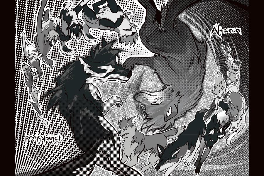
 zack-sr — BBA Mandala
Published: 2007-11-24 21:59:16 +0000 UTC; Views: 9303; Favourites: 269; Downloads: 90
Redirect to original
Description
recently commissioned me. I laid out an assortment of ideas for her, and after several stages, she settled on a design that I then completed for her. This was one of the designs she didn't pick. However, the composition made an impression on me, so I took the sketch and gave it some pizazz with MangaStudio. Maybe a little too much...
Related content


Comments: 56

Oh, that's alright. Thank you for responding.
👍: 0 ⏩: 0


is yoru manga studio full or trial?
i cannot find the trial one to see if I want to shell out 300 dollars for something i might not use/be afraid to/never make a comic.
but it uses vectors. i hate them so much it hurts.
👍: 0 ⏩: 1

Back when I drew this one, it was the trial version. The vectors aren't so bad, because it's still just line art (not necessary to use shapes or the pen tool).
Manga Studio's technology is based on making clean freehand lines that are drawn directly to vector, so that they can be infinitely resized or manipulated with no quality loss.
Here, try this link: [link]
👍: 0 ⏩: 1
yeh i need the freehand touch.
im dumbz.
👍: 0 ⏩: 0


ooo ")
👍: 0 ⏩: 0


Thank you Rabbi! Sorry I haven't talked to you in a while, I've been busy! I hope you are well.
👍: 0 ⏩: 1

You're welcome
Yes, I'm quite fine; I hope you too ^^
👍: 0 ⏩: 0

Do you mind if I color it?
👍: 0 ⏩: 1
Sure you can color it!
👍: 0 ⏩: 1

Actually, the "Large Heads" Make it look really good. With images that have a constant size/proportion change it make it look natural because the whole body is going to increase/decrease in size.
If you don't get what I am saying, I am so sorry. Tis 10 at night and I am tired. n.n
👍: 0 ⏩: 1
It's cool, I get it! Although it does look wonkier when it is printed out and staring at me on paper. On the screen it's not so apparent. I understand that it's good to have big heads in advancing perspective... but some of these are just TOO big..
👍: 0 ⏩: 0

Zack this is wicked! The use of tones is great and I love the movement captured here. Also I have to say I AM a fan of the idea of this as a multi-positional poster. Very impressive work - will be finding use as my Mac's desktop wallpaper for quite some time.  (Smile)")

👍: 1 ⏩: 1
Yea no joke, this is badass
Im working on the poster (over the last couple of days). I have it all penciled, but im not sure if I want to do digital lineart (in which case I have to trace my lines with the pen tool because i suck with tablets) or leave the pencil (in which case it may look messy blown up to the size it's going to be).
Blar >.o
👍: 1 ⏩: 2

I could sketch it up, make some looser backgrounds with a grittier, painterly twist. Would be a real cool idea.
👍: 1 ⏩: 2
nah i like tight backgrounds
👍: 1 ⏩: 1
Yah, but it could be the same kind of tight as the Alteron concept work we did, with the drippy rocks? That's looser than my usual style.
👍: 1 ⏩: 1
really? well whatever it is i looove that style
👍: 1 ⏩: 0
An added plus is that it hopefully wouldn't take as much time to do as your normal backgrounds (I can't even imagine the hours you put into those)!
👍: 1 ⏩: 0
Pencil? Now that you mention it, it would look pretty cool to have a BBA poster in a gritty, sketchy motif, if the DPI is high enough so viewers can't see pixels! But that style might clash with Erin's neat backgrounds, unless she's also willing to sketch it up... On that subject, one of the cool things about MangaStudio is that when you ink, there is an ink "correction" option which smooths out the lines for those with shaky hands or less tablet coordination. It's even adjustable from off (can be as shaky as your hand is) to 20 (practically makes every stroke a straight line). It's REALLY handy!
👍: 1 ⏩: 1
im going to look up that program
I'll email you a thumbnail of my pencil work so you can see what it's like. All my comic page work is drawn with mechanical pencil and not inked, just colored. So it would turn out kindof like a big comic page if i used that method. I kindof think it's worth inking with the pen tool though because then I have nice vector lines that I can do anything with!
👍: 1 ⏩: 1
Definitely; if you have vector curve skills, as evident from your multitudes of drawings, you should go that route! (I barely know how to use the MS Paint curve!)
👍: 1 ⏩: 1
Yea the vector lining is really tedious on an image of this size and it's taking forever. I spent almost an hour just lining swift last night, but it looks AWESOME. Will send you lineart soon so you can see. I was going to send you the pencils but after zooming in to 100% i realized that the pencil wasn't going to work - too gritty. So i will send you the final inks in a couple days so you can see what Im doing
I had to change some of the characters in the background into different characters - Erin brought up the good point that many of our alteron character designs are concept-only and by sticking them on the poster we'd have to commit to them. So I made the BG wolves be Blackblood on one side, inaria on the other.
I guess we'll have to do an alteron poster after issue 2
👍: 1 ⏩: 1
That's cool--the bg character choices were a suggestion, with the final choice up to you. It sounds great!
👍: 1 ⏩: 0

My first thought of this, before I remembered what a mandala was, was of a BBA yin and yang kind of thing. It's awesome either way. Very nice tones, but either you resized this or my monitor hates me, because some of them don't look quite right, particularly some areas behind Alteron and on Swiftkill. Makes me sad I can't see the tones in their full glory D:
Amazing work!
👍: 0 ⏩: 1
Hey! How've you been?
Do you mean the moiré patterns in the tone? That's my own inexperience, not your monitor.  (Wink)")
But yin and yang is definitely included in there, somewhere! Thanks!
👍: 0 ⏩: 1
I'm pretty good- school is keeping me much busier than I thought it would. Absolutely no time to draw. Right now I'm praying for a snow day. What about you?
I'm not entirely sure what I meant. I've never really used tones, though, so I'm really not one to talk, hah.
👍: 0 ⏩: 1
Snow days seem to be getting rarer... School needs "snow rememberance" holidays.
I'm OK; making the comic is the only thing on my mind! So I'm in a determined mood all the time.
👍: 0 ⏩: 1
Well, that is great because only seeing new pages of your comic will begin to make up the horrendous lack of snow days.
Actually, it's kind of ironic. We're supposed to get snow where I live tomorrow- Saturday. There is no justice in the world.
👍: 0 ⏩: 0

I cant stop looking at it.
the tones are gorgeous. and do you know what I love? The way you think that the two main characters are leaping as if it were a time line... Like the smaller characters from each alliance/pack in the background are the main character leaping forwards. Does that make sense?
you are wonderful beyond words
👍: 0 ⏩: 1
That's a cool analogy! It makes sense, and it's close to what I originally had in mind: This idea was called "the will of the pack" and the concept behind it was how entire packs act as a single social unit, where motives and needs of individuals meld together into one single force of will, under the alpha, who then acts as a representative of what the pack stands for. This is more for human packs than for wolf packs though, I think...
👍: 0 ⏩: 1
thanks ;D that concept definitely shows through in this image! i like the idea of it working for a wolf pack though, not just a human "pack". i dunno, kinda makes the wolves seem more human, which, for the purpose of a lot of art on deviantART, is relevant!
👍: 0 ⏩: 0


Oh wow, that's amazing. You did a great job on that!
👍: 0 ⏩: 0
Gasp! *eyes fall out of head* thats sooooo cool!!!
👍: 0 ⏩: 0

Just a liiiiitttle too much pizazz.. its almost too hard to figure out whats going on, I think the BG tones make it too busy. But other than the the composition is interesting. I like the yin-yang formation in the middle followed by the trails of dogs behind them (though at first I thought it was an 'animation' sequence of the same dog running at each other since the designs are similar in B+W)
👍: 0 ⏩: 1
I agree! This was done with a trial version of the program, so I was like, "I must try everything!"
👍: 0 ⏩: 1
haha I'd do the same thing I assure you! I'd be so excited to try every little filter and whatnot.
👍: 0 ⏩: 0
| Next =>