HOME | DD
 zblowfish — Simplicix Media Design

Published: 2010-01-19 23:10:11 +0000 UTC; Views: 4774; Favourites: 43; Downloads: 184
Redirect to original
Description
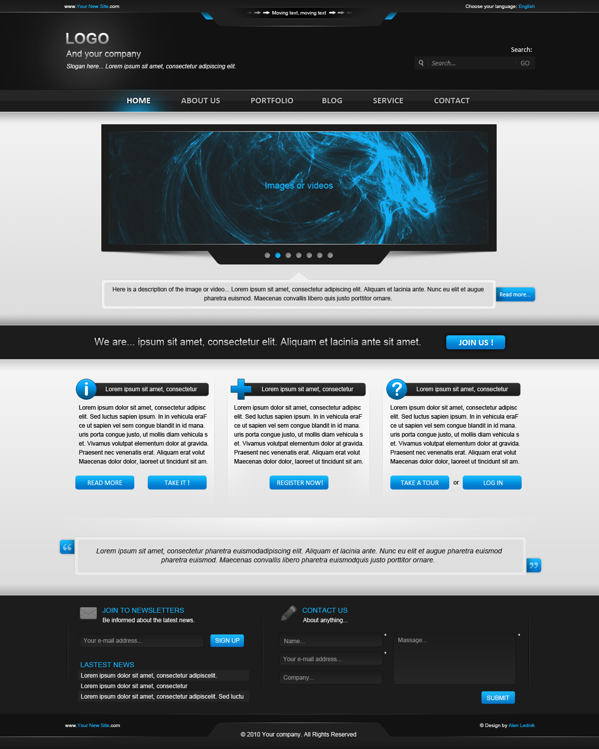
Simplicix Media Website[link]
This is a site added to the group for critiquing, I have an identical on in my portfolio but I would like to see what you guys think about it.
This is going to be my new media company's website, I really like how it turned out, tried to keep it simple yet make it attractive.
Will be coded most likely soon, I have never really got most of my sites coded, but I think this one is going live.
Thanks to grace-stock for the headline place holder
Thanks to windows vista for the bottom overlay image that I changed up a bit/warped
And lastly, thanks to timsilva for a little inspiration
")
I really want to be critiqued so if you can critique it, it would be really appreciated!
Comments = <3
Favorites = <3
Related content


Comments: 9


 (Smile)")


nice layout, great colors, and yea do as axe suggested
 (Wink)")
👍: 0 ⏩: 0

I really like it! One suggestion though, turn the opacity on those gray gradient blobs you have scattered everywhere. Make them less subtle
👍: 0 ⏩: 3

I agree, they're much too dark. They look out of place right now. Nice work though.
👍: 0 ⏩: 0

I'll look at how it looks, thanks for the suggestion!
👍: 0 ⏩: 0
