HOME | DD
 zdan — DevID - Zdan

Published: 2001-10-26 21:06:08 +0000 UTC; Views: 247; Favourites: 1; Downloads: 18
Redirect to original
Description
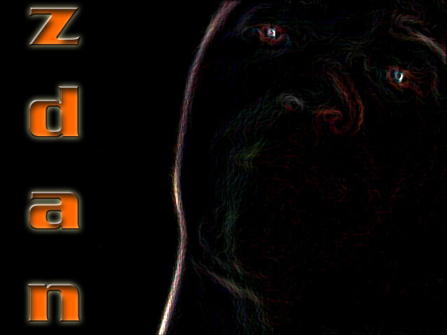
its seems like everyone had one... thats me in the photo and the little circle in the bottom right is just for some pplim not inspiered at all...
comments anyone?
Related content


Comments: 3

oh who cares
you were rejected anyways
:smiles:
but don't lose hope
i'm with ya
:smiles:
---------------
Woman by Birth
Bitch by Choice
👍: 0 ⏩: 0

WoW, this is what i call a comment
the data fiels, well i went for the "typewriter effect", u can never get it in the lines (hope u understand what i mean)
ppl, learn from noahx01, great comment
-{Project: Goa}- http://www.projectgoa.f2s.com
The quest for non earthly energies
It is something to be able to paint a particular picture, or to carve a statue, and so to make a few objects beautiful; but it is far more glorious to carve and paint the very atmosphere and medium through which we look... Henry David Thoreau
👍: 0 ⏩: 0

It's pretty cool, however there are a view things I just have to say about it. \
I'd prefer the boxes on the bottom to all be the same size, they are mostly different and it doesn't look quite right.
Secondly, on the data fields, some text floats 2-3 pixels above the lines while other text is on the lines, might need to fix that.
The only other thing I don't like is the bottom, there's like 50 pixs of not much there, maybe if you put a large DA in the background of ur ID and faded it out it would look cooler.
Otherwise than that, this has a good layout and is fairly interesting. I especially like the "rejected" stamp. Very cool, original idea. Keep it up.
____________________
noahx01 | website: http://noahx.hotmagma.co.uk
aim: noahx01
icq: 115301478
👍: 0 ⏩: 0