HOME | DD
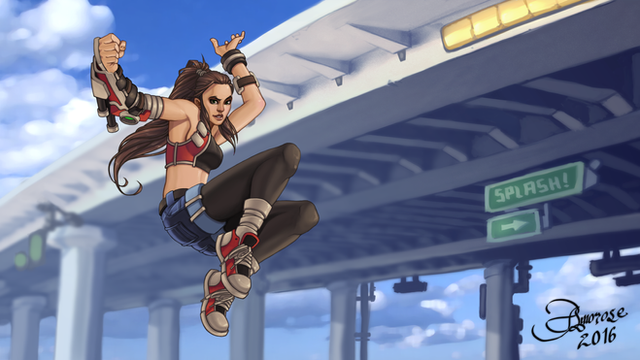
 ZedEdge — Dynamic Color Dodge tutorial

#tutorial
Published: 2018-05-12 13:06:08 +0000 UTC; Views: 5089; Favourites: 121; Downloads: 40
Redirect to original
Description
A simple little technique I only recently started using to avoid merging layers or using the color dodge blending mode (which also totally works - just not with all colors).
Happy color dodge day. ;D
EDIT: Oh boy ... I just found out that you can completely bypass all of this whole tutorial. Just double-click on a new layer, and uncheck "Transparency Shapes Layer". Then paint with white. It's works perfectly.
Thanks to the "Photoshop Training Channel" for that.
Related content
Comments: 8

Hey, Thank you for posted this up. It will be very useful to me.....Well, One day anyway.
👍: 0 ⏩: 1

Hehe - that's totally fine. I certainly don't use new techniques like this right away - the information just builds and when the art calls for it, you'll know what to do!
👍: 0 ⏩: 0

marvelous tutorial! thank you for clarifying this, i have been pondering it for a while!
👍: 0 ⏩: 1

Why, thank you! Really glad it makes sense - haha! Hope it helps.
👍: 0 ⏩: 1

it surely will 
👍: 0 ⏩: 0

OH SHIT, THANKS!
I've been wondering how I can do this kind of glowing effect on my art, but it's hard to find tutorials that show the kind of glowing that I mean.
This is very helpful, thanks again! 
👍: 0 ⏩: 1

Oh awesome - really glad to hear it! Hope it works for you.
One way to see if the Color Dodge layer blending will work is to: fill your canvas with a random warm-ish tone - then apply a mask like in this walkthrough to highlight some areas - and afterwards, use the hue/saturation window on the warm tone to get the highlights looking right (if it feels blown-out, try darkening it or reducing the saturation. Here's a hex code for a good starting point #7d6a6a ).
👍: 0 ⏩: 1


