HOME | DD
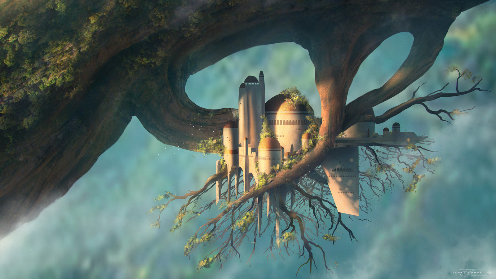
 ZedEdge — Sign posts

#arora #conceptart #environments #fantasy #landscape
Published: 2015-04-10 13:53:42 +0000 UTC; Views: 2466; Favourites: 82; Downloads: 51
Redirect to original
Description
As the title identifies, these are actually sign posts, written in the language of Arora , and scattered across the landscapes.Something about colossal objects just gets me so exhilarated.
© zachula.deviantart.com, 2015
Related content


Comments: 10

they're almost as if these represent three of the four elements. The top is above a lake, water. The middle is raised from the ground around a lush landscape, earth. And the last is high above a desert, air. My best guest is that the last symbol is in the biggest volcano or at the center of the earth.
👍: 0 ⏩: 1

Huh - I hadn't even noticed. That's really cool.  (Smile)")

👍: 0 ⏩: 0

All of your artwork opens up so many mysteries, makes me wonder what the story is behind them.
👍: 0 ⏩: 1
Aw - that's a wonderful comment. Thanks so much.
And for Arora at least, you won't have to just wonder about the story for much longer. ;D
👍: 0 ⏩: 1
")

These are great zed
I'm curious what is your coloring technique
Everything looks nice and light and colorful
It all seems pleasant
👍: 0 ⏩: 1
Thanks so much! That's lovely to hear.
I'm not actually fully aware of how I choose colors ")
For example, the first painting is basically brown and blue. But the brown transitions from a yellow-brown to a red-brown - and the blue transitions from a green-blue to a blue-blue. It just makes the colors feel "fuller".
Another little thing I know I like to do is adding subtle bloom - where the light almost glows beyond where it's hitting. Which makes everything feel "soft".
Hope that helps. ^u^
👍: 0 ⏩: 1
I see it now!
Cool!
Thank you so much!!!!
OuO!!!
👍: 0 ⏩: 1