HOME | DD
 ZedEdge — Sprite Redraw
#mario #metroid #samus #tloz #zelda #megaman #pixelart #pokemontrainer #redraw
Published: 2020-05-08 09:52:35 +0000 UTC; Views: 6725; Favourites: 158; Downloads: 23
Redirect to original
Description
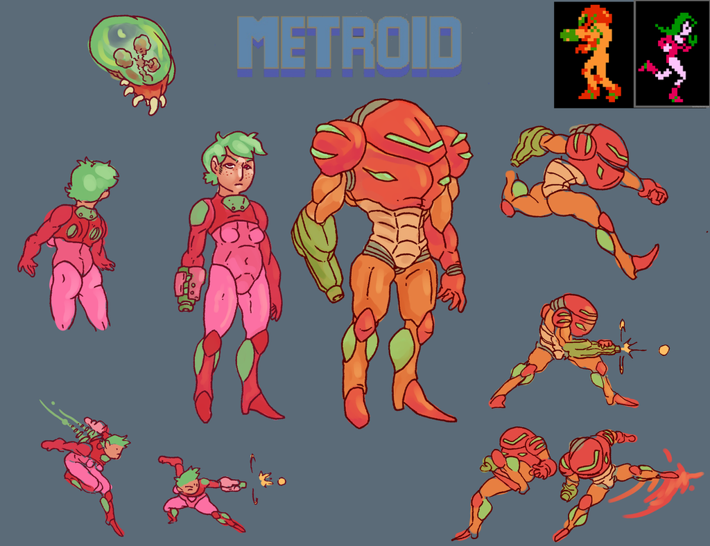
What if classic sprites were redrawn with modern designs?
This was such a fun exercise. The original sprites are of course hugely impressive since pixels were a totally new medium at the time and they're also designed to be readable in various gameplay scenarios. But yeah, since each character's visual identity has been greatly refined since then, I wanted to explore how they would look in the limitations of their original games.
Related content


Comments: 37

👍: 0 ⏩: 1

👍: 1 ⏩: 0

👍: 1 ⏩: 1
👍: 0 ⏩: 1
👍: 0 ⏩: 0


Samus's is definitely the most drastic of changes
👍: 0 ⏩: 1
Yeah, it's interesting how small they originally made her shoulders despite the cover art showing them with the usual large size.
👍: 0 ⏩: 0


Very cool! Sprite reinterpretations are always a ton of fun. I've always wanted to see what current developers would do with older consoles.
Gotta nitpick Samus there though (sorry): the game has all-black backgrounds, and the few black pixels inside Samus's sprite are not a layered 4th color like Megaman has, they're just transparent pixels showing the background. So the arm cannon on your version would be invisible in-game.
👍: 0 ⏩: 1
Right right! That totally makes sense (also glad you like them all the same  (Smile)")
👍: 0 ⏩: 2
It's not a bad look IMO, and also, having the weapon stand out like that is definitely gonna help with readability when viewed at small size.
👍: 0 ⏩: 1
Also very true. Right on, thanks!
👍: 0 ⏩: 1
Though I do see what you were going for with using the brighter green in your original one, representing bright lights and all. Looking at it that way, you're right it is pretty bold. ")
👍: 0 ⏩: 1
Indeed - I almost want to do a redraw of every sprite in the game to look at how everything could be balanced. But just focusing on these was a really informative exercise.
👍: 0 ⏩: 0

My nitpick is that the NES only had certain preselected colors, so the green she shows is likely the one your stuck with. Also, Mega Man desperately needs his outline back. Ditch the small red square, (limited resources - only show necessary details), use the palette space for his outline. And frankly, Capcom hasn't actually changed his design since the 80's (looking at you, 9 & 10!). Finally, Red feels like he's looking up to the Face of God, instead of in front of him. That said, I do appreciate the effort, and they are neat. I'm just being a pedantic jackass.
👍: 0 ⏩: 1
Haha - thanks for the thoughts. Pedantic and otherwise.

👍: 0 ⏩: 0


👍: 0 ⏩: 1
Oh wow, really fun to hear! Though I'd still want to give credit to the original designers, since they also came up with the refined the designs that I aimed to replicate here. ;D
👍: 1 ⏩: 0

I think the Samus one looks the best. The Link and Red redraws are pretty good, too. I'm a little iffy on Mario and Megaman, though. I think the difference in shades on Megaman is a little hard to look at, especially against a white background. Mario actually feels to me like a step backwards. Overall, really good, though.
👍: 0 ⏩: 1
Aha, interesting! Thanks for the feedback. I'd certainly expect they could be refined further depending on the background color of the game worlds. But yeah, it was really cool to get a sense of how precisely the original sprites are designed. Even if some could be refined, it feels like the designers considered every single pixel.
👍: 0 ⏩: 0
"...readable in various gameplay scenarios."
And that's why redesigns like this may not be as practical to implement. The simple and exaggerated design and the bright color palettes help you identify them easily at a glance.
Here's something I stumbled upon which elaborates: Pixel / Gameart 101 #12 Zeldas Visual Priority
It's a good example why you shouldn't over-complicate an inherently simple visual style.
👍: 0 ⏩: 1
Yeah, great infograph! Gameplay readability is definitely the most important factor. Though, if it was the only the thing that mattered, then the designers could have just made each character colored squares. But the idea of playing as a high-fantasy hero slaying monsters is a huge part of what makes it fun. With a redesign like this, I imagine it wouldn't just be the playable character, but every sprite undergoing a similar redesign to assure they all work together - keeping that readability but also refining the world imagery to make it a bit easier to suspend disbelief.
👍: 0 ⏩: 0

Now THESE are the videogame remakes I'd love to see! ")
👍: 0 ⏩: 1
Haha, I admit I'm graphics-monger as well. ")
👍: 0 ⏩: 0

