HOME | DD
 Zedna7 — Vampire january challenge
#bite #vampire #vampireromance #vampyr #blooddrink
Published: 2017-01-19 23:26:42 +0000 UTC; Views: 3294; Favourites: 18; Downloads: 0
Redirect to original
Description
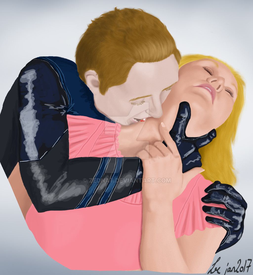
My piece for the january challenge in the Improvement-Club . The challenge was to draw something if you weren't you. I thought I'd make bookcovers for people if I weren't me. Cuz normally I wanna do my own stuff, and not for others, well not all the time.Kinda happy with this piece
 the pose are from SenshiStock patreon stocks, was kinda hard to do her head's angle (x.
I saw sakimichan 's skintight clothes videotut and got inspired to do his clothes like that.
Related content


Comments: 9

Overall

Vision
Originality
Technique
Impact
First, a note: I think the star rating things are a little too obscure so I just always do 3 every time for everything. Please ignore those. e.deviantart.net/emoticons/b/b… " width="15" height="15" alt="
")
Wow this is something! I remember seeing it when you posted it and being super impressed. e.deviantart.net/emoticons/b/b… " width="15" height="15" alt="
Since some of the areas are so well rendered, there's a few places that stand out as a bit less refined. The details of the shading in the bite area of her neck/collar bone stand out as a little harder to read the form. It gets a bit flat as it moves towards the edge of the shirt and it stands out mostly because the face is so well crafted. Her shirt also doesn't appear to cast any shadows.
I think his ear is another place that seems under developed. Ears are kind of a pain and this one is also foreshortened, but taking some time to build up that form would strengthen the over all image by showing consistency of detail.
There's something neat about how fluffy the hair looks for both characters, but in contrast with the smooth rendering of the faces and skin it seems a bit set apart in style. I think working with hair as a mass in future works rather than individual strands might lead you to a better sense of cohesion. It looks like you have a passion for the detail, so keeping some of that in the hair in some areas would be good, but as a complete look for the hair it reads much less realistically than the wonderful forms of the faces. I think it works much better for him than her, perhaps because his hair is much more short.
The scribbly loose style for the highlight on the black fabric works all right on the gloves, especially with the contrast of the light stitching. I think it reads a bit more messy on the larger areas of the arm. Again, it's another case of contrast with how delicately handled the faces are (major props again!).
The anatomy is strong. I would say that over all, if you can contribute as much love and attention to the clothing and hair as you do to the skin you will be moving in the right direction. I hope this was helpful! e.deviantart.net/emoticons/b/b… " width="15" height="15" alt="
👍: 0 ⏩: 1

Wow, thanks so much 
I see now that his ear is underdeveloped.
I'll keep your advices in mind in my next piece, they are super helpful
Thanks so much for critiquing

👍: 0 ⏩: 1
Yay good luck with the future work!
👍: 0 ⏩: 1


This is really, good! I can see a few imrovements you can make though!! They're just shading details like the cheekbones on the vampire. His face seems a liiiitttle one - toned. make sure you remember to think about your light source though because that really will matter when you're shading the vampire and giving him countour.
👍: 0 ⏩: 1
Thanks, and thanks for the constructive criticism
👍: 0 ⏩: 1