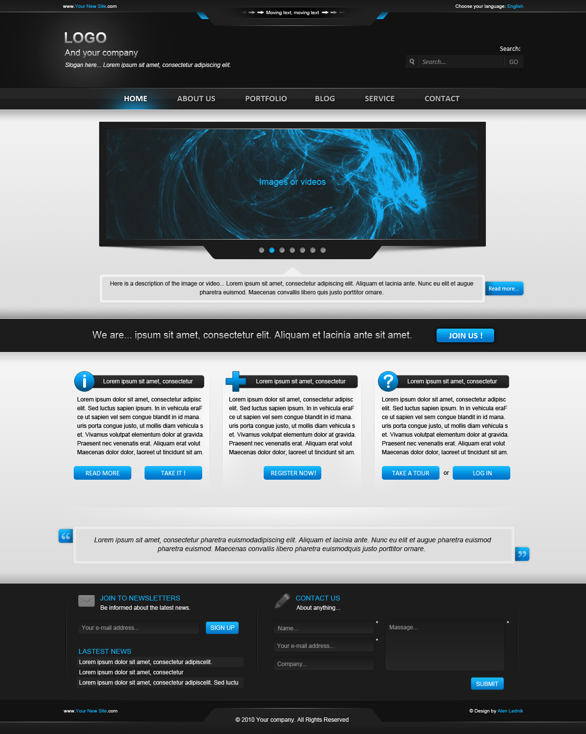
HOME | DD

zee7 β€” Blue Experiment

Published: 2008-02-22 11:27:14 +0000 UTC; Views: 8901; Favourites: 69; Downloads: 381
Redirect to original
Description icon by :alert84.deviantart.com
Related content
Comments: 78

UEY-S [2008-04-21 11:45:21 +0000 UTC]

hey champ, this clear/glassy design by you inspired me to do one of my latest lil projects for uni.

Your professional criticism would be much appriciated and don't worry about sounding too harsh,

cheers, laters

πŸ‘: 0 ⏩: 2

zee7 In reply to UEY-S [2008-04-21 12:36:51 +0000 UTC]

thank you soO much

πŸ‘: 0 ⏩: 1

UEY-S In reply to zee7 [2008-04-21 14:21:11 +0000 UTC]

any criticism tho? rip into it by all mean!

πŸ‘: 0 ⏩: 0

UEY-S In reply to UEY-S [2008-04-21 11:46:56 +0000 UTC]

oh yeah, here are the links to the sets

[link]

[link]

[link]

πŸ‘: 0 ⏩: 0

owsian [2008-04-15 17:14:46 +0000 UTC]

rly nice design, like it

change avatar... pink sux ^^

πŸ‘: 0 ⏩: 1

zee7 In reply to owsian [2008-04-15 17:31:39 +0000 UTC]

thanks
yaah soOOn i will change this

πŸ‘: 0 ⏩: 1

owsian In reply to zee7 [2008-04-15 18:33:42 +0000 UTC]

np ^^
good ; ]

πŸ‘: 0 ⏩: 0

walendo [2008-03-26 12:25:01 +0000 UTC]

nice, but in your shoes I want to add sam colors ^^

πŸ‘: 0 ⏩: 1

zee7 In reply to walendo [2008-03-26 12:47:50 +0000 UTC]

sorry i didn't get .wht does it mean explain plz

πŸ‘: 0 ⏩: 0

g-dexigner [2008-03-18 14:55:58 +0000 UTC]

nice work brother Zulal, keep it up

πŸ‘: 0 ⏩: 0

lunsil [2008-03-14 17:27:26 +0000 UTC]

All yours projects are in the same style. Do something original!

Sorry for my English!

πŸ‘: 0 ⏩: 0

elly5 [2008-03-14 16:08:09 +0000 UTC]

woww fantastic work! *_*

πŸ‘: 0 ⏩: 0

hydrus9o [2008-03-13 16:33:58 +0000 UTC]

really nice, i like your templates, u style is ftw

πŸ‘: 0 ⏩: 1

zee7 In reply to hydrus9o [2008-03-14 07:07:30 +0000 UTC]

thanks a loOOt by the way what stand for ftw?

πŸ‘: 0 ⏩: 0

Laserdance-CA [2008-03-07 14:20:20 +0000 UTC]

Very well done all gradients : > Work's great ; )

πŸ‘: 0 ⏩: 0

penaf [2008-03-05 15:38:49 +0000 UTC]

wonderful design ... I would love to manage to do something even closer in style to your desings

πŸ‘: 0 ⏩: 0

x-media [2008-03-01 06:42:09 +0000 UTC]

like the colours

πŸ‘: 0 ⏩: 1

zee7 In reply to x-media [2008-03-01 16:40:36 +0000 UTC]

thanks but its rejected design actually they want full flash (open type ) site .Now a days i am working on new version of this.

πŸ‘: 0 ⏩: 1

x-media In reply to zee7 [2008-03-01 17:28:44 +0000 UTC]

np its ok chalta hai

πŸ‘: 0 ⏩: 0

bruninhoo [2008-02-23 19:32:59 +0000 UTC]

Wonderfull !
, for sure

πŸ‘: 0 ⏩: 1

zee7 In reply to bruninhoo [2008-02-23 20:29:16 +0000 UTC]

thanks for coOOoments and favoOOOooOOooOOooOOooOOooOOooOOo

πŸ‘: 0 ⏩: 1

bruninhoo In reply to zee7 [2008-02-24 21:54:39 +0000 UTC]

You're wellcome mate !

πŸ‘: 0 ⏩: 0

stremel [2008-02-23 14:33:04 +0000 UTC]

Looks very nice, man.

πŸ‘: 0 ⏩: 1

zee7 In reply to stremel [2008-02-23 17:10:05 +0000 UTC]

thanks you

πŸ‘: 0 ⏩: 0

taghaboy [2008-02-23 01:04:57 +0000 UTC]

as allways : wawwwwwwwww ur the best

πŸ‘: 0 ⏩: 1

zee7 In reply to taghaboy [2008-02-23 05:30:45 +0000 UTC]

thanks

πŸ‘: 0 ⏩: 0

entitydesigns [2008-02-22 23:36:08 +0000 UTC]

Am I the only one to notice that the splash page looks like a certain part of the male anatomy?

πŸ‘: 0 ⏩: 2

zee7 In reply to entitydesigns [2008-02-23 05:31:10 +0000 UTC]

hmmmmmm......thanks for your attention.

πŸ‘: 0 ⏩: 0

Hyb9 In reply to entitydesigns [2008-02-23 02:48:51 +0000 UTC]

Unfortunately, no your not the only one..

πŸ‘: 0 ⏩: 0

rulian [2008-02-22 18:56:12 +0000 UTC]

I ask not to be nosy but because I"m looking to join in on freelancing gigs

πŸ‘: 0 ⏩: 0

rulian [2008-02-22 18:55:49 +0000 UTC]

ahh web2.0 how we loathe thee

I like that this is a well though of implimentation of popular design elements right now.
Nice colors too. Although as a coder I do have a philisophical stance againt outsourcing.
Whats your service, whats the payout ratio?

πŸ‘: 0 ⏩: 0

TatsuLung [2008-02-22 17:42:32 +0000 UTC]

great but i think - if you using the red logo/logotype you must to use red design becouse this two colors (blue and red) aren't good if they be together ... i have a dream - you know what i say ^^

πŸ‘: 0 ⏩: 1

zee7 In reply to TatsuLung [2008-02-23 05:34:53 +0000 UTC]

yaah but i like green

πŸ‘: 0 ⏩: 1

TatsuLung In reply to zee7 [2008-02-23 09:32:29 +0000 UTC]

but i talk about red logo and blue design, i'm not say anything about green colour ^^

πŸ‘: 0 ⏩: 1

zee7 In reply to TatsuLung [2008-02-23 11:28:06 +0000 UTC]

ahan.............yaah sOOmething should be diffrent

πŸ‘: 0 ⏩: 0

pienose [2008-02-22 17:33:59 +0000 UTC]

really good, stuff I love the sense of texture

πŸ‘: 0 ⏩: 1

zee7 In reply to pienose [2008-02-23 05:34:24 +0000 UTC]

thanks

πŸ‘: 0 ⏩: 0

ondkloss [2008-02-22 16:49:23 +0000 UTC]

I'm most impressed by how you made gradients and different shades of blue do almost all the design for you. Sweet way of giving different elements priorities.

πŸ‘: 0 ⏩: 1

zee7 In reply to ondkloss [2008-02-23 05:37:19 +0000 UTC]

thanks

πŸ‘: 0 ⏩: 0

Dyson247 [2008-02-22 16:42:44 +0000 UTC]

Wow, awesome!

πŸ‘: 0 ⏩: 1

zee7 In reply to Dyson247 [2008-02-23 05:35:30 +0000 UTC]

woOOOoow thanks

πŸ‘: 0 ⏩: 0

eClips2k [2008-02-22 16:15:35 +0000 UTC]

very nice work

πŸ‘: 0 ⏩: 1

zee7 In reply to eClips2k [2008-02-23 05:35:57 +0000 UTC]

glad to know that you enjoyed my work

πŸ‘: 0 ⏩: 0

B3rko [2008-02-22 15:52:03 +0000 UTC]

niiiiiiiiiiice

πŸ‘: 0 ⏩: 1

zee7 In reply to B3rko [2008-02-23 05:36:02 +0000 UTC]

thanks

πŸ‘: 0 ⏩: 0

DaWick [2008-02-22 15:48:09 +0000 UTC]

nice, clean and a wonderful colour

πŸ‘: 0 ⏩: 1

zee7 In reply to DaWick [2008-02-23 05:36:12 +0000 UTC]

thanks

πŸ‘: 0 ⏩: 0

titi-arts [2008-02-22 15:45:11 +0000 UTC]

very nice !

πŸ‘: 0 ⏩: 1

zee7 In reply to titi-arts [2008-02-23 05:36:23 +0000 UTC]

ty

πŸ‘: 0 ⏩: 0

Drugi [2008-02-22 15:12:50 +0000 UTC]

ThatΒ΄s pawesome !

πŸ‘: 0 ⏩: 1


| Next =>