HOME | DD
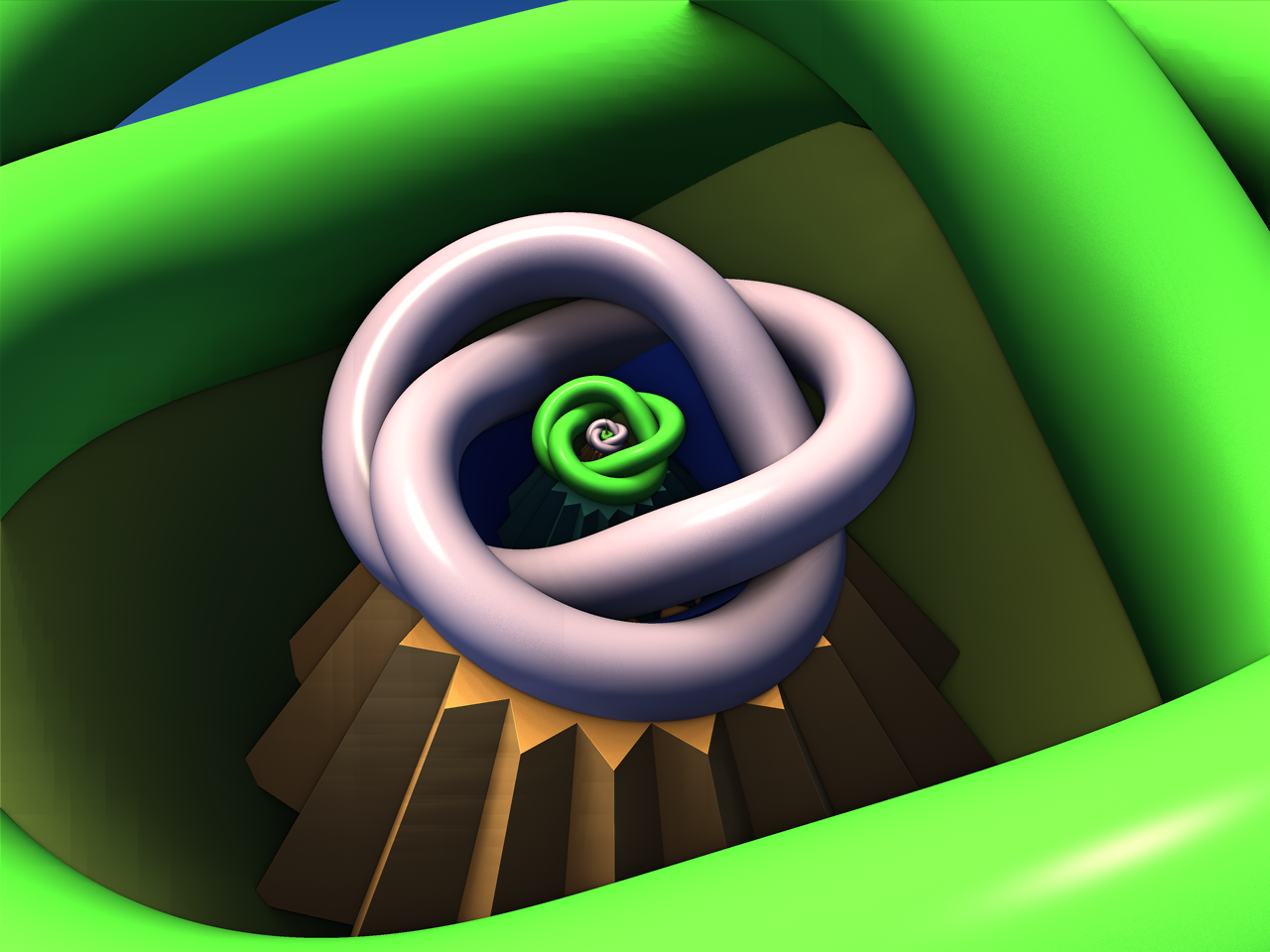
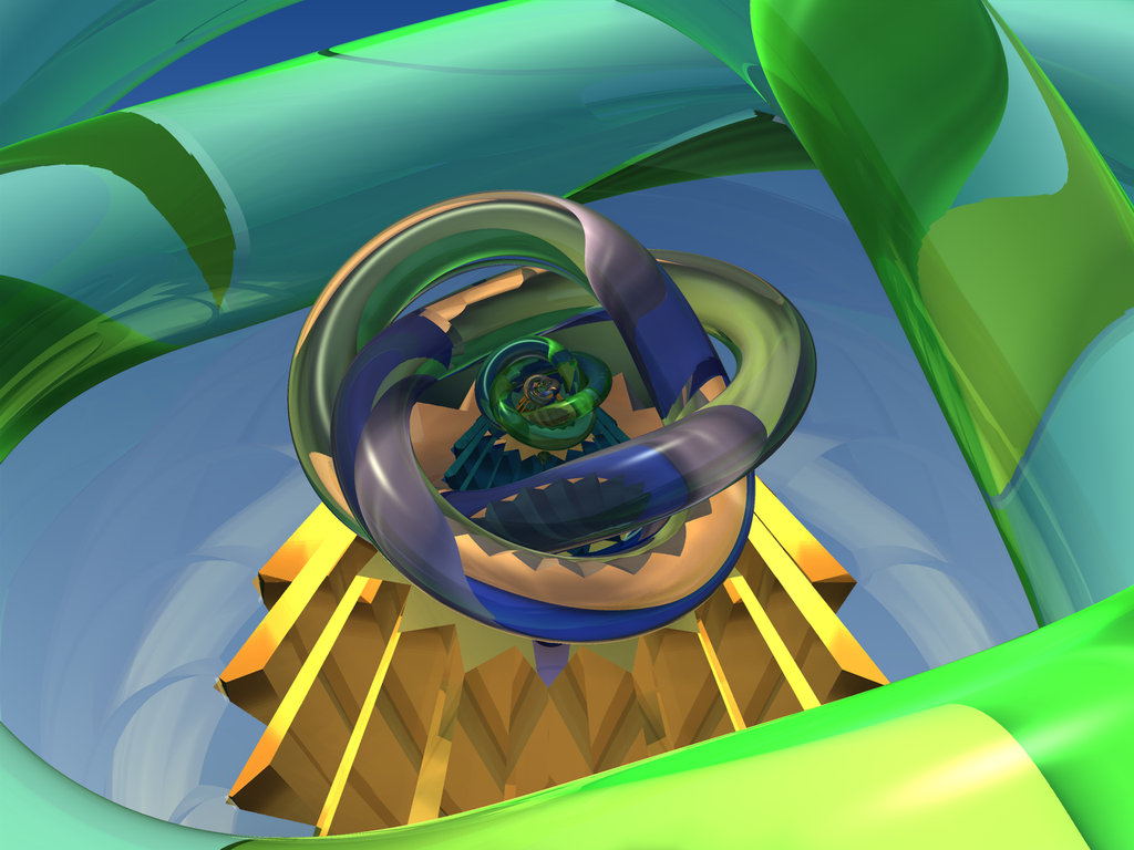
 ZeeShiKing — Processing Knots
Published: 2015-05-17 20:15:27 +0000 UTC; Views: 516; Favourites: 19; Downloads: 0
Redirect to original
Description
MendelBulb3DRelated content


Comments: 29

 (Smile)")

Thanks Linda. This one is original one, without any shadow and reflections stuff.
👍: 0 ⏩: 1
")


If you put a shadow under the pedestal it would look like the bottom is deeper perhaps and it's floating, just an idea. same with the knot, have a big drop shadow, play with the strength and distance til it looks like you want.
I am assuming you are comparing this to the other. one. great work though, love it.
👍: 0 ⏩: 1
Thank you so much for your comment.
Yeah, I was talking about these, I made three works because I didn't know which one is better.
I will try to do what you have mentioned. Thanks again!
👍: 0 ⏩: 1
That would have to be done in layers, by assembling each object in a editor like photoshop. As I said in the other reply I am not familiar with Mendelbulb. With fractals though, we can make several then use another program to manipulate them further. I think it is great work. At what point do we quit manipulating and leave it alone? One brush stroke too many ruins a painting. What we learn from the last art can be used to make better or different art next time.
👍: 0 ⏩: 1
I can understand what you mean. I have made a few fractals using multiple renders.
👍: 0 ⏩: 0
Thank you so much Han, glad you like this one too !
👍: 0 ⏩: 1
You know the new deviantart logo looks like my "Z"??
👍: 0 ⏩: 1

Yes, but your 'Z' is prettier, the new logo doesn't look well on the images,
it spoils the look of it sometimes.
👍: 0 ⏩: 1
hahaha, thanks.
Yeah, I don't like it too much, the big logo on the images was always a turn down for me, now it's much worse...
👍: 0 ⏩: 1
Yes, it is definitely 'turn off'
👍: 0 ⏩: 1


Thank you so much bro!
👍: 0 ⏩: 1

this makes me think of the secret mario playground
👍: 0 ⏩: 1
Thank you so much Karin !
👍: 0 ⏩: 1

You're very welcome my friend


👍: 0 ⏩: 0