HOME | DD
 ZERGEV — NewsTrick - Responsive WordPress Magazine / Blog
by-nc-nd
ZERGEV — NewsTrick - Responsive WordPress Magazine / Blog
by-nc-nd
Published: 2013-02-08 22:41:26 +0000 UTC; Views: 12101; Favourites: 74; Downloads: 240
Redirect to original
Description
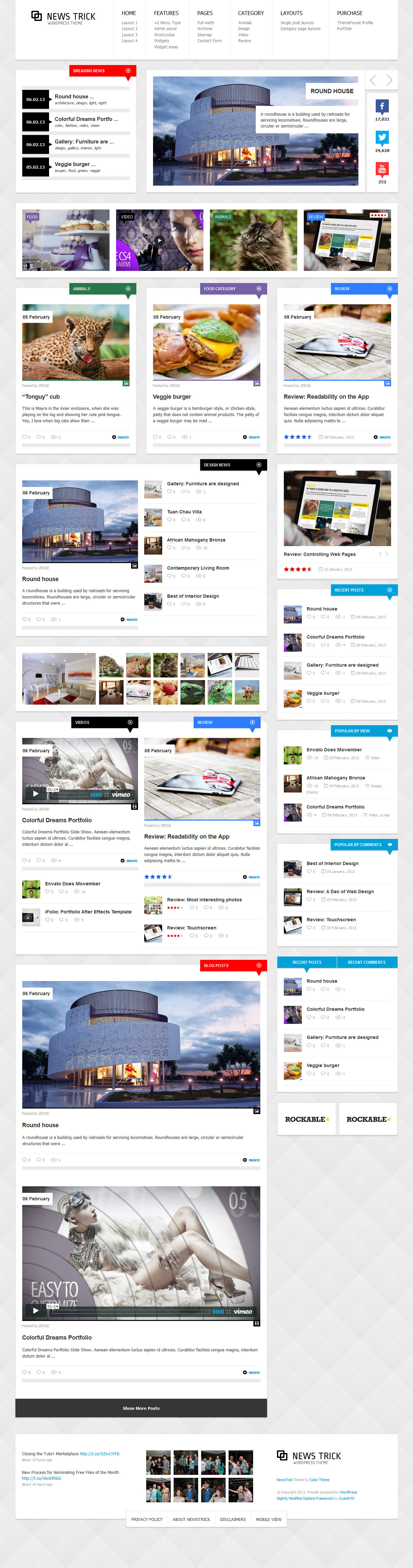
NewsTrick is a super-duper customizable, flexiblle, responsive WordPress theme for your Blog, Magazine or News website.NewsTrick can be configured to focus on your work, your blogging, or both. Theme is powered by the SMOF Options Panel, which provides tons of options to manage and modify any aspect of the theme – it is well suited for both beginners with no coding knowledge and developers.
It comes with 25 custom widgets, 25+ widgetized areas, 5 post formats (image, audio, video, gallery, standard),
8 Home page layouts, 5 Blog layouts and tons of theme options.
NewsTrick developed on the Bootstrap — beautifull boilerplate for responsive development so it look beautiful at any size, be it a 17” laptop screen or an iPad, iPhone.
Visit the responsive preview site and resize your browser to see it in action or visit NewsTrick directly on your mobile device.
----------------------------------------------------------------------------------
You can check out those WordPress Theme at the live preview.
Available for purchase on Themeforest for just $45!
Another projects:
Related content


Comments: 18

Overall
Vision
Originality


The website is great, but I notice the texture is too light and needs to be darken. I would like to see more o the white texture background, because I like the way the texture looked. You should darken the text on the website for people who cannot see very well, were the link buttons are. I like how you have a Facebook and Twitter account posted above.
The reason why I say these things is because that is how I was taught in College, maybe it just me, but I like to be able to see more the background. I find that the background could be a kind of a dark grey or a black, but again that is just me. For people who like to cannot see white text on text very well, you just have to turn the text black, for they can see it a little easer, (well, you get what I am saying, yeah.)
I love the images, because they are so well done, it almost like they are picture perfected. But, like always usually website have their photography done by
professionals to make it look good. The most I like about this website that it look so interesting that I would take a look around the website to see what is on this site and for people who love designs, would defiantly like more of design of the background. You could do more to the background than it already is, because in my opinion that good backgrounds make good webpages and nice too look at.
Well, but other than maybe the texture of the background and darken the text on the links, it would look good. Designing the webpage is really up to you. Over all, I must say it looks fantastic.
👍: 0 ⏩: 1

First of all, we want to thank you all of your feedback. Your comment are so important to us
 (Smile)")
👍: 0 ⏩: 1

 (Wink)")

Nice, nice! It's a clean and bright theme with dominancy of the grey and white. Not so complicated but attractive!
👍: 0 ⏩: 1

It looks great, just make sure you darken the link buttons for
people who have a hard time seeing on the website. But over
all it looks fantastic.
👍: 0 ⏩: 1

Dude you're amazing ! It's one of the best template i've could ever seen.
👍: 0 ⏩: 1


")