HOME | DD
 ZERGEV — TechDesk - Knowledge Base/FAQ WordPress Theme
by-nc-nd
ZERGEV — TechDesk - Knowledge Base/FAQ WordPress Theme
by-nc-nd

Published: 2013-09-14 19:31:17 +0000 UTC; Views: 3356; Favourites: 16; Downloads: 28
Redirect to original
Description
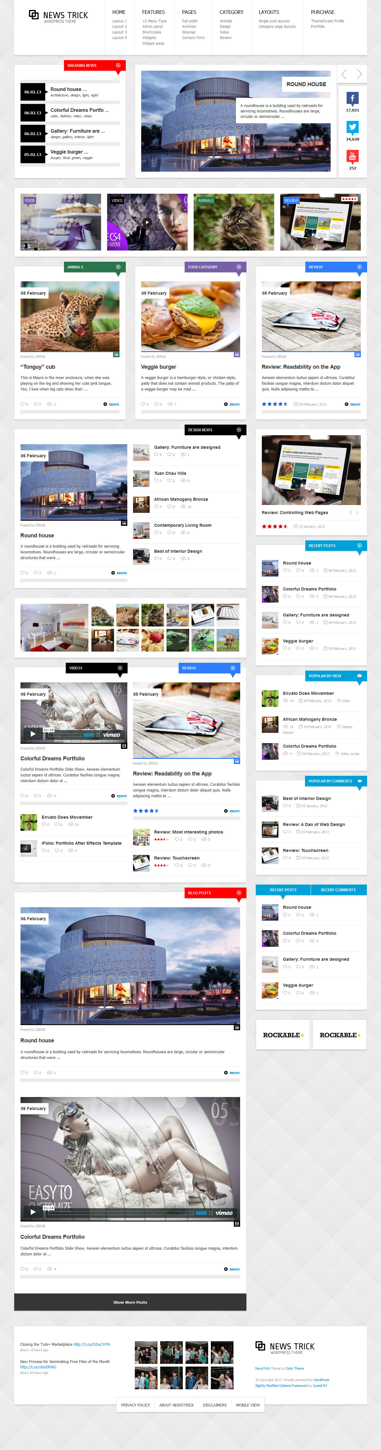
TechDesk – is a Helpdesk/FAQ/Knowledge Base WordPress theme.Clean and intuitive design with a tons of features & options: live search, widgetized areas, faq post format, shortcodes and much more.
TechDesk is a simple way to create your own Helpdesk/FAQ/Knowledge Base of information, with no technical knowledge or expertise required!
Theme is powered by the SMOF Options Panel, which provides tons of options to manage and modify any aspect of the theme – it is well suited for both beginners with no coding knowledge and developers.
It comes with 10 custom widgets, 5 widgetized areas, 5 post formats (image, audio, video, gallery, standard),
Unlimited Home page layouts and tons of theme options.
TechDesk theme developed on the Bootstrap 3 — sleek, intuitive, and powerful mobile first front-end framework for faster and easier web development.
----------------------------------------------------------------------------------
You can check out those WordPress Theme at the live preview.
Available for purchase on Themeforest for just $45!
Another projects:
Related content


Comments: 1


The first thing that grabs you are the colours and the layout. The use of boxes to separate things makes it very easy to differentiate between the various categories.
Subsequent viewings show the depth of planning that went into this layout, it's clean, minimal and bold when it could very easily have been cluttered or overwhelming. It also makes good use of the two column layout without being obvious about it, this could be either a good or a bad thing depending on your point of view. From the design point of view it's good, it separates this theme from others by not conforming to the same old conventions. From a UX point of view it COULD be bad in so far as the users having trouble finding things which would traditionally be on the sidebar or footer. That said it's seems to be aimed at people that are fairly technicaly savvy so this negates most of that issue and the general layout does the rest, so well done!
As far as technique goes this theme is perfect, the flat layout, use of boxes and beautiful muted colours are all lovely. I'm particularly fond of the blue used for the header and footer.
Now, onto my specialist subject, User Experience. Although UX isn't marked by DA I still think it's important to give feedback on it in a critique so here goes.
Apart from the aforementioned potential confusion over things like where the twitter feed is, which is a VERY minor issue, the UX seems to be spot on. The colours are good with no clashing or eye strain induced. The white text is soft enough that you can stare at it for a while before you feel your eyes hurting and there are no harsh contrasts. The font is easily legible and very smart, fitting nicely in with the overall feel of the theme, no jarring differences. The links are obvious and navigation looks like it would be easy so there are no UX issues I can see.
Overall this is a well crafted, stunningly designed theme which is unusual whilst still being familiar enough to facilitate good UX. Nice work! e.deviantart.net/emoticons/b/b… " width="15" height="15" alt="
")
👍: 0 ⏩: 0