HOME | DD
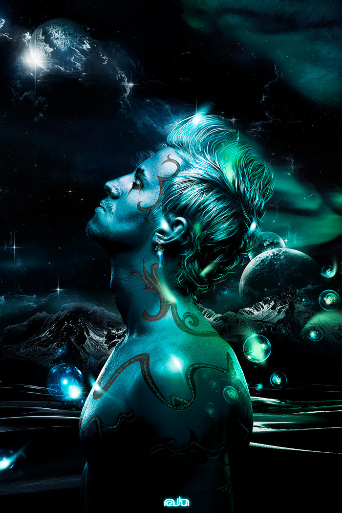
 Zerj19 — Ice Cold
by-nc-nd
Zerj19 — Ice Cold
by-nc-nd

Published: 2009-10-10 22:38:43 +0000 UTC; Views: 8735; Favourites: 95; Downloads: 5430
Redirect to original
Description
Wallpaper 1920x1200hit download!for full res!
----------------------------
It's been long since I've done a typography piece....
This was really quick but I liked the result a lot...
----------------------------
Stock:
sxc.hu for the background
Related content


Comments: 64


Interesting work!
A bit messy/random maybe, a bit overcontrasted,
but typo is cool, detail is great, nice overall.
👍: 0 ⏩: 1

yeah.. it's been so long since I've don a typographic piece.. I was thinking on doing something else with 3d but more polished..thanx for commentinf m8 I really appreciate it!
👍: 0 ⏩: 0


")


")

y para que quieres esa resolucion?? al res mas grande es 1920x1200 esa le cabe a cualquier compu widescreen o no...
👍: 0 ⏩: 0

 (Smile)")


kk thanks you can never know for sure
👍: 0 ⏩: 1

thanx bro glad you liked it!
👍: 0 ⏩: 0


cool!!
very very cool!!
but you should to submit it in the Text Art.
👍: 0 ⏩: 1
it is 3d it is tect art.. kinda unreadable so I just put ti on abstract.. may change that.. thanx!
👍: 0 ⏩: 1
ah I see ...
You're right now
👍: 0 ⏩: 0


I said that the quality is not that great, but overall it's a nice piece.
👍: 0 ⏩: 1


damn... this is EVK quality... im really impressed by this! great work!
👍: 0 ⏩: 1
you think so??? this is the only work I've managed to finish on the same day I started it...lol....really fast but I think it turned out well... a little unreadable tho.. that's my only concern..

👍: 0 ⏩: 1
true... and the motion blurs on the fragments is a little odd... it illustrates motion, but i dont think its needed.
👍: 0 ⏩: 1
it's wind...
I'm actually pretty amazed at the response it's gotten 'cause I really did it in like 2 hours -rendering time...
👍: 0 ⏩: 1
well, i think you found a new strength.. ^^ i think its one of your best... maybe not the best executed, but its the coolest looking one i think.
👍: 0 ⏩: 1
not the best executed??? mmmhhhh ¬¬ ^^
👍: 0 ⏩: 1
take volta or eterna for example... this one is visually probably your best, but the others look better constructed. this one on the other hand comes across more powerful, but the construction is not. its a fine line though... definitely on the fence with those 2. i think all 3 are some of your best... digital inc. is really great as well, but the motion blur or smudging you did makes it look at bit rushed. there are other ways of achieving that effect. either way this one is in my top 3 fav of all the ones you have done!
👍: 0 ⏩: 1
I like the one with the descontructed nekkid men ^^
👍: 0 ⏩: 1
yeah, ive been running slow on projects... only 1 in the past month.. i think im gonna do another project like separated, but not as part of that series...
👍: 0 ⏩: 1
| Next =>