HOME | DD
 ZEROresolution — Colour Comm: Black and White Knights.

Published: 2009-10-02 18:09:18 +0000 UTC; Views: 1278; Favourites: 16; Downloads: 21
Redirect to original
Description
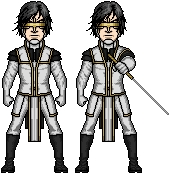
A colour commission forThe characters are White Knight and Eclipse.
Eclipse © White Knight ©
And superb Lines by

Did the background myself.
Related content


Comments: 13

I have to say amazing colouring... 
Then again i could be wrong about that! While i am still learning to colour digitally myself i feel that i should point out that it maybe a minor thing and it may only be bugging me but the lines upon the buildings edges appear harsh and not as well blended into the image unlike the foreground characters and the same with the moon... I feel also that you could have done a bit more blurring on the building the on the right of the guy dressed in white (one right next to his hood) its just simple strait lines and a little blurring would make it appear more like building! The background just needs to be a little softer so that it allows the people in the foreground to stand out that little bit more...
If... you dont mind me pointing this out that is... 
👍: 0 ⏩: 2

Hey I was thinking about what you said, so I tried blurring the background. check it out [link]
👍: 0 ⏩: 1
ah yes i do like that its not quite what i meant but the way you have done it shows the figures in the foreground better as the detail is lessoned but there is still that suggestion of the city scape within the background
👍: 0 ⏩: 1
Great, Thank you and Thanks to you.
Your input is always much appreciated.
 (Smile)")

👍: 0 ⏩: 0
You know.. You are actually quite right, it's not that often that I get a intelligent criticism on my works. It's actually quite refreshing, and I'll take your comment under advisement.
👍: 0 ⏩: 1
")
👍: 0 ⏩: 1

This is super, super cool! Nice job! Have you shown
👍: 0 ⏩: 1
Thank you. It's really great to get positive feedback from a professional.
yes, he really liked it
👍: 0 ⏩: 0


Yeah they do have a pretty cool look don't they.
👍: 0 ⏩: 0