HOME | DD
 zeruch —
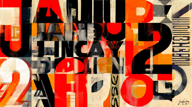
language is a virus II study

Published: 2004-04-23 08:04:30 +0000 UTC; Views: 3946; Favourites: 55; Downloads: 1298
Redirect to original
Description
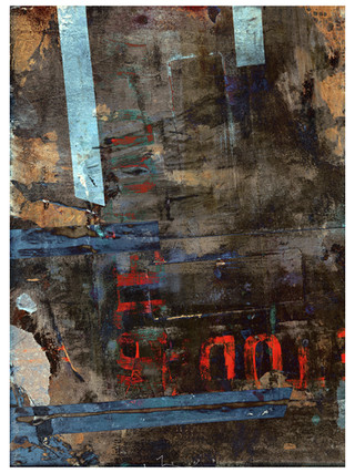
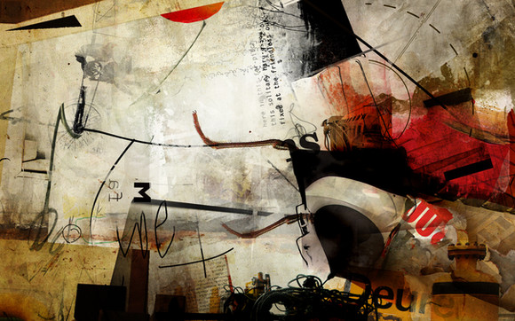
so this is another idea I am playing with using stencils (yep, I like Jasper Johns...sue me).acrylic paint, acrylic ink, pencil + digital
Related content
Comments: 64

Oh man,this is awesome iloveit. How big is the painting and how did you do the letters?. Ilove the idea and colours of painting.
👍: 0 ⏩: 0

Sue me too!! Johns is a god!! I wish he and Duchamp had done some sort of collab!
👍: 0 ⏩: 0

this is a really good idea..very cool very defined...i love the rapid color change. congrats on the daily deviation.
👍: 0 ⏩: 0

i did comment once lready right?! i just wanted to say well done on the daily deviation 
👍: 0 ⏩: 0

this is sweet as hell. for some reason it stood out in your gallery a great deal from alot of your other peices...even though they are equally as awesome. I'm loving the color and the texture and how the balance falls mostly on the left side...it makes it interesting.
👍: 0 ⏩: 0

this is freaking beautiful... I don't know how you managed to do this! O_O.... wow, awesome texture and all.... wow is the word...
👍: 0 ⏩: 0

just saying congrats on the dd
kindda late but still very well deserved u know that
👍: 0 ⏩: 0

stencils are -sweet- and yes, I will sue you...for blowing my mind up with such a beautiful piece!...heh
👍: 0 ⏩: 0

gives me a New York kind of feel, looks like something you'd find on a wall of a city hospital 
great work
👍: 0 ⏩: 0

I just want to apologise for my shoddy description of this. I had no clue that I'd have to write a description for the piece if it got chosen for the front page and was informed of this when I was in a rush.
But, anyway, congratulations! You know I feel you are one of DA's best... and if it were up to me, I'd feature all your work! 
...Well, back to homework.
👍: 0 ⏩: 1

You don't have to apologize for anything..I found it a pleasnat (albeit perplexing) surprise. I didn't realize that's how DDF got picked....
👍: 0 ⏩: 0

Interesting concept... there's nothing wrong with stencils!! I like stencils. Sometimes I know even my language gets confusing... so I just stop speaking for a while.
👍: 0 ⏩: 0

exelente , me recuerda algo en otra vida kizá "hail to the thief"
👍: 0 ⏩: 0

if there is one thing that amazes me about this deviation, its the texture in the fonts..
but theres not one thing that amazes me..
the whole lot does 
nice one
👍: 0 ⏩: 0

Excelent job with typography, and use of the negative space. I particularly like the T and A as they sort of cancel each other out.
👍: 0 ⏩: 0

wow...
this is a great work.
for letter-patterns, colors and surface matter.
I can definitely tell I'll be sneaking into your gallery now.
I really love this, the artistical references and the title, that was what caught my attention at first, which reminds me of some Burroughs writings...
take care
👍: 0 ⏩: 0

Simply gorgeous! Amazing texture, color combination, and general concept.
👍: 0 ⏩: 0

Well, once again, I am baffled by the whims of DA. Somehow this has been made a Daily Deviation Feature (thank you ~shebadapuddytat and %leodadominico ), but why this piece is bordering on unfathomable [it's been over a week since I submitted this, I didn't think it would go over well, and I certainly feel it is far from a complete idea...but hey, in two years here, I have been perpetually lousy at understanding the whims of DA).
I am thankful yet perplexed.
👍: 0 ⏩: 1

i suppose it would be fitting for me to say...
I'm speechless.
👍: 0 ⏩: 0

Great piece. Loveg the explanation of how you do it.
👍: 0 ⏩: 0

a classic and welcome piece
good to see more diverse styles around
im mighty impressed with that looming R
it looks dangerous and especially infectious
👍: 0 ⏩: 1

I am definately having a bit of fun with this stuff, but I have been struggling to give it a voice seperate from the obvious artistic references I am apeing...I'll get to a solution eventually.
👍: 0 ⏩: 0

Oooh... Chaotic. I like how there's so much overlapping going on. Makes everything look disorganized, but at the same time have the clean letter outlines show.
Yeah...
👍: 0 ⏩: 0

I think it's safe to say if Jasper Johns were to walk into your studio you would either start drooling or would soil yourself.
I love this piece. So classic, so stylish. Fantastic work.
👍: 0 ⏩: 1

i would probably be reduced to a stone silent clod...and I would probably then proceed to soil myself.
i actually only today figured something out that I needed to get out of the sheer aping of his stencil work (similar idea, different application and visual cues, which to date I had been trying to work out in a stunted fashion...now all I have to do is apply it in a useful execution).
btw, your avatar really looks like some early celluloid foreign film.
👍: 0 ⏩: 1

Yes......
I gave `mick-mick some examples to research for my icon, and I mentioned Metropolis and Jarmusch films. He says it's still in progress, so the final one will be up soon.
Hope all is well my friend.
👍: 0 ⏩: 1

All is well, and I do love Metropolis. I have alwasys wanted to see Fritz Lang's "M" but haven't scored it on any format yet. He has such an unsettling quality to his work.
👍: 0 ⏩: 0

This one was very successful. It's interesting. And Jasper Johns is pretty neat.
👍: 0 ⏩: 0

rather nice experiment. everything flows and fits together quite nicely and is very easy to look at and follow. always a plus.
i think i like the idea the most. the whole language being a virus thing, or atleast what i can pull from the title and relate to the visual work itself. the textures really have a somewhat diseased, virus like look to them. as do the different colors. the way it blends with the stenciled letters makes it feel and look even more like a virus. communicable. much like language.
very interesting. would love to see where you take this series. if you plan on continuing it that is. nice work.
👍: 0 ⏩: 0

This is really nice - and reminds me of a William S Burroughs quote, much used elsewhere "Language is a virus from outerspace"
👍: 0 ⏩: 0

Really interesting graphic work. The pencils work very well here on the paper. The way that's the letters mix them, and especially the colors which overlaps and creates some kind of "negative" tones. Great idea, really.
👍: 0 ⏩: 0
| Next =>
