HOME | DD
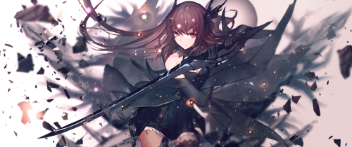
 zetherman — Ruby Rose (Rwby) forum sig

#forum #rose #ruby #sig #rwby #banner #signature #rubyrose
Published: 2016-09-11 20:44:40 +0000 UTC; Views: 1643; Favourites: 15; Downloads: 12
Redirect to original
Description
Still playing around with lighting effects and stuff.Resources:
Render by:
Originally from: www.pixiv.net/member_illust.ph…
Texture: frostbo.deviantart.com/art/Tex…
Fractal: frostbo.deviantart.com/art/Fra…
Bokeh by:
actual bokeh used: magnifiquen.deviantart.com/art…
Related content


Comments: 9

Judging by the previous sig I just commented, this one is better, and the ones in your gallery getting better pretty much each sig! Keep going!
This one isn't like one I've seen before either, I love the effects. The only thing I don't like is the font choice and color for the font. The rest of the image itself, is nicely done. Great job!

👍: 0 ⏩: 1

Yeah, I'm pretty bad with text, trying to get better with. Still learning. Thanks.
👍: 0 ⏩: 1
I'm terrible with text, often times I just settle on something very simple. When I'm feeling up to it, I definitely will take my time, and produce some nice text. Keep working at it and you'll always improve. ^^
👍: 0 ⏩: 0
Thanks, but I feel like it's a bit small
👍: 0 ⏩: 1

Eh.... it's big enough for me. I don't mind a bit of pixellation.
👍: 0 ⏩: 1
That's fair, I respect that.
👍: 0 ⏩: 0
