HOME | DD
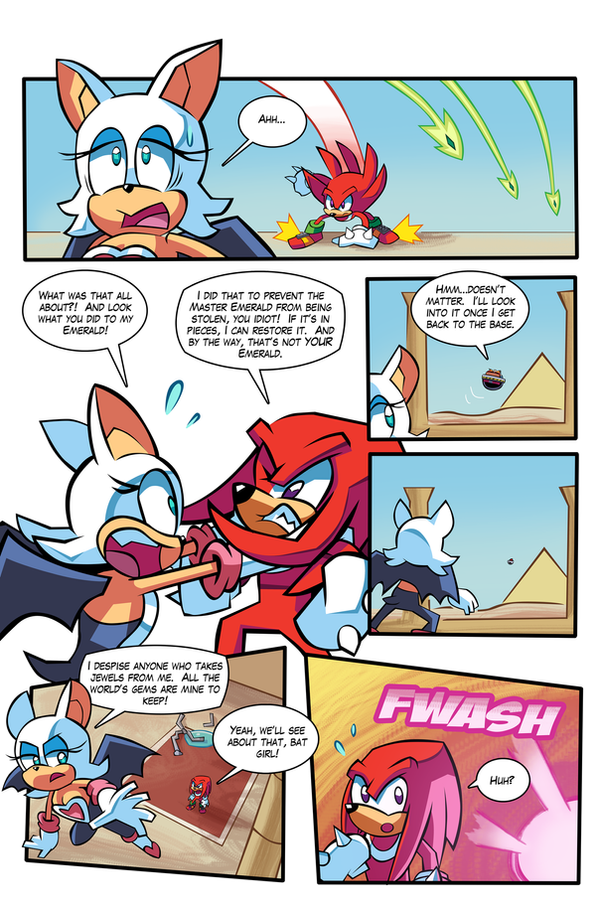
 Ziggyfin — SA2 COMIC Issue 1 Page 12

#amyrose #cityescape #comic #knucklestheechidna #rougethebat #sa2 #sa2comic #sega #shadowthehedgehog #sonicadventure2 #sonicthehedgehog #tailsmilesprower #eggmanrobotnik #tracyyardley #ianflynn #mattherms #wildcanyon
Published: 2015-11-02 17:36:28 +0000 UTC; Views: 11907; Favourites: 134; Downloads: 18
Redirect to original
Description
SONIC ADVENTURE 2 COMIC Issue 1 Page 12The feedback I've been getting for this comic is heartwarming. I'm glad you guys like it as much as I am enjoying making it!
NEXT PAGE: ziggyfin.deviantart.com/art/SA…
PREVIOUS PAGE: ziggyfin.deviantart.com/art/SA…
Related content
Comments: 42

👍: 0 ⏩: 0

👍: 0 ⏩: 0

coloring error on rouge's clothes in 4th panel? or am i nooty
👍: 0 ⏩: 1

Yeah I see, I made the wings together though they should be separated, thanks for pointing that out! I'll make sure she's on model next time around!
👍: 0 ⏩: 1

This is just a comic based but does not mean it's true in the series
👍: 0 ⏩: 0

Great artwork! Looking forward to the next but though if may I ask, why most of the art looks a little blocky? not criticising your work, I promise. I just came to wonder about it, is it your own style or is it due to the pen tool you use? KKS.
👍: 0 ⏩: 1

Thanks! No worries, critiques are always welcome! I take a lot of inspiration from the Archie Sonic art (Yardley and Herms and such) with a Sonic Battle flare to it. I love me some blocky/hard edges, and I found the easiest way to do that is with the pen tool. A lot of that is seen in the way I colour, but sometimes my blockiness shows in the inks as well, especially hands.
👍: 0 ⏩: 0

From Wild Canyon:
Yeah, Rouge, she's sexy and smooth!
A double cross spy-thief, that's out for my jewels, huh...
I'm feelin' her in mysterious ways.
👍: 0 ⏩: 2

Oh wow, that song totally slipped my mind.
👍: 0 ⏩: 0

Um... the artwork seems to have taken a bit of a dive on this page. Perhaps you should get more practice drawing Rouge first.
👍: 0 ⏩: 1

She does seem pretty wonky, eh? Especially that top panel. We won't be seeing her until next issue, so I'll make sure to practice drawin' her. Anything else I should work on?
👍: 0 ⏩: 1

Needs more tits.
Other than that, I wonder where you're going with this. If it's just to make a straight adaptation of SA2 in comic form, I don't really see the point. You're not contributing anything to a story that fans are already familiar with. So far it's a scene-for-scene reenactment of the game, and I wonder if there's anything new you will add to expand the plot. I hope you bring your own ideas to SA2's story, otherwise you're just retreading old ground.
👍: 0 ⏩: 1

Ah ha, haha I see!
I don't want to spoil anything, but there will be changes to the story, some big and some small. I'm trying to start us off in a familiar place, with small tweaks to a bit of the dialogue, but eventually as people read this we will explore more and introduce things that weren't in the game. My own spin(dash) on things!
👍: 0 ⏩: 0

No Chao in this issue, but they will be coming!
👍: 0 ⏩: 0

I like your art style. It reminds me of Crash Twinanity a little.
www.kokopolo.com/HOSTS/WEBBSTA…
👍: 0 ⏩: 1

I like this page!
But I have one critique, I can see if the page was larger then it would be easier to read what eggman says, but even when you zoom in it is hard to read what he says.
-------
Lastly 2 side things:
How do you do the lettering (Including text in text bubbles, the text bubbles themselves and the text sound effects and such? (I want to know because I am trying to learn how for the LTH comic.)
And I finished coloring all of GOTF Issues 1-4 that were black and white before so, Yay it is now done!
-------
Oh no its Navi the annoying fairy!
Also Rouge's face reminds me of this ( evanstanley.deviantart.com/art… ) [Just add "I'm a firing my Laser!!" to it.]
👍: 0 ⏩: 1

Thanks for the feedback! I changed the font of Eggman's lines to make it easier to read!
So I do all that in Photoshop. I make layers at the very top of the image and use the text tool to write each individual bubble (the font is up to you, but keep it comic booky!) Then below the text layers I make white circle/ovals with the circle tool (and sometimes different bubbles with different tools). On the layer with all the white I select it and select STROKE, then make the stroke black and the size of the stroke 15. If that makes any sense. Sometimes I'll fiddle around with the bubbles to make them go underneath characters heads and stuff, maybe one day I'll make a tutorial thing or something.
👍: 0 ⏩: 1

Thanks for responding and giving the feedback man, I am happy with how this comic is proceeding!
👍: 0 ⏩: 0

Oh wow! I love this! Straight from SA2B!^u^ Looks amazing!
👍: 0 ⏩: 1

Thankaloo! Glad you like it so far!
👍: 0 ⏩: 1

Awesomeness! I read it in their voices too Very Cool!
👍: 0 ⏩: 2


