HOME | DD
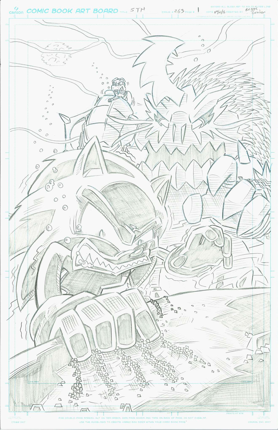
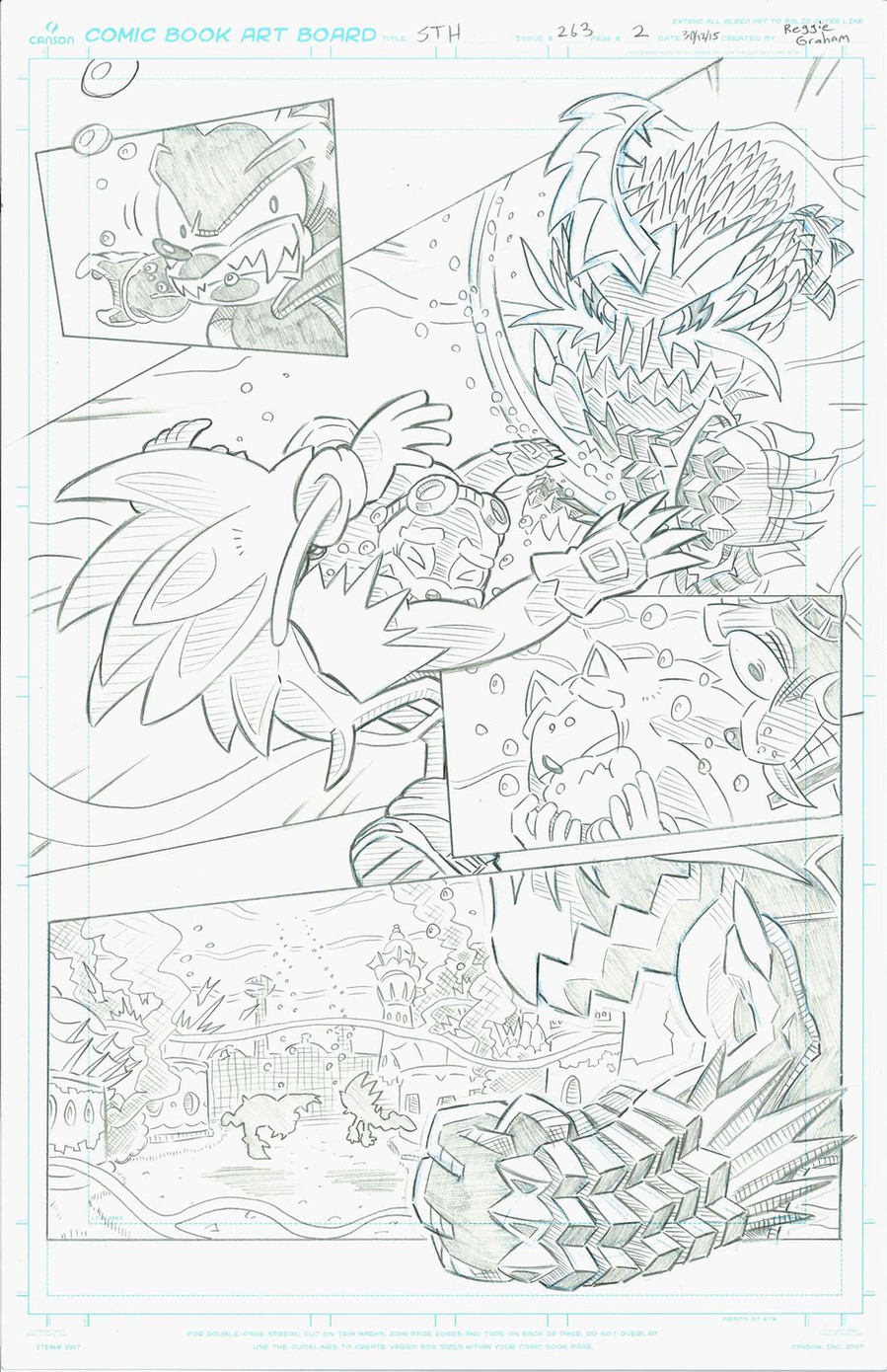
 Ziggyfin — Sonic Archie Re-Draw (STH#263 Pg1)
#comic #sonic #wavesofchange #archiecomics #archiesonic #comics #rotorwalrus #sonicthehedgehog
Published: 2016-01-11 16:02:08 +0000 UTC; Views: 1561; Favourites: 44; Downloads: 0
Redirect to original
Description
Hey guys, I'll be uploading a few re-draws I've done recently. Any criticism is appreciated as all I want to do is get better!")
Related content


Comments: 10

Overall

Vision

Originality
Technique
Impact
Awesome work on the page! I really like the layout of the page. It works really well, especially for a splash page.
First off, Your placement of the characters is nice and varied. You left little unnecessary space, except for a small corner, but that's great because of that large, pesky credits box. haha e.deviantart.net/emoticons/x/x… " width="15" height="15" alt="

The angle of the page is possibly my favorite part of it. Great choice of using a worms eye view! It really brings out the amount of struggle Sonic is having as well as the bigness of the monstrous beast. Personally, I think a larger emphasis on the worm's eye view and having the monster take up more of the page rather than the sand would make the page a lot more dynamic, but it's still pretty strong. e.deviantart.net/emoticons/s/s… " width="15" height="15" alt="
 (Smile)")
Personally, I feel like you did a better job than the published version layout wise.
Pencilwise, you have a really clean look to your pencils, and I'm super jealous lol. However, there are areas that don't have any clear direction. It's hard to tell if you wanted certain areas filled with black, or hatched, especially with the monster. Adding Xs to indicate blackout or darkening your shading can be super useful for getting rid of this issue.
Also, when shading, it's important to take into account that the page is going to be inked and colored. Covering the monster with lots of shading can be a nice thought when penciling, but it'll either be filled with black or hatching and it'll look really dark and some of the body parts will be meshed with others.
I’m not sure if this is an issue, but I feel like the characters are a tad blocky. I’m pretty sure this is part of your own style, but it looks very different than most of the Sonic drawing styles. Not sure if that could be considered off model. Honestly, I have no real issue with it and I kind of like it (it fits as an all ages look. e.deviantart.net/emoticons/b/b… " width="15" height="15" alt="
Anyway, it’s an awesome job on the page with a few issues with shading. Hope that was helpful, and not too harsh. (I hope I wasn’t OxO)
👍: 0 ⏩: 0


