HOME | DD
 Ziggyfin — Sonic Universe #28 pg 16 Re-Color
Published: 2012-06-20 16:40:31 +0000 UTC; Views: 4427; Favourites: 98; Downloads: 130
Redirect to original
Description
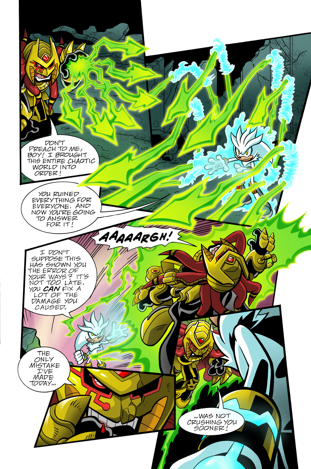
Writer:Pencils:
Inks: Jim Amash
Letters: Phil Felix
Colors: Reggie Graham (me!)
Related content


Comments: 28


Well, what can I say? It's awesome!
Not only does ZiggyFIn have the lineart of this amazing Sonic Universe issue but he recolors this awesome scene with jaw-dropping colors that lay as a beautiful remark of the color spectrum.
The colors of Enerjak's mystic Chaos powers are green and have a nice glow to 'em. Enerjak's color scheme makes him stand out as well as Silver the Hedgehog.
The shading and coloring techniques are impressive and the color choice is second to none.
A truly modest and well executed example of coloring a magical page drawn by Tracy Yardley! by none other than ZiggyFin!
👍: 0 ⏩: 1

Thanks for the critique my friend! Very thoughtful!
👍: 0 ⏩: 1

That's pretty good colouring there. Very bright and fluid in comparison to Steve Downer's more darker, grainier colouring. I think Steve Downer's colours were better though because this is set on a post apocalyptic world so the colours are SUPPOSED to be dark. Still though, this is pure awesome sauce contained in a glass bottle and I really commend you on your work. Nice one.
👍: 0 ⏩: 1
Thank you very much! It's true, no one can beat Steve Downer's colors.
👍: 0 ⏩: 0

It looks awsome, almost like in Archie Comics.
Lucky for Silver that Lara-Su was there.
👍: 0 ⏩: 0

Nope, hopefully one day. I just colored this because I bought the original page from the artist and scanned it.
👍: 0 ⏩: 1

Very excellent work! I love how bright and neon your special FX are. Are you rendering in RGB or CMYK? Just a few quick notes, looking it over:
1. With as bright and vibrant as your FX are, there needs to be more interactivity - they're a powerful light source and should reflect off your characters and backgrounds. Don't be afraid to up the contrast on Silver.
2. Speaking of interacting with the light... Your backgrounds in panel 1 and 2 are particularly drowned out. It's a delicate balancing act - you want the eye's attention on the awesome Chaos Spears and psycic powers, but don't want to lose the artwork. Try this: create a new layer set to a Hard Light or Screen, about 15-20%. Using your lasso select flat ridges of your BG that are facing the action. Fill these with a soft mint green. This should create a very light "glow" on your BG, popping it out and defining it.
3. Enerjak is looking a little muddy. The trick to rendering gold or metal or any similar texture - which, trust me, you'll have to put to use alot in any Sonic book - is contrast. HIGH contrast. The way light reflects off these surfaces is very unique and cool. Your highlights on gold should practically be white, and the shading a deep, dark, brownish gold. Still avoid the K or black tone here, too, if possible. You've got some great rendering going on - love that close-up in panel 4.
4. Depth of field, particularly in panel 5. Don't be afraid to darken Silver up a bit. He's in the extreme foreground, heavily inked, in a dark arena. Our eye wants to focus in on Enerjak taking off into the sky in this panel. To keep his features recognizable after darkening, change what are his white highlights on his fur now to a light green-ish tone, reflecting Enerjak's powers.
👍: 0 ⏩: 1
I'm rendering in RGB. Does it matter which setting I put it on? I'm really new to coloring as I just started last year and learned everything by myself through observing artwork in comics, so it feels great to hear some pointers from a pro. Thanks!
These tips are great and I'm really glad that you took the time to give me them. I'll certainly use this to benefit my work in the future. Also, I can't believe I was so lazy in the background for this one, is this background better? [link]
👍: 0 ⏩: 2
Definitely switch to CMYK. That's the set up for all graphic files that are to be printed. Switching can be a little jarring at first... I colored in RGB all though high school and up to my first pro gig, and it was a rough transition. CMYK will look a bit more dull on your computer screen, but you get used to it!
👍: 0 ⏩: 1
Oh dear, I was afraid of this. Well, you probably saved me a lot of the trouble I could've had through the road. Thanks so much! Now I'll be using CMYK for practice throughout the remaining 2 years of my high school. (and hopefully a pro gig too)
Thanks again!
-Reggie
👍: 0 ⏩: 0

Wow! Advice from the colorist that inspired you! I'm jelly! And you did a good job coloring yourself!
👍: 0 ⏩: 0

Comparing the official colors to your colors, your's are a lot more vibrant and "neon" like. Not quite as detailed, but Still great. Keep practicing!
👍: 0 ⏩: 1
Thanks for the input. Yeah, I'm trying to go for a more vibrant look. However, I'm basing my colors a bit more on a Matt Herms/Hunzeker style rather than Steve Downer(the original colorist for this comic). He has a style that's going away a bit from cel-shading with more strokes for his different shades of color whereas Matt Herms keeps things kind of simple, yet bright and fabulous.
I was trying to make this a bit faster than normal because I know the people who make it don't have much time. Ian Flynn told me that my last re-color was too detailed and would take to long to make for the book, so I had to make my new pictures simpler so I could get it done faster for practice.
👍: 0 ⏩: 0

When your famos remember your crazy icefox friend!!! Trololol
👍: 0 ⏩: 1

I like.
And with a name like Reggie Graham, you're practically made to work on comics!
Great work, bro.
")
👍: 0 ⏩: 1
True, it would be epic as well to be a part of Archie comics. Haha! Reggie? Haha? Haha....ha.
👍: 0 ⏩: 1

Is it a reference to something. I must not've seen it or don't remember.

👍: 0 ⏩: 1
Reggie is one of the main characters of the Archie comics. XD
👍: 0 ⏩: 1
I...must be before or after my time, then.
👍: 0 ⏩: 0
