HOME | DD
 ziinyu —
COLOR Primer - :Color + Value:
ziinyu —
COLOR Primer - :Color + Value:
Published: 2010-08-27 03:57:46 +0000 UTC; Views: 123732; Favourites: 3493; Downloads: 2530
Redirect to original
Description
COLOR THEORY : Primer (v 0.1) 9/29-10Submitted to #contribution-box : 8/26-10
This is not a technique tutorial, it is a formal introduction to the principles of Color Theory, that can be applied across all visual media. The goal of this tutorial is to provide a reference source for discussion about color theory as well as value development.
col·or noun, often attributive \ˈkə-lər\
- Merriam Webster Online Dictionary
PART 1 - COLOR
When we talk about a color, what do we mean? Is it a Hue? A Value? Perhaps a Saturation?
Hue
The identity of a color as defined by its relationship to what are considered the "pure hues" (RED, ORANGE, YELLOW, GREEN, BLUE, VIOLET, etc.).
Saturation (Intensity, Chroma)
How intense or dull a color appears relative to other iterations of itself. The "pure hues" are considered to be highest saturation in that hue, with all other tints and shades being of a lowered saturation.
Value (Lightness, Darkness)
How a color relates to pure white and pure black. This interacts distinctly with hue and saturation as in the two common color spaces (CMYK and RGB) the values of the primaries are not equal.
(Notice how all of these properties are relative to some standard or themselves, this is one of the key attributes of color theory, but often goes the most neglected.)
In reality color refers to all of these things, and as a result the range of the Visible Spectrum is quite expansive. Quite often the grayscale swatches are not referred to as colors, but for the purpose of this tutorial we will use them interchangeably with colors. So how do we organize all of these colors, recognize them, recreate them. and most importantly utilize them? The answer is dependent on the Color Space in which we are working.
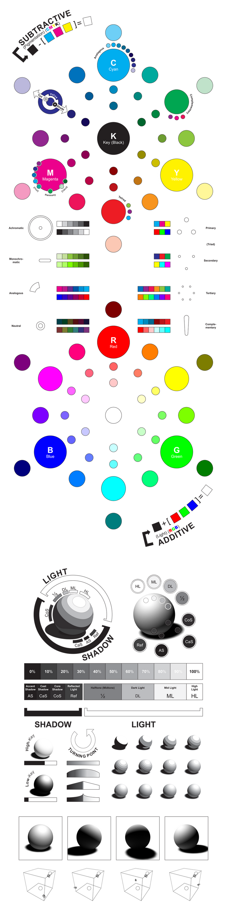
1A : Color Space
The term "color space" refers to a collection of the visible spectrum that can be represented by a combination of primary colors. This means that a color space doesn't actually represent all colors that can be seen by the human eye, it forms an approximation (of course the visible spectrum can be thought of as an individual color-space, just a complete, expansive space).
Now it is important to note that most color spaces that come close to approximating the visible spectrum use at least three distinct axes. Be they CMYK or RGB or even HSV, whatever the primaries of a color space, they define the total range of colors available to that space. These are just the common color spaces that have been used because they are easy to reproduce, they are to some extent standardized. Really, there are infinitely many color spaces, and often you have the need to create your own. Take the act of painting with a limited starting palette. If you initiate your painting with the pigments of Burnt Sienna, Phthalo Green, and Titanium White, you have provided yourself with a color space, that is, all colors that can be created by blending those three primaries. This means that colors exist in three dimensions, but in most media we can only actualize and visualize them in two. Be certain not to limit your spectrum to your chosen visualization method.
Common color spaces :
- CMYK Subtractive (Pigmentation)
This space refers to the physical spectrum, colors that are created with pigments. Painting hues can be represented within this spectrum (be the medium oil, acrylic, encaustic, watercolor, etc.). This specific color profile is used for printing purposes as it uses the three primary colors of ink (CYAN, MAGENTA, YELLOW) (as well as a key, BLACK) that have become standards in the print industry (electric printing as well as screen printing and other manual methods).
This is a Subtractive color space, the colors must be subtracted from black to generate a white surface.
(A simulation of a CMYK color wheel is shown above - simulation as it is CMYK as interpreted by the RGB used in the color space of LCD monitors.) - RGB Additive (Light)
This is a spectrum referring to light as defined by the primaries (RED, GREEN, and BLUE). This spectrum is used for the digital industry, as LCD screens work based on a combination of these three primaries being combined within each "pixel".
This is an Additive color space, the colors must be added to black to generate a white light. - HSV (HSB)
This uses a polar representation of color. The hue is indicated in a number of degrees, while saturation and value distinguish a unique two dimensional color space for each hue.
Color profile refers to a specific method of referring to a distinct color (for example, sRGB or Pantone), while a color interface is a method of visualizing a large range of colors. A common color interface is that of the Color Wheel, and for good reason, it allows us to view distinctly at least two of the three axes of our color space, and extrapolate the third.
1B : Color Wheel
Two color wheels have been provided above, one for the subtractive standard (CMYK) and on for the additive standard (RGB). Outside of the standard ring of pure hues tints and shades have been added to indicate the nature of the blending. Please be aware that the creation of a color wheel requires decisions about axes to be determined, and as it is only a projection, some things must naturally be left out. These wheels use the standard pure hue outer ring and mix to pure white and pure black in the center (rather than directly blending across, developing a gray in the center for a CMYK color wheel), this means that the neutral colors do not exist in this projection.
So the color wheel, why do we use it? Firstly because it is a simple method of showing many colors as related to hue and value (or saturation, if we choose to create our color wheel). Secondly because, being circular in nature, it lends itself to simple color scheme palette selection and harmony creation techniques. Before we get too far into harmonies and color contrasts, let's define the parts of the color wheel.
Primary (Axes)
The primary colors are named as such because they are the purest of colors, they cannot be formed by any combination of colors in the color space.
Why is it that cyan-blue and cyan-green do not combine to create cyan? The answer is that the color of pure cyan is unchanged by the inclusion of any other color. If we combine a color composed of cyan and magenta as well as cyan and yellow we end up with a color containing all of these primaries. In reality, instead of creating cyan we have created a darker, more neutral, and less saturated shade of cyan, but not the primary itself.
Primaries are considered "pure hues".
The color wheel shown above is based off of a CMYK color space, but the RYB (RED, YELLOW, BLUE) color wheel is traditionally used to represent pigmentation.
Secondary
The secondaries are the next most pure colors, they are created by mixing equal parts of two of the primaries.
Secondaries are considered "pure hues".
Pure Hue
The circle that contains the secondaries and the primaries is considered the circle of pure hues, it is the circle of highest visible saturation on the color wheel. Other circles in the color wheel concentric to this one contain the same hue distribution but vary in value and saturation.
Traditionally, this circle is the outer bound of the color wheel, as showing the outer tints or shades (depending on subtractive or additive) would create too much imbalance in the overall value representation of the color wheel.
Tertiary
Any color that exist in the circle of pure hues that is not a primary or a secondary is considered a tertiary color, or the third level of a pure color. As with secondaries, tertiaries are composed of only two primaries, but not in equal ratio.
Traditionally we think of six tertiary colors as those hues located halfway in between a primary and a secondary. When using a RYB color wheel (the most common pigmentation wheel, but more limited than CMYK) these are the colors with hyphenated names (Blue-Green, Yellow-Orange, etc.).
Tint
A tint is any color that has been shifted closer to white, it is a lighter version of the initial hue. Tint can be used as a global term (anything lighter than the pure hues) or locally (lighter than a relative hue).
To create a tint of a pigment color, it must be used in lower opacity or be added to a white pigment.
To create a tint of a color of light, a ratio of the primaries (RGB) must be added to the current color. If an equal part of each is added a desaturated tint will be created, while if they are scaled relatively (a zero value remains zero) a brighter version of a darker color will be created, retaining or increasing relative saturation. This means that a tint of a fully saturated color must be lower in saturation (the same occurs in the HSV color space).
Shade
A shade is any color that has been shifted closer to black, it is a darker version of the initial hue. Shade can be used as a global term (anything darker than the pure hues) or locally (darker than a relative hue).
To create a shade of a pigment color, it must be added to a darker pigment (in CMYK this is the Key, or BLACK) or mixed with the compliment. Mixing a hue with a compliment actually produces a neutral color, closer to a gray or an earth tone, and while creating a shade of the original hue, it also adjusts the saturation.
To create a shade of a color of light, less of the primaries (RGB) must be used while retaining the current ratio (changing the relative saturation), or removing an equal portion of each (changing the hue but retaining the saturation).
Neutral
A neutral color is a color that does not exist naturally within the projected color wheel, but still has a place in the color space.
In pigmentation, a neutral is formed of all of the primaries used in unequal (or even equal) proportion.
In light, a neutral is created by adjusting a hue linearly (not to scale) from its current position, usually creating an unbalanced ratio between the three primaries.
Aside from simply locating elements, hues, tints, and shades, the color wheel's great strength comes from the ability it gives us to visualize color relationships. The true strength in color material, versus simple black and white gradations, is in the depth and complexity of color relationships. When designing a piece, the artist creates a color scheme that reflects both the content and the concept of the piece. This allows them to add yet another level to their composition (in addition to shape layout and value), that of color interaction. Certain colors when placed in relation to others will visually become striking (contrast), advance or recede (temperature), or create unity or discord (harmony and disharmony). By manipulating and carefully selecting the colors of a piece (and their use within it) the artist is given a distinct and expansive set of tools with which to communicate their art.
Contrast
Color contrast is similar to value contrast (in fact contains it as a subset if the grayscale range is considered to be within the color space). The contrast between two elements is their distance in their color space.
As color has three elements (Hue, Saturation, and Value), there are three ways in which two colors may be contrasted.
- Hue : Colors that have opposing hues (called complementary colors) have the highest level of hue contrast, while close hues (called analagous colors) have a low hue contrast. Hue contrast is not as strong as value contrast, but still quite apparent if properly used in a composition. In a color wheel representation, hue contrast is the angular distance between two colors (the smaller the angle the lower the contrast - the higher the greater the contrast).
- Value : The value contrast is the difference in the lightness and darkness of two colors. A very light color (10% gray in value) appears very prominently against a dark color (90% gray in value) (high contrast) but rather dull against a color with similar value (15% gray in value) (low contrast). This is the strongest of the three forms of color contrast, it has its basis in grayscale value contrast. In a color wheel, this is the radial distance between two colors.
- Saturation : This is a contrast between the intensities of colors. A very bright color (such as a pure hue) will have high contrast with a dull color (such as a tint or a neutral). This is the weakest of the forms of color contrast
As there are three distinct forms of color contrast, combining them allows for many levels of contrast between colors. Colors may contrast on one level, many different levels, all levels, or none. Two diametrically opposite colors (in contrast, not in the color wheel) will contrast on all levels (such as a bright, intense violet, and a dull dark yellow), while two close colors may only differ slightly on each (such as a simple blue, and slight tint of cyan).
Simultaneous Contrast
An effect which occurs when two colors are identical on two of the three axes and perfect opposites on the last. Primarily this is seen when two distinctly different hues (such as complements) have exactly the same intensity and value. It results in a strong discomfort and creates the illusion of chaotic interaction. If used intentionally, it can be used to impress upon the viewer an unsettling feeling.
Temperature
Color temperature is both used in a global color sense (relating a single color to the entire color space), and in a localized sense (relating a color to another adjacent color. It groups warm colors and cool colors and allows certain relative statements about each group to be made. Effectively, the warm/cool structure divides the color wheel (and concurrently color space) in half and allows the entirety of each half to be treated as a complement to the other half.
- Warm Color : RED, YELLOW, ORANGE
The warm colors lie around the red/yellow area of the color wheel. Warms are generally thought to advance in perceived space. In the spectrum of visible light, this shift happens between yellow and green. It is important to distinguish that even within the warm half of the spectrum, there may be relative warmth, with red generally being regarded as warmer than yellow (though this may be affected by saturation variances). - Cool Color : BLUE, GREEN, VIOLET (equivalent of Magenta in light)
The cool colors lie around the blue/green area of the color wheel. Cools are generally thought to recede in perceived space. In the spectrum of visible light, this shift happens between yellow and green. It is important to distinguish that even within the cool half of the spectrum, there may be relative coolness, with blue generally being regarded as cooler than green or violet (though this may be affected by saturation variances).
Warmth and Coolness are often considered in the effects of light and shadow (as they are attributed to the spectrum of light emitted by a black body, though the actual temperature scale has been reversed). A warm light will leave cool cast shadows, while a cool light will leave warm ones (really each will leave the direct complement in the additive/light color space). Usually this effect is very slight and will only be noticed in an exceedingly warm or cool lighting situation, but an artist may manipulate the effect to accent the contrast (hue contrast) between the light and shadow halves of an object.
TODO :
Related content


Comments: 185

Thank you for sharing and making this awesome tutorial!!!
👍: 0 ⏩: 0

small question:
i have tried and tried to make pinkish neon violet but i CANT!!!
how do i do this?!
👍: 0 ⏩: 0

Please.. someone can help me? I'm very confused.. everyone and even in Japanese magazines they talk about a scheme color and how to pick up colors that match each others... but still i don't understand how to picking colors, based to that color weel... these tutorials show only theory, but in the actual, it's not easy..
I read this tutorial, but I have just confusion of colors and nothing else.
I'm doing a drawing and now finished lineart, I need to choose colors. I'm starting from the brown of hair.. but I still don't understand what colors match with brown better... there's tertiary colors, double color, 4 colors in the color weel... but how to actually use ? I dont even seen the brown I want in the color scheme, how can I know how to count to get the colors that match?
I 've read this (it says 'be careful to select colors that match your brown"--- yes.. but how?
pronouncedyou.deviantart.com/a…
They explain about tertiary color, etc but still when I come to color my own drawing... I can't understand what color take . All that I know is that Ive decided the color of hair (light brown). All the rest, I dont have idea how to picking up the correct colors that give the drawing a nice coloring (because the perfect colors calculation before choose a color. I dont want to use casual colors)... I'm so confused...
See how they choose perfect colors?
sta.sh/07u5zegsk48
sta.sh/0xv6j9f6bpi
sta.sh/016684815jec
👍: 0 ⏩: 0


I love you. You just summarized my art class in an image.
👍: 0 ⏩: 0

Thanks for this tutorial.
I guess it will become more useful over time as I learn more.
Colo
👍: 0 ⏩: 0


Am gonna use this........................................am gonna use this now!
👍: 0 ⏩: 0


Thank you! This is really helpful for my school project.
👍: 0 ⏩: 0


Very nice presentation! My only concern is your black value. I know CMYK black looks grey on a monitor but for the sake of the presentation I think you should've used RGB black because CMYK black is in print deep black and not dark grey.
👍: 0 ⏩: 0


Very in depth! Thanks for taking the time to make this!
👍: 0 ⏩: 0


This is a great tutorial. I'm a little overwhelmed at all the information in it, right now, but I am going to start with the basics and go from there. I'm going to be tutoring some kids in art, starting next month, and I want to discuss color theory first thing. Well deserved DD.
👍: 0 ⏩: 0

I'll be sure to read it thoroughly. My biggest problem is with shading and light sources. For some reason I can't shade if my life depends on it.
👍: 0 ⏩: 0


Lovely and detailed, this is a fantastic reference~ Nicely presented, and thoroughly comprehendable.
Wonderful collection of tips and definitions! ")

👍: 0 ⏩: 1

Thank you so much!
Definitely - I mainly wanted to use this piece to get people thinking about color a little more systematically. I wanted a nice visual glossary to get ideas and inspirations going. Sometimes being able to talk about something, to have the word for it, gives enough of a handle on it that it becomes easier to think about!
 (Smile)")
👍: 0 ⏩: 1


You are very welcome! I'm so glad you found it useful.
👍: 0 ⏩: 0

Heroism indeed!
I'm glad you like the piece!

👍: 0 ⏩: 1

Thank you! I'm really glad you found it so!
👍: 0 ⏩: 0

You are welcome! I'm glad it was helpful!

👍: 0 ⏩: 0

Thanks! I appreciate the support (and caps)!
👍: 0 ⏩: 0

I'm planning to start Manga Coloring, and this tutorial might help.
👍: 0 ⏩: 1
Glad to hear it is being put to good use!
👍: 0 ⏩: 0

As someone who is desperately trying to learn about lighting and color theory, this is heavensent. Thank you
👍: 0 ⏩: 1
You are so welcome!
If you want the truth the the easiest way to learn about it is just to experiment with it! Grab some paints and get a'mixing! Observe everything around you, how different kinds of light treat different kinds of material, all the nuances in shadow - there's so much to be seen!
👍: 0 ⏩: 0

wow this one i looking for painting to printing this is usefull thank's alot
👍: 0 ⏩: 1


Glad to hear it!
I've only just started making informatics and teaching devices like this, so I'm happy that it doesn't come across as too convoluted.
👍: 0 ⏩: 0

So when choosing colors for a piece...are we choosing based on whether or not we want to piece to be warm or cold or...what? See, I get all of this but when it comes to choosing colors that work and are strong often fails for me. So I don't know.
I don't even know what I'm trying to ask.
Just know that I suck at choosing colors and this tutorial is awesome.
👍: 0 ⏩: 1
So here's the gist of it!
Choosing colors is always a difficult process, why? Because there are infinitely many choices! What's important though is that the choice you make for a piece is based on how you want color to compliment and enhance that piece. Everything should be intentional, nothing arbitrary!
For example, say you have some painting of a woman who is totally depressed, except for a few glimmers of hope her and there, maybe she is remembering her long gone family or whatnot. Anyway, you take your subject matter and start making choices based on it! First choice, maybe the color purple resonates depression with you (it does for me at any rate) so let's start with that as a base. Now I have this purple scheme going and maybe I introduce some other similar/analagous colors (close to each other on the color wheel) like indigos and some lighter blues for highlights. Cool (literally, this is a cold color scheme). But her memory is a much happier time, in fact it's totally opposite from what she's feeling now. So the next choice I make is to represent this opposite emotion with the opposite color, yellow. So I paint her memories in yellow, ochre, and gold. They need to blend at some point for mid tones, so we add some earth colors in the in-between (beige, olive, peach) and play them off of each other in the composition. Just like that - theoretical color scheme!
You'll start to get a feel for your own approach and style for color as you use it more in your work! It's really just another tool (like line, form, shape) in your repertoire of ways to make an image say something. The important part is that your choices reflect your intention with a piece, and help it communicate your meaning!
Let me know if you need any extra pointers or want me to take a look at something!
👍: 0 ⏩: 0

| Next =>