HOME | DD
 zilla774 — Godhead

Published: 2004-05-28 16:05:09 +0000 UTC; Views: 15865; Favourites: 173; Downloads: 13257
Redirect to original
Description
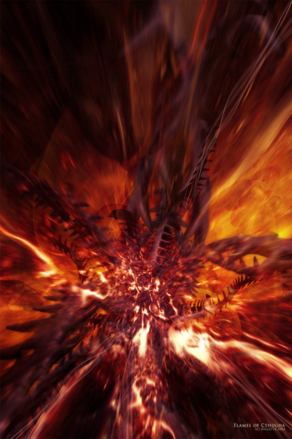
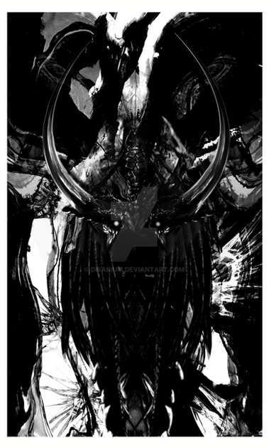
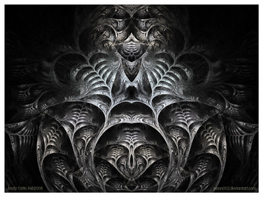
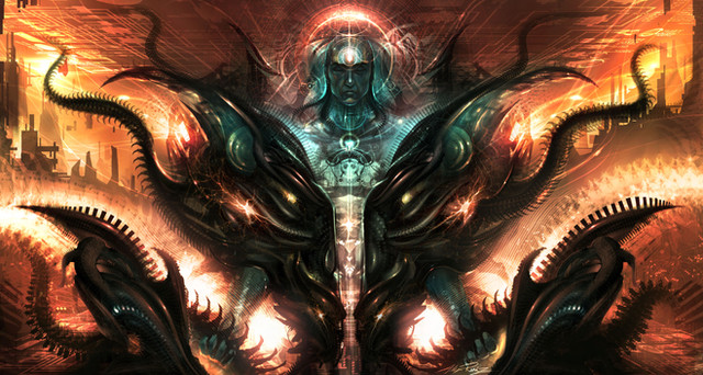
a little bit of a departure from urs truely on this submission.After feeling a little bit lost with my work recently I've been trying out new ideas and techniques in a bid to break myself out of the Artists Block I seem to be in.
Its really frustrating when I get into one of these blocks as when I do I start to doubt my abilities and judge everything I do as having to be *better* than the last one. Why can't it just be *different* ?
This piece was created after playing around with Cinema 4D. I'm kinda getting into C4D, although Matrix Extrude is both a blessing and a curse, great for the instant effect it gives u, but bad cos it looks like every other Matrix Extrude Deviation out there....
As with all my work, this is an experiment. It may work, it may not. I like it in a kinda 'symmetry meets Satan' sorta way. Hope u do too.
EDIT: as ~polyboom has rightly pointed out, this image works even better flipped 180° !!!
If enough of u prefer it like that, I'll resubmit it the 'right' way round.


Related content
Comments: 124

I don't think your talent is fading. this is incredible!
👍: 0 ⏩: 0

very interesting and different for sure.
love the render... very kewl and i really like the brushing work on it.
nice coloring too!
great job
mP
👍: 0 ⏩: 0

I don't normally go for abstract pieces, but this really stands out. Perhaps because it's less abstract, with its smooth curves and almost structural-appearance, it hints more at being several different pictures than one normal picture. I wish my artistic blocks were as productive as yours
I tend to agree with the 180o thing as well. It looks very daunting and imposing from that angle.
Oh yeah, and
👍: 0 ⏩: 0

the turned version by 180° and it looks much better. But this one is awesome!! Really good job
👍: 0 ⏩: 0

*turns laptop upside down* 
👍: 0 ⏩: 0

i cant understand how you do things like that...
is amnzing babe, i like the two way, this way and fliped
love the textures and lighting, this smoking atmosphere and organic colors, yep, grear wok, as always
👍: 0 ⏩: 1

wow thats really good, what did u use to make it? +++favs
👍: 0 ⏩: 0

phew hardcore style! looks damn good but i think its a bit too dark to be god ^^
nice work you did there! keep it up
👍: 0 ⏩: 0

ok man how do you did that amazing SHIT!!!! .. you should post a tutorial !!!!! 
👍: 0 ⏩: 0

damn tight dude, sexy colours and symmetry rocks. Reference to the goth-rock band or? either way, great work
👍: 0 ⏩: 0

great stuff man really amazing piece. . . . liking the colours alot
gunna have to be another 
👍: 0 ⏩: 0

At first I thought of a futuristic dungeon, but when I flipped it, it makes it look like some kind of awsome throne room. I love it! I have to agree with everyone else, 180 is definitelt better for this peice. THIS IS THE BEST!
👍: 0 ⏩: 0

I like it the normal way :d its more intimidating....absolutely fantabbydozy....
👍: 0 ⏩: 0

Man this look twisty beautiful!!!!!
to the fav this goes!
👍: 0 ⏩: 0

Lovin' this, awesome work, I really want to learn how people make these types of works, usually all I can come up with are repetitive abstract type things, but things like this appear as more of a machinery look. Very nice job +fav
👍: 0 ⏩: 0

wow, looks great, i love that render and the brushing/lighting is awesome +fav
👍: 0 ⏩: 0

That's cool! I've got to find that Cinema 4D. It's AWESOME looking.
👍: 0 ⏩: 0

This is so cool, good work on this. 
👍: 0 ⏩: 0

Very awesome...I like how it has some implied motion to it...
👍: 0 ⏩: 0

Wow. Cool. It reminds me of Boris Vallejo's stuff... except without the hot fantasy chicks. ; >
👍: 0 ⏩: 0

love superior light and deslike inferior lights and brush
👍: 0 ⏩: 0

Aye-maye-sing.
*gets out PS* *flips*
Aye-maye-zing.
Outstanding render, beuatifully done brushing. Lighting and perspective *mwah!*. Gorgeous.
👍: 0 ⏩: 0

Just dont like the colors, the rest of all composition is nice.
👍: 0 ⏩: 0

"EDIT: as ~polyboom has rightly pointed out, this image works even better flipped 180° !!!"
I agree. Don't get me wrong, this a great wallpaper but flipped it has a nicer movement to it I reckon.
👍: 0 ⏩: 0

that's 'good'. very good. the symmetric look and the head like proportions... well... looks a bit alien like. i don't think i want such a god. 
👍: 0 ⏩: 0

THIS IS A MA ZI NG !!!
Super + Fav ! I wish I could Fav it twice
👍: 0 ⏩: 0

Huh. It's really good. A bit diffewnd from your older works. Nice 2d lights.
👍: 0 ⏩: 0
| Next =>

