HOME | DD
 znodden — Introduction

Published: 2011-07-22 00:41:32 +0000 UTC; Views: 4911; Favourites: 260; Downloads: 77
Redirect to original
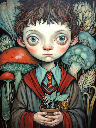
Description
Heh.[link]
Related content


Comments: 49

Overall

Vision
Originality

Technique
Impact
youve done a good job creating a friendly, warm piece. the composition and colors both go with this. mistakes are largely technical. the implied perspective looking at the top half of the piece would have the girl standing a tiny bit farther back instead of at the same distance as the guy. some forms arent implied well, namely hands, his hood, the brown shape between girls arms, his left lower leg (looks flat). another main thing is the guys head anatomy... the nose and mouth imply that his head is closer to a side profile orientation but his hair tells us otherwise. its not horrible because of the style you are using but its noticeable that something isnt quite right. also with the ear, even at the orientation he is at, we would see not just the back but some of the (front? sounds weird to say front of an ear) rest. i dunno bout his head id recommend looking at photos of faces at the angle, flip your drawing back and forth (this is if you really want to fix it i understand if you want to move on; anyways you can keep this in mind for your next piece) and use construction lines to figure out the planar discrepancies
another thing is some of the brushwork; the one bright stroke on his right leg stands out too much i just cant stop looking at it its not really good... too contrasted and not done well enough to justify being contrasty; its just a scribble which i think you might have been going for but do it more subtly or where it fits the rest of the brushstrokes; the pants only have that type of brushing in the horizontal creases which adds to the contrast of the vertical line all the more. its just attention grabbing and its not your focus. his pants arent the focus right?
im sick and kind of feeling weird right now hope that doesnt invalidate the advice im trying to give you anyway
to continue with brushing those groups of strokes of the lighter bg color on either side of them that come down into the 'ground' look bad just take them out and have the ground extend both ways or i dunno you dont have to but give it a shout flip back between the two versions and see for yourself. id also recommend making those framing bits of yellow gradient more smoothly into the bleached yellow of the background. not straight gradient just make the transition a little smoother; it will be less eye grabbing and direct eye flow towards the center better i think. also that especially dark stroke on the guys hair, its just out of place its the only one like it on his hair it doesnt make sense... if you wanted it there to increase contrast between his hair and face then blend that stroke into the hair so its not also standing out from the hair. if that makes sense.
also her legs are a bit too long so you can resolve her needing to be back farther and her long legs at the same time.
anyway think im about done babbling yeah overall i like this very cute conveys a lot of feeling/character the colors are very warm and comfortable good job
👍: 0 ⏩: 1

wooaaahh that's a lot of advice alright  (Smile)")
thanks a lot for the crits man
👍: 0 ⏩: 1
no problem. like i said, i understand wanting to move on, but its good to keep in mind. glad i could help
👍: 0 ⏩: 1
Totally! The painting's a couple of months old now so I almost can't stand to look at it anymore
👍: 0 ⏩: 1
yeah i found it in someone's favorites and saw the critique button and went oooh fun
👍: 0 ⏩: 0

Beautiful piece!! I love the way you paint with visible brush strokes, love the warm colors and the idea, the pose, everything
👍: 0 ⏩: 1


great overall piece. the composition, colours, and level of detailing are great.
👍: 0 ⏩: 1

I love this drawing very much. The puppy is such a darling-looking little thing! And I really like your style.
👍: 0 ⏩: 1
Hahah, thank you! It was a real challenge trying to make the puppy adorable-looking....
👍: 0 ⏩: 1
Well, that hard work really paid off.
👍: 0 ⏩: 0

Good job on the puppy! Their expressions combined with your palette makes it such a warm and happy picture. I really like the whole feel of it! No crits for this one
")
👍: 0 ⏩: 1
That was the point heh! Thank you very much!
👍: 0 ⏩: 0

oh wow this is adorable. makes me wanna try out that challenge.
👍: 0 ⏩: 1

Your colors are always so gorgeous, and I really love your painting style qvq This is adorable <3
👍: 0 ⏩: 1


I love this picture. It portrays something special.
👍: 0 ⏩: 1
I'm glad you think so, thanks a lot!
👍: 0 ⏩: 1

Åhåhåh älskar hennes ben samt fötter! Och allt det andra, obviously
👍: 0 ⏩: 1
What really? Did they have a puppy too?
👍: 0 ⏩: 1

they did, it was an itty bitty one like this too ^_^
👍: 0 ⏩: 1
Hahah cool, that's pretty weird
👍: 0 ⏩: 0


Oooooomg I've missed your stuff!! Lemme just say that dog is ADORABLE

👍: 0 ⏩: 1
Thank youuuu! Hahah that dog nearly killed me! I'm not good at drawing puppies :C
👍: 0 ⏩: 1
Well I think you proved yourself wrong with this picture hahaa
👍: 0 ⏩: 1
Hahah I'm glad you think so ")
👍: 0 ⏩: 0


