HOME | DD
 zoggles — Raistlin

Published: 2004-02-10 23:34:03 +0000 UTC; Views: 3068; Favourites: 26; Downloads: 790
Redirect to original
Description
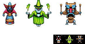
A pixelled character portrait, based on [link] by ~yrindaleRelated content


Comments: 42

Nice, You planning to do caramon or tanis next? I always wondered what sturm Looked like! ( Maybe him?)
👍: 0 ⏩: 0


RAISTLIN! I was looking thru your pixel art, and one of my favorite characters of all time pops up! Awesome job, chum!
👍: 0 ⏩: 0


Really cool!I like the shading ^^ Very good job,man
 (Wink)")
👍: 0 ⏩: 0

wow that's a really cool character! really dig the swirly smoke!
👍: 0 ⏩: 0


Hey hey! Some pixel works by the Grand Pixel!
Great pixelation of the original. The smoke is very well done. The texture of the robe is superb.
more! more!

👍: 0 ⏩: 0

Great one, man. The style this one was done on is reminiscent to what you used to see in SNES games, not only the color palette but the style that was used at that time. Good job!
👍: 0 ⏩: 1

Heh, never actually had a snes (or any other kind of console) but it's always fun to try and emulate styles by studying screenshots etc - not that I was actually trying to in this piece.
-Z-
👍: 0 ⏩: 0


perfect job! everythings extremely detailed, i really like the cloak and the smoke +fav
👍: 0 ⏩: 0

so.. I check my devwatch and it says 'zoggles' and I'm like "waaaaa..?"
awesome dude.. looks like the glow could use a little AA though. but you gotta love it..
does this mean we'll be seeing more from you in like a near future? I've really been missing your pixels.
👍: 0 ⏩: 1
Yeah I've been very busy doing work for various projects and not had anything I've been able to post here as yet.
As for the glow, it does have AA in my original, but I had to change the colours of the smoke here to blend in with the lighter background, and it didnt turn out quite as nicely. It was designed for transparency over a dark background.
-Z-
👍: 0 ⏩: 0


That's impressive. I like the fact that you didn't copy the original exactly, but you used the same concept. It's quite good.
I see all the detail in his robe which must've taken a bit of work. Excellent job there. I also like your colors, though I might've made the ring around him a red tint instead of yellowish-green. That's just a preference though.
I noticed that his right hand isn't on the staff, unlike the original where both hands are grasping it. Any reason why? I think it looks better with both hands, as your design seems as if he's just kind of relaxed.
At any rate, nice adaptation with this one. It's away from your more popular isometric city scape designs, but I think it came out great.
👍: 0 ⏩: 1
Well the smoke has changed shades a few times, mostly depending on what background colour the image is sitting on, in this case a grey/green.
The hand, I'm still not happy with, but I tried several things with it, it just looked very stretched when it too rested on the staff, but its something I will probably go back and have another go at with a fresh mind at some point.
-Z-
👍: 0 ⏩: 0


Hey, I found the logo! I really like it and it was well hidden  (Smile)")
👍: 0 ⏩: 0

that is really amazing
like the way you hid your logo
👍: 0 ⏩: 0
Woa! very cool work man, glad to see you're submitting stuff. I like that smoke/cloud effect - that looks great and character himself is done really well. Great shading on the cloak and light, like the character
👍: 0 ⏩: 0


Looks good as an addition to your wizard style
👍: 0 ⏩: 0


man, dude, you wouldn't believe how much your pixel work has inspired me. i love you
👍: 0 ⏩: 0


Haven't seen you in a long time. Amazing work as usual.
👍: 0 ⏩: 0

It has been a bit since your work has graced my watch once more .. so I think it seems fit that one that finally hits it is a doozy (as is all your work, actually .. ).
Wonderful pixel work and excellent coloring to go along with it -- some real nice shading giving this a very realistic manner.


👍: 0 ⏩: 0

")
")
👍: 0 ⏩: 0


Whoa, does this mean you're back? It's been like 5 months.
Kickass folds here, and I like the smoke, it's always hard to pixel smoke. Is the logo in the folds on his arm? Otherwise, I don't see it.
👍: 0 ⏩: 1

lol all the fun is in the finding, i wont spoil it for you.
👍: 0 ⏩: 0
Wow amazing!! the smoke is very well done, the shading is gorgeous especially the clothes.
BTW - i like the way snook you logo in there....yes i'm sad enough to actually check but only because i would have done exactly the same thing lol.
👍: 0 ⏩: 1


