HOME | DD
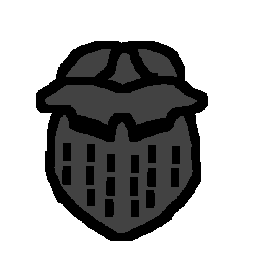
 zoggles — Zoggles Plus devwatch

Published: 2002-12-01 18:51:52 +0000 UTC; Views: 2216; Favourites: 29; Downloads: 232
Redirect to original
Description
Alternate version with a 'plus' symbol following wenstrom's suggestion.Related content


Comments: 49


 (Wink)")


Wowlez, you're the original creator of 
👍: 0 ⏩: 0


So cute! Heheh..
We can use it now. A nice few additions to the Emoticon Legend..
Jimzip
")
👍: 0 ⏩: 0


 (Smile)")
👍: 0 ⏩: 0


Looks great! Yea, this would do the job jsut fine. Nice work on it.
👍: 0 ⏩: 0


Damn! So you are the one whose : +devwatch : beat mine
👍: 0 ⏩: 1

Hehe I was quite suprised it got added actually. It's been on here since 2002. Just had a quick look at yours and thats pretty damn sweet too.
I'm not even fussed if mine or someone else's gets used, just that there now is one
-Z-
👍: 0 ⏩: 1
Have you seen those chemistry things I was started to do at pixelation? You promised to help with it but... well... it was laying in WIPs for a while so I posted it here as is.
👍: 0 ⏩: 1
Yeah but only briefly while I catch up with things. Have been offline for the last week or so due to severe computer problems. Will be giving it more of a detailed crit soon once I have had a good look at it in ImageReady. There are a couple of sections which seem a little odd, but need to investigate it further. Looks great overall though
-Z-
👍: 0 ⏩: 1

very smooth ... I like it ... hopefully we can use it ...

👍: 0 ⏩: 0
Just updated it so that the '+' is more in-keeping with the other '+' icons as requested.
-Z-
👍: 0 ⏩: 0


Just to clarify, I agree with 


👍: 0 ⏩: 0


👍: 0 ⏩: 1

i agree, like this one better than the one by ~eStunt
👍: 0 ⏩: 2

Er.. not you. I meant eStunt. I always seem to hit the wrong "Reply" button.
👍: 0 ⏩: 1

")
👍: 0 ⏩: 0


Yup we need this on the list.
Wish I was the head list maker for emoticons, I'd have 1,000's of 'em!!
👍: 0 ⏩: 0

nice...double function...could also be a peeping tom?
👍: 0 ⏩: 0


Very nice work!!! I like the addition of the plus sign in this version! Cute! Great job!
👍: 0 ⏩: 0

look at the fattie! regardez son lorgnon!
since when do emoticons have feet .. tiny feet in tiny brown shoes?
👍: 0 ⏩: 0


Heh, I once took a shot at the infamous +davWATCH as well.
Yours turned out uber sweet.
I'm not so sure how the "+" turned out though... I liked the original much more better. Maybe it's the fact that it's bright yellow...
Though this one's improvements made it much more clearer that is in fact PLUS devwatch.
So good job.
👍: 0 ⏩: 0


