HOME | DD
 zyphar — risk v1

Published: 2002-02-13 03:01:23 +0000 UTC; Views: 312; Favourites: 2; Downloads: 21
Redirect to original
Description
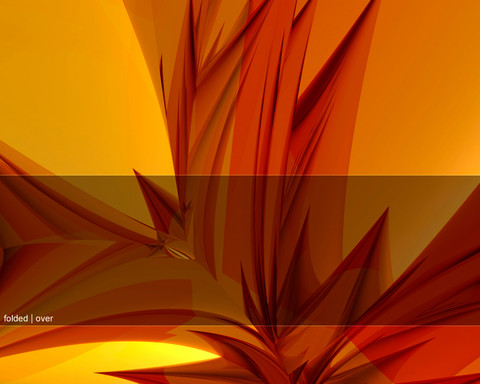
another render from bryce 4, i REALLY like th colors in this peice... expect a larger one soon....----- EDIT -----
i realized (mostly thanks to hyrax
Related content
Comments: 5

Nice colors, with type, give it contrast, think thick and thin lines, curved lines versus str8 angular lines and find fonts that fit the structure of the image, Later!
-----
Look. Learn. Live. Longevity.
Zrystalik 05: DARKNESS BP02 [link]
👍: 0 ⏩: 0

Nice render, but yeah the typography and stuff doesn't really fit in I don't think. I like those squares with the shadows though.
👍: 0 ⏩: 0

def. a very good direction for you, I believe
look for a more technical font
yes, the more boring, the better it will look. trust me
-----
001.0008
002.6302
004.0195
001.2706
003.9125
002.0060
000.8103
006.0520
009.9608
001.0247
000 https://frail.deviantart.com/gallery
👍: 0 ⏩: 0

Oh nice! Make the typo a bit better on it and it'd rule!
👍: 0 ⏩: 0

The colours are definately nice on this one zyphar Not sure if the typo is very effective....would be nice to see more of the render!
👍: 0 ⏩: 0


