HOME | DD
 zyphar — version change

Published: 2002-02-23 22:06:07 +0000 UTC; Views: 722; Favourites: 3; Downloads: 16
Redirect to original
Description
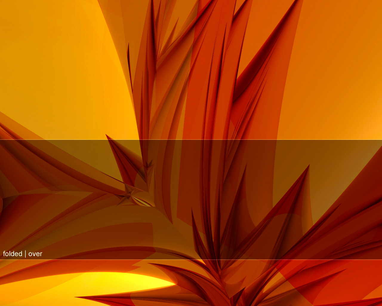
haven't submitted a wallpaper in a while, wer simple, no 2d work (which i suck at)let me know what you think.
Related content


Comments: 14

Minimalistik, nice and simple I like how you didnt have the grid cover the whole image, what u did added variation
Later!
-----
Look. Learn. Live. Longevity.
Zrystalik 05: DARKNESS BP02 [link]
👍: 0 ⏩: 0

I like this a lot, those blue fades really look good. only thing I dont like is the text but for the rest its really good, nice 3d n reflections n stuff
👍: 0 ⏩: 0

i like it, but i dont think there is enough open space for a wallpaper
-----
i love going to the playground and watching the kids jump and scream, because they dont realise im using blanks
👍: 0 ⏩: 0

Smooth, medium dark, and very cool. rofl..medium dark, well you know what I mean. Awesome work!
-----
-amphex (Dan)
👍: 0 ⏩: 0


A+
-----
001.0008
002.6302
004.0195
001.2706
003.9125
002.0060
000.8103
006.0520
009.9608
001.0247
000 https://frail.deviantart.com/gallery
👍: 0 ⏩: 0

Looks great, smooth and flowy. Typography is top notch, seriously! Great work
👍: 0 ⏩: 0

btw the graph is fine, dont change it
-----
: :::www. .net::: : www.subroot.net
👍: 0 ⏩: 0
simple and beautiful, just what i like! good work
-----
: :::www. .net::: : www.subroot.net
👍: 0 ⏩: 0

smooth....simplistic....grrrreat...
i like it..
-----
>>> tripp
👍: 0 ⏩: 0

...i like the blue colors definately. but i think you should fade the graph a little...it's a little too visible. just my opinion though.
👍: 0 ⏩: 0


I really like this image... the blues are perfect and the way it all works together is very nice.. however not terribly original.
good work though
👍: 0 ⏩: 0