HOME | DD
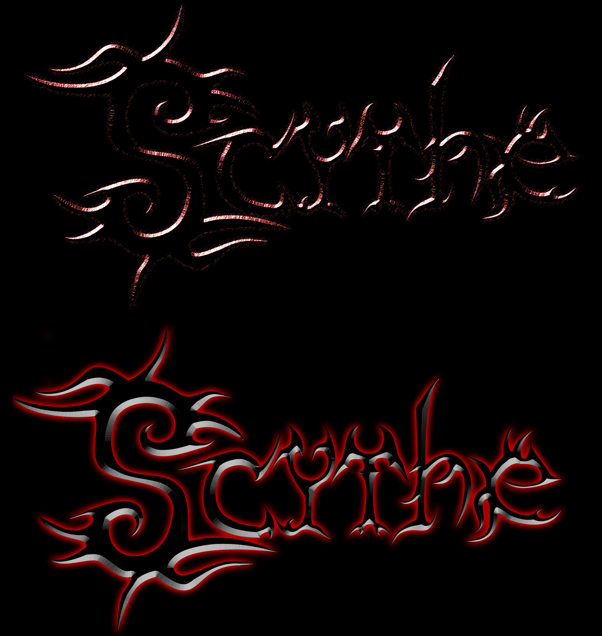
 Zyphre — Scythe Logos Version 0.2b
Published: 2005-11-08 06:45:44 +0000 UTC; Views: 99; Favourites: 0; Downloads: 6
Redirect to original
Description
Im going to need all the opinions I can get. Full View is nessesary for the top one, but not so much for the bottom. These are 2 prototype logos for my band S.C.Y.T.H.E. Im going to continually update and re-vise these as I get feedback on them. Currently there are 2 in the image and more to come after some feedback.Im asking that if you like it, tell me what you like about it in the best detail possible. If you do not care for either, please supply some reasons and if possible suggestions. Thanks for your help

Related content


Comments: 5

hey I use Adobe PS ....... how did you make those? I love the metal effect!
👍: 0 ⏩: 0

Basically, just polishing up the blades so they look chromatic.
👍: 0 ⏩: 1

ack x..x you dont mean chromatic, chromatic is the twelve tone scale of notes *stiffles music theory* you mean more chrome looking. Thats simple enough, ill do that.
👍: 0 ⏩: 0
I like the way the font's written in blades. Could you up the reflectivity/add more light with isolated fallout?
👍: 0 ⏩: 1
could you clarify that a bit? It would be difficult to get more light or reflection and preserve the color and feel of the blades. I could likely emphasize the edges more (beings how the center is currently black). If you have photoshop, feel free to play with it, and show me what you mean
 (Smile)")
👍: 0 ⏩: 0