HOME | DD
 0rAX0 — eHomosapien - Metacity v0.4
by-nc-sa
0rAX0 — eHomosapien - Metacity v0.4
by-nc-sa

Published: 2010-02-04 17:14:58 +0000 UTC; Views: 43425; Favourites: 62; Downloads: 9343
Redirect to original
Description
---Good News!!
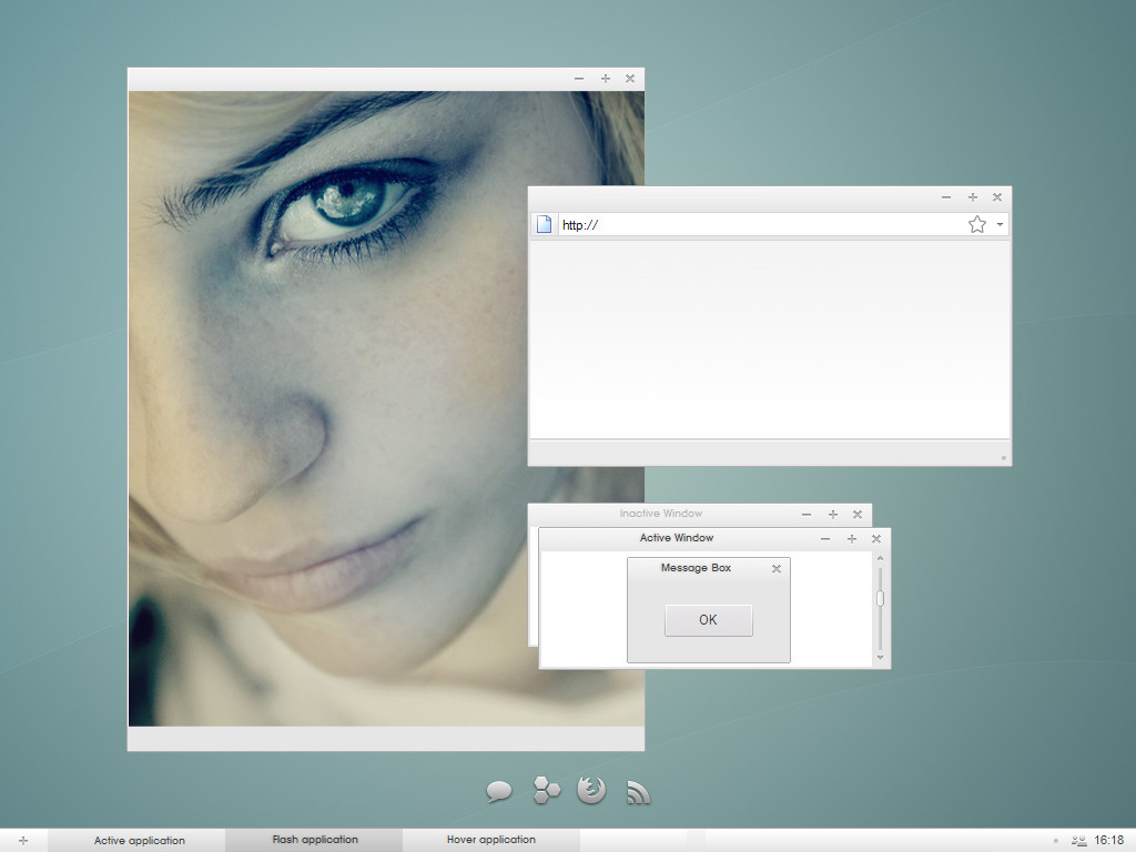
eHomosapien the Elementary-inspired metacity is now a reality!!
---
About the work:
The theme is based on the metacity created by Zac Barton which is based on my mockup
 (Smile) - :)")
Original Mockup here: [link]
Zac's work:
[link]
Elementary:
[link]
---
Changelog:
-V0.1:
-First Release.
-V0.2: (Friday February 05 2010)
-Improved contrast.
-Reduced size.
-Improved Colors.
-New effects.
-Added Titlebar highlight (eGTK style).
-V0.3: (Friday February 05 2010)
-Removed the right and left edges.
-The titlebar is now thinner.
-Changed the colors of - + to blue on hover.
-Added the engraved text style to the unfocused windows.
-replaced the titlebar icons with eGTK button.
-V0.4: (Wednesday February 17 2010)
-Added a new menu button (not a mod of eGTK's button).
-Improved the unfocused windows' look.
-Some minor fixes.
---
This is the best version of eH so far, so make sure you update.
---
Note: I'm not really sure about the new rounded button, please let me know what you think in a comment.
Note2: Although this theme has been made to match the Elementary suite, I'm not obligated to copy the eGTK's style or make a dumb copy with different buttons, I hope you understand what I mean.
Related content


Comments: 41


Nice, except that it doesn't retain custom colors when maximized in foreground.
👍: 0 ⏩: 1

Thanks for noticing and reporting that, I'll see what I can do.
👍: 0 ⏩: 0

I'm developing a new Free and OpenSource Operating System, M_Ordinateur OS ( [link] ) , based on OpenSUSE. Can I use your theme on it, as a default theme?
👍: 0 ⏩: 1
Yes, of course
and thanks for choosing it
👍: 0 ⏩: 0

the update finally fixed the choppy black between the metacity and gtk in compiz wobbly windows! REJOICE!! btw the new menu button isnt "ugly" oh something that makes me angry its just a bit odd looking, its fine by me so just keep it for now, i seriously dont know what a different menu button would look like so... yeah just keep it O_o
👍: 0 ⏩: 1
Thanks, um, about the choppy black line, I still have that and I thought it was just a Compiz/ATI problem, I'm glad it was FIXED
I'm not sure about the menu button though, maybe I'll make a complete new theme based on that (maybe  - :D")
👍: 0 ⏩: 0

hi again,
i really like your work, but i'll try to point out what i think is not perfect yet.
i'm using elementary-gtk, like, i suppose, most of those who use your metacity, and i seems to me, that the blue of the close-button is very bright and popping, whereas the egtk elements like the scrollbar are using far more discreet shades of blue.
second, i like it that you made a border, seperating the buttons, but it is made in a way that makes the window look flat and the buttons as if they are painted on the window, or something. if you look at the round button on the left (windowmenu-button), you can see, that it also uses a border, but a border that integrates not separates the button from the window. i'd prefer a solution like that for your buttons as well. which would mean, lighter buttons and a greyish gradient for the border that deals with an assumed light source. (like the elementary-monochrome tray icons, which are really a fine piece of work).
i'd also like to see a window-menu button in the homosapien-style.
and then, there is of course the problem that the concept of having an entity of three buttons doesn't work if you have a different button arrangement, or if the window just displays one or two buttons instead of all three. but i guess thats really just a problem with the concept and i'm ok with that.
well. that's it. pretty much. but i have to tell you that i really enjoy using your theme. it really adds this certain something to elementary. great work so far.
👍: 0 ⏩: 1
Thank you for your comment, I agree that the theme isn't perfect yet, and it has some limitations that can't be solved, I'll explain:
About the blue button's color, it is supposed to match the elementary-icons not the eGTK. (even in DanRabbit's Elementary concept they're different).
I'm aware of the problem with stroke too, and I'll working on it.
About Homosapien, I'm not developing it(Zac Barton is in charge), however I agree that it should be a button there, maybe not like the mock-up though.
Now for the personalized order, the concept was introduced like that, and maybe that's what makes it different, I know that the ability to play with the order is cool, but you have to make the buttons square or circular or as simple as possible and I think we've seen hundreds of them, plus, the buttons are the theme's strongest point so far  (Wink) - ;)")
Thank you again participating in making this theme as perfect as possible.
👍: 0 ⏩: 0

Awesome work, thanks!
But we can't put buttons on the left side, 'cause the order is close, minimize and maximize. If I put in this order on the left side it will appear horrible
 - :(")
👍: 0 ⏩: 1
Try to flip them first in the metacity-1 forlder.
👍: 0 ⏩: 1
Impossible, they have another order. The right order is: minimize, maximize, close.
Left order: close, minimize, maximize.
We need new pics for do that!
👍: 0 ⏩: 1
Totally possible, in fact I just did it, do a horizontal flip and re-arrange with UbuntuTweak (latest).
👍: 0 ⏩: 1
Ok, maybe 3 pics can explain what I mean:
Original:
[link]
Flipped:
[link]
What I mean:
[link]
Cheers mate, I just do the 3 buttons mod, if you want I can send to you!
👍: 0 ⏩: 1
Oh, I see now, altough, it worked with me with no extra modding, just a flip, but I had to make them: close,maximize,minimize not minimize,maximize, anyway, it is so confusing I can't work like that sorry
 - :P")
👍: 0 ⏩: 1

Pack in wih tar.gz instead of 7z, so users will be able to install it using GNOME UI (Appearance preferences).
👍: 0 ⏩: 1
You can find the tar.gz inside
👍: 0 ⏩: 1
Of course I can, but can't drag and drop download file on GNOME Appearance preferences window.
👍: 0 ⏩: 1
7z is DeviantArt friendly, I don't think this site supports tar.gz, that's why I had to do it likt that.
👍: 0 ⏩: 0
looks great, but: the download-link directs me to the picture not the precious metacity-theme
👍: 0 ⏩: 1

I'm pretty new to modifying my themes. I have a (hopefully) simple question. I installed this theme along with the Elementary icon set but the colors still look like the default Human theme. I changed "controls" to Clearlooks and it looks a little better but still doesn't look like the screenshot.
Is there a different control option that needs to be installed?
Thanks!
👍: 0 ⏩: 2
you have to install DanRabbit's eGTK theme
[link]
👍: 0 ⏩: 0
@pjman80
actually the theme consists of three different things: metacity (window border), gtk (all the other stuff
so, what is called «controls» in the appearance window is actually the gtk-theme. all you have to do now, is to install the pretty elementary gtk, or eGtk from here: [link]
hope i could help.
👍: 0 ⏩: 0

Nice effort, I'm using it right now. IMHO the buttons should stand out a little more, the border kind of fade in the title bar and; the +/- are kind of hard to see. The + sign fades on the left, for no particular reason. A smaller title bar would be nice, to save few pixels.
The round borders don't look so good on my machine, I guess it's a metacity flaw; it would probably look better with square borders in the bottom. The borders are a bit too wide, I know they are useful to resize a window, but a workaround could be removing the left and right borders and just keep the bottom one.
You should also consider removing the application icon in the left of the title bar and use a standard button, for consistency.
I prefer the "engraved" of the font in the title bar of elementary's metacity, but that's just me.
Again, I really like it, I don't want to sound too critic.
👍: 0 ⏩: 1
I just uploaded the new version, check the changelog/screenshot. I'll work on the rest.
Enjoy.
👍: 0 ⏩: 1
Hello - Nice theme. The new 7zip upload doesn't contain the compress tar.gz file.
Thanks!
👍: 0 ⏩: 1
It doesn't have to, I should have included it, anyway, you can extract the folder into .themes in your home directory
👍: 0 ⏩: 0


I must say I was waiting for this! But the border are really big. You should make a thiner version. Also you could take inspiration from Danrabbit's metacity the way the font looks in the metacity. Other than that, it's beautiful work and concept. Thx!
Ps: sorry for my bad english
👍: 0 ⏩: 1
I'll see what I can do
P.S. It's OK
👍: 0 ⏩: 0
