HOME | DD
 1ALPHA1 — REVELATION

Published: 2006-01-23 20:30:25 +0000 UTC; Views: 1656; Favourites: 21; Downloads: 237
Redirect to original
Description
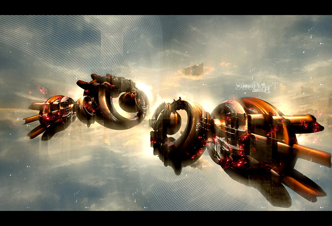
uhm.........yeah new piece.. (Smile)")
pscs2/c4d.
now i think i might start my little break..lol..
Related content


Comments: 48

Pretty cool, I need to try blending some photoshop with my c4d images, great job.
👍: 0 ⏩: 1


the only problem is the render lighting, with that big of a light explosion, the render would be brighter in the the front. looks nice otherwise though. deserves a fav. good job man
👍: 0 ⏩: 2
lol so that white blob is pointless? o well still looks nice
👍: 0 ⏩: 0

there was no lighting at all, lol.. but thnx..
👍: 0 ⏩: 0


I'm not gonna have any clean jeans left if you don't stop turning out such good shit >_<
👍: 0 ⏩: 1
hahaha, lmao. well thnx, happy you like my work..
👍: 0 ⏩: 0

I really like your style....! I like the text and the colors, and the composition....
In the lower right quadrant, it looks like some kind of futuristic bike....
👍: 0 ⏩: 1
OMG, dude i thought noone would notice that, i also seen that but not till today...lmfao.........you should win a prize for that..lol, appreciate the comments. great minds think alike..
👍: 0 ⏩: 0

dude I love that render, but I dont like some of the colors.
👍: 0 ⏩: 1

i love all ur work but one thing tht really bugs me about all your stuff is the typo, the actual art is good but it would be good if u could add some nice typo to finish them off.
👍: 0 ⏩: 1
")
with a more piece oreinted style, and will work on that..
👍: 0 ⏩: 0
sick means good right?, lol, i might be having a brain fart, anyways thnx homie, i think..
👍: 0 ⏩: 1

S.I.C.K means the bomb diggity.

👍: 0 ⏩: 1
lol, oh ok.. appreciate the ebonics help..
👍: 0 ⏩: 1

your renders are awesome ... but the athmosphere u are creating is sick ")
👍: 0 ⏩: 1

Awesome render. I really like the lighting effects in this one mate.
👍: 0 ⏩: 1

cool, happy
👍: 0 ⏩: 1

")

some of the darker brushing could use a lil work. Other than that it looks nice!
👍: 0 ⏩: 1
i see whatcha mean, thnx though..
👍: 0 ⏩: 0


Great render but the text needs to be fixed again!
👍: 0 ⏩: 1
cut me some slack man, you cant always do whats common even if common looks good..but whatever..
thnx though..
👍: 0 ⏩: 1


looking nice realy nice the brushing could eb allitle better but still very ncie
get in the fucking MSN!!!
👍: 0 ⏩: 1
i didnt want to over do the brushing.. but thnx..
👍: 0 ⏩: 0


