HOME | DD
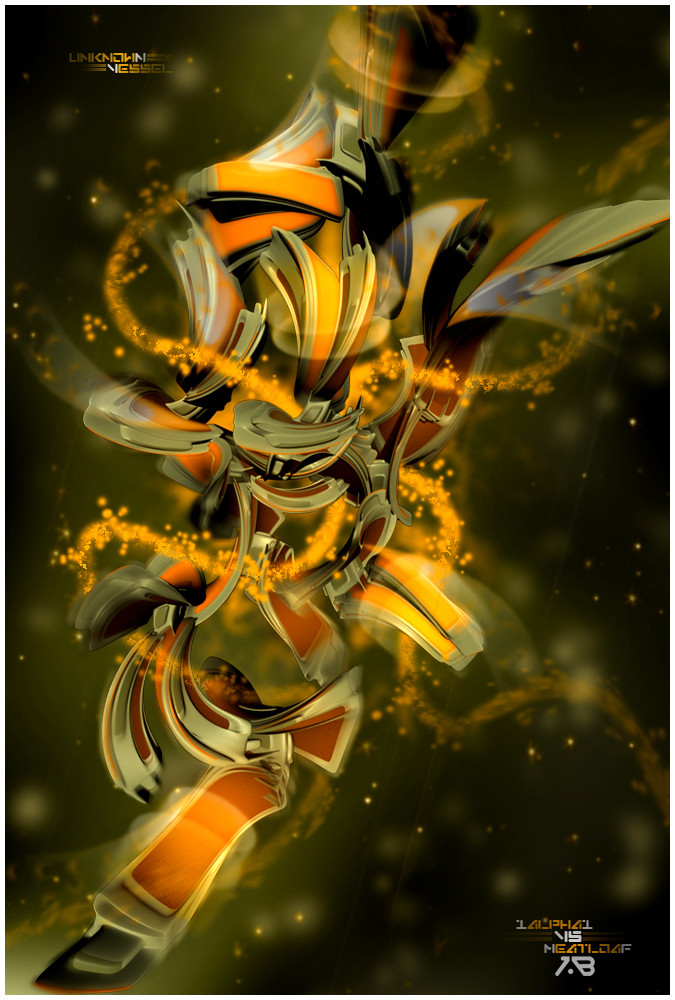
 1ALPHA1 — conditionZero

Published: 2006-10-19 05:58:43 +0000 UTC; Views: 3028; Favourites: 63; Downloads: 46
Redirect to original
Description
a little differant then some stuff i been doing latlywhatcha think?..
resurgere and feeling experimental.
")
Related content


Comments: 81

Awesome render, but a little to blurrd for me. Think it could use more brushing and a little more depth. Great work tho
 (Smile)")
👍: 0 ⏩: 0


:sits silently and dose not know what the hell should he say:
👍: 0 ⏩: 0


liking...needs work but man, its a fresh look for you i'm relaly liking..and of course the redner is pure sex

👍: 0 ⏩: 1

thnx bud, yeah a little here n there improvements would help it
👍: 0 ⏩: 1
")

Is there a chance u called it condition zero cuz its blue and yellow just like CS CZs logo?
and for teh peice i liekz it but in a weird way
not like all ur other stuff

👍: 0 ⏩: 1
the name is something i been wanting to use for awhile now.
thnx dude.
👍: 0 ⏩: 0

i used to build renders like that.. but never got them submitted.. great stuff here
 (Wink)")
👍: 0 ⏩: 1


")

thats a good thing
SMILE!!!
👍: 0 ⏩: 0

I love how unique and different your renders are than just a plain-everyday abstract one, you know? I like the colors and the depth in this one a lot too. Nice job.
👍: 0 ⏩: 1
thnx dude, i always try n be dif
👍: 0 ⏩: 0

looks awesome man, i just wish like the render was more realistic than cartoonish, u kno what i mean?
👍: 0 ⏩: 1
thnx, not sure i see that in this one.?
👍: 0 ⏩: 1
i dunno, like its too round, and not crisp, u may not see it, but thats how i do.
👍: 0 ⏩: 1


that awsome bro... looks amazing may be allitle bit more contrast
👍: 0 ⏩: 1


I love the darkness, depth, and all the little details you put into this. There's just so much to keep looking at! As always, you're amazing.
ROFL look at the mood emote! That is hilarious! Kudos to whomever made it.
👍: 0 ⏩: 1
thnx , lol your all into that emote...
👍: 0 ⏩: 0


nice render and colors, but i don't like the tipography and low quality of image
brushing need more work i guess
that's it
👍: 0 ⏩: 1
i think my brushing and render aliasing gave it the low quality a bit,
thnx dude.
👍: 0 ⏩: 1
you're welcome, and sorry if was wrong
👍: 0 ⏩: 1
no sorrys dude, i hear yah all the way.
👍: 0 ⏩: 0


| Next =>